
EMUI
Design Case Study (Before and After)
Background
Learn how we created Huawei Consumer’s new design system and language and how we crafted a unique look and feel that is both functional and delightful.
After (the redesign of EMUI)
To appreciate how far we have come since we gave EMUI its much-needed makeover, it helps to look at what EMUI looked like before its transformation and the steps we took to accomplish a complete makeover. Pictured below are six screens and examples of the newly redesigned EMUI 5.0. Compare them with their six counterparts from the ‘old’ EMUI 3.0. see further below. While we gave the new EMUI its own distinct and fresh look and feel, different from anything before, we retained EMUI’s original circular signature elements that existed since EMUI was conceived. The result is a fluid, timeless, universal, and accessible look and feel.


Before the redesign
Pictured (6 screenshots of EMUI 3.0) that were taken before EMUI was redesigned.
For more comments about the design philosophy and process behind EMUI, and how we orchestrated EMUI’s redesign, see below.


EMUI redesign Case Study
Reasons for the Redesign
Inconsistencies and a lackluster visual appearance plagued EMUI, and it mostly lacked a coherent vision. This was mainly due to multiple teams and multiple functional roles with different skill sets and perspectives without a leader at the helm. I managed the design teams and the agency that supported design production; I created the original design vision and strategy for the project, including the design principles informing the design system. With Huawei Consumer creating state-of-the-art hardware and devices in cooperation with world-class partners like Porsche and Leica, we had a tall order to ensure alignment with these leading partners, in addition to an outstanding user experience — through the new design system. To achieve cohesion and consistency in design, it was vital to define reusable and cross-platform components and styling options. A consistent design system and language make it much easier to ship products on many platforms and devices, which is especially crucial for Huawei Consumer.
When they interact with a product that has a strong visual language, users tend to remember it better. Unfortunately, a majority of products available on the market have generic designs. It is too easy to confuse one product with another when they share the same visual styles. When people interact with a product that has a powerful, visually appealing, and supportive look and feel, they tend to focus better on their content and experience. Hence they will have positive associations with both the company and the brand. Unfortunately, EMUI, before the redesign, felt generic as it was created from an Android-based technology, without any association with the award-winning and beautiful hardware that Huawei Consumer was shipping. Without a uniform design system, not only was the user experience cluttered and confusing, but it was also challenging for engineering to integrate changes into new builds.
Therefore, creating a strong design system with a deliberate plan was crucial before developing the next release of EMUI. Every aspect, including reusable interface controls, icons, color palettes, typefaces, images, illustrations, gestures, animations, and even sound, was deliberately planned and coordinated to help people use and remember EMUI as an outstanding experience. When an authentic design language is crafted carefully, it creates meaningful touchpoints for the brand.
Clarity
We put a strong focus on clarity — we wanted to make our interface clean and not cluttered. By following a deliberate design approach, we minimized the number of interface elements that users have on every screen and created a highly-focused experience.
Clean and focused design helps to focus user attention on essential elements of your design. EMUI 5.0 Comp.
Innovation through design
With so much competition in the phone market, companies invest significant resources to make people try their products. Companies invest in innovation and try to break new ground to attract users and pique their interest. Visual interface design is often the fastest and cheapest way for a product to innovate. We followed an extensive design research process, including ideation, and exploration of multiple directions and options, to allow for side-by-side comparison, especially when reviewing with the executive team, including CEO Richard Yu, who was very involved in the design process, right from day one, when he hired me for the role of the design leader.
Achieving consistency was a core goal of creating a cohesive language. It’s essential to standardize the visual design. When we started this Huawei project, it was essential to understand the opportunities for our design before starting work on the visual language, and therefore, I had the design team perform an in-depth audit of the existing EMUI product and take screenshots of EMUI and multiple competitor products. We reviewed the visual design language, the user experience design, the product design, and feedback from both the media and users. Our UX research team analyzed all mobile OS systems available on the market and identified the full range of challenges typically faced by users. Our goal was not only to understand Android OS’s anatomy and how it applied to EMUI; we also looked for potential elements of EMUI that were worthwhile to retain. We created a top ten feature list, where we ranked the features from most important to least important, and dozens of additional features were added and ranked accordingly.
When we broke down the whole mobile OS into its atomic elements — main components, controls, shapes, use of images, icons, typography, and other visual attributes, such as the direction of the light, shadows, lines, layout, sounds, and transitions, and by decomposing EMUI, we decided to retain a few of its core elements, including the shape of a circle as an essential and repeatedly used element, that would eventually become a visual “hallmark” of the new EMUI. At the end of the UI audit, we understood what to add, change, or remove, why, and how.
Pictured below: EMUI 5.0 layouts. We used circular visual elements, to create a unique visual language for EMUI.


Understanding our customer and competitors
When working on Huawei’s visual language, it was essential to clearly understand who we were designing the experience and how they perceive Huawei — compared to Google and Apple, and other competitors. Our goal was to create a meaningful experience supported by a distinct and unique design language that feels bespoke and made explicitly for Huawei Consumer. We had a global design challenge due to its global user base. Our new design language had to meet the needs of both Eastern and Western design sensibilities. We categorized large groups of users and created summaries based on our international target groups’ available information. Every overview of our audiences had the following information blocks — demographics, goals, lifestyle, what they care about, and their expectations. Here is an example of the summary of the group of Central European customers:
Men and women aged 30 - 64;
Average annual income: USD $75.000
They live in both urban and suburban environments; they are driven by business, social status, and personal organization; they care about:
Live a healthy lifestyle.
Spend quality time with their loved ones.
Being organized and ordered.
Efficiency and productivity to enable them to enjoy their own time.
Their goals:
Contributing to something bigger than themselves.
Maximizing life and living for happiness.
Their expectations:
An OS and experience that supports them throughout all life situations, and settings: during exercise, work, and play.
With the expectation that the design should match the audience’s lifestyle and be extremely refined, we evaluated every design decision by our target segments’ needs, mindset, and mental model. Such an understanding will give you a reason for your visual direction.
To identify strategic design opportunities, we had the UX research team to conduct a competitor analysis. We identified four major competitors who had established and well-known design systems and focussed on identifying their strengths and weaknesses. For example, when we evaluated Apple’s iOS, I brought up Apple’s strengths — scalable across devices, great focus on standardization, focus on delighting the user through a lucid, clear interface, and giving way to content. We discussed iOS’ weakness — its home screen (at the time) was not efficiently managed and would not allow users to use numerous applications.


Competitive Edge
We identified core competitors, and put every maker on the plot with the following findings:
Our analysis helped us identify four vital quadrants that players follow for their product strategy. Our goal was to be most emphatic and bespoke out of these options to be different and unique while still offering value to users.
Empathic: (design tailored for the individual user, and design that demonstrates genuine human empathy and genuinely reflects the audience.)
Neutral: design that is the same for everyone and does not adapt to the user’s needs.
Generic: design that utilizes a look and feel that does not appear proprietary and unique, such as the commonplace designs based on Android, which makes competitors appear very similar.
Bespoke: Design designed specifically for the company — while still relying on standardization and reusable patterns.
Our meticulous process helped us to identify the opportunities for our design language:
Scalable: The language should be efficient for implementations and scale across devices and third-party developer apps, too.
Bespoke Design DNA The language should be unique and distinct from the major competitors, with deliberately and carefully chosen design elements and attributes.
Long-lasting The language must be long-lasting.
We have been identifying opportunities for Huawei Consumer and the new design system by taking a close look at both, our customers and competitors.
Emphatic design
Designing for the peripheral mind is about using visual cues to communicate a particular structure to the user subconsciously. Our peripheral minds are incredibly powerful at processing data, while only a few percentages of our brain, our higher consciousness, use power. On a practical level, we use visual design to guide the user’s focus by accenting UI elements. “Living Shapes,” specifically conceived for Huawei Consumer, uses calm design: audio, visual elements, and gentle animations that help people focus on their current tasks. Using ambient aesthetics, organic animations, and peripheral techniques, applying brain science, we reduce stress levels. We use slow organic motion and subtle colors and sound to create an atmosphere of serenity. We help users to focus by reducing notification pop-ups, icon badges, and alerts. We avoid interruptive actions and alerts.
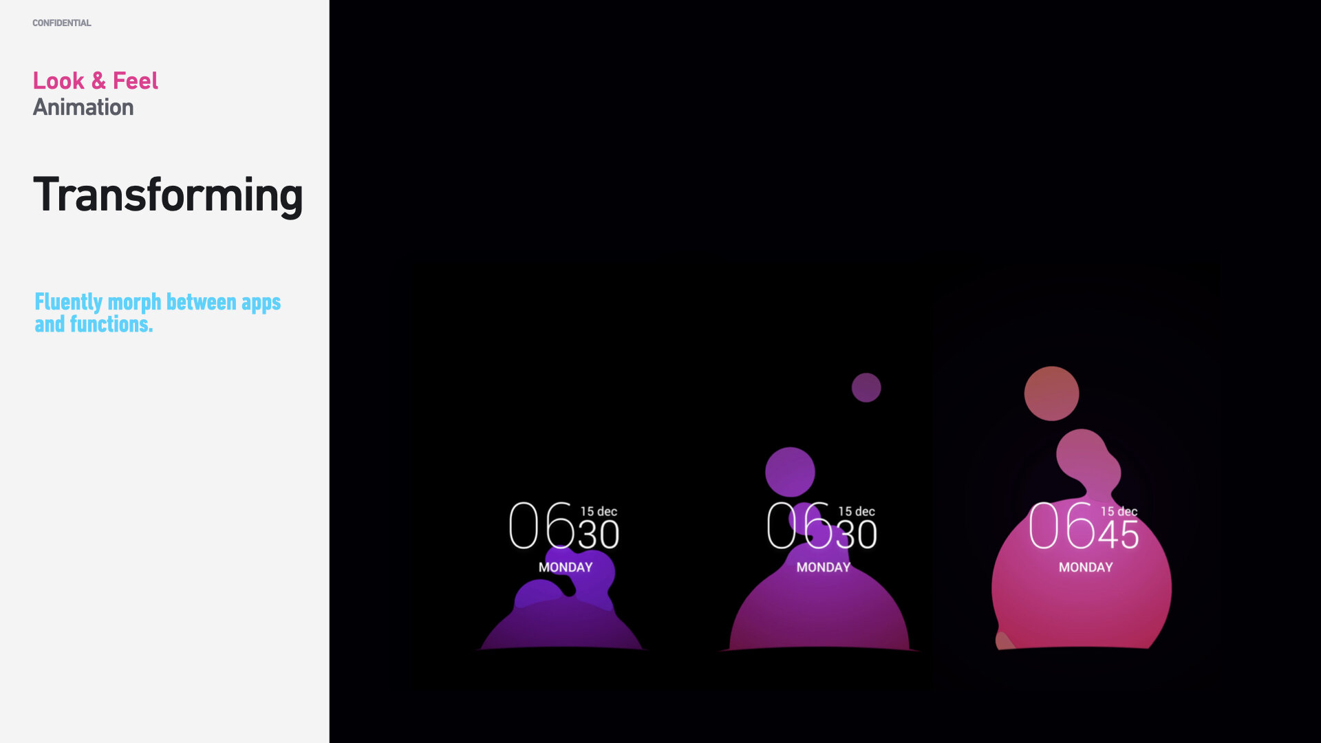
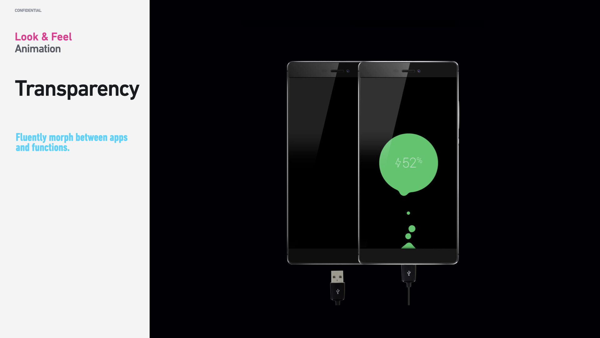
Pictured on the right or below: non-interactive living shapes, so-called metaballs, mainly inform users of an operation going on in the system. For example, as the charger is connected, animated meta-balls visualize the charge amount and charge growth.
“Living Shapes,” specifically conceived for Huawei Consumer, uses calm design: audio, visual elements, and gentle animations that help people focus on their current tasks. Using ambient aesthetics, organic animations, and peripheral techniques, applying brain science, we reduce stress levels.
A living interface
We created a motion-rich interface that feels alive with moving and transforming shapes that provides a smooth and fluid experience. Organic, round shapes with pleasant curvatures, often overlaying each other. We took cues from the sky and learned about natural light phenomena, such as the Tyndall effect. Hence, in addition to a basic, neutral OS palette, we used soft gradients mimicking natural ambient light.
Layered animation of living shapes
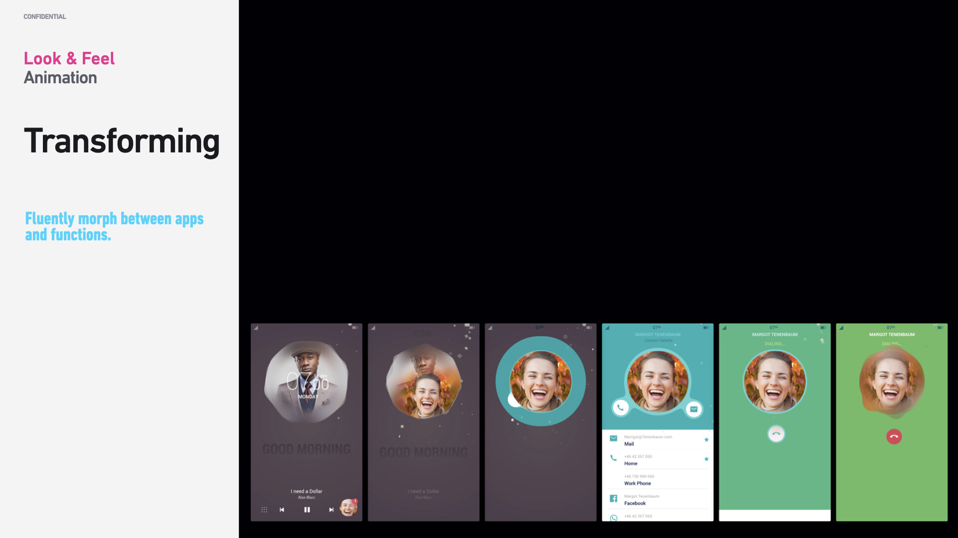
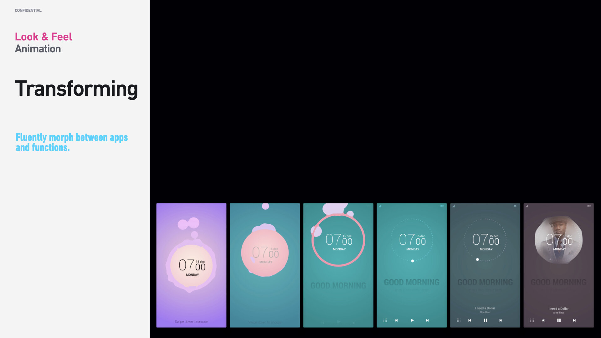
Our animation system (for specific screens and transitions) allows individual user interface elements to transition into a new state. This will lead to a smooth experience for the user when moving from one application to another. Individual components can be animated, allowing for dynamic, smooth, and seamless animations.
Animation of layered elements results in a smooth experience for the user when moving from one application to another.
Nature as inspiration
As we defined a vision for EMUI’s visual design, we started with universal user experience design principles. However, an additional goal was to humanize technology and achieve harmony between people and nature. Aside from brain science, we looked into science, art, and nature for inspiration. In the California Academy of Sciences, we looked at jellyfish and the science of color. After careful research and design, we decided to incorporate natural forms (smooth curves and organic forms — aka “Living Shapes”) in our visual design. As a result, all graphical elements, and controls, such as buttons, icons, shapes, and even textures and color palettes, have an organic design aesthetic.
We spent a lot of time trying to find the direction for EMUI’s proprietary visual design and core identity. We’ve decided to use the philosophy of organic design as a foundation for our design language. Organic design is centered around using nature as the greatest inspiration. Animations’ primary purpose is to help the user to understand how the OS works. It can help to create more memorable moments that enable users to navigate the system. Animation guides the user’s attention to processes in the interface. Creating excitement and fun is also an essential purpose of animation, but it should never take priority.
Our animation system allows individual elements of the interface to transition into a new state and view. The animation and transition lead to a smooth user experience when moving from one application to another. Individual elements are animated, allowing for dynamic, smooth, and seamless animations accenting negative space.
Animations unlike anything before — ever.
Animations’ primary purpose is to help the user to understand how the OS works. It can help to create more memorable moments that enable users to navigate the system. Animation guides the user’s attention to processes in the interface. Creating excitement and fun is also an essential purpose of animation, but it should never take priority.
There is no doubt about the importance of animations, transitions, and gestures in mobile design. Often, animation serves a purely-functional role — it provides feedback for user action and connects different states of the mobile app together. A well-crafted animation also contributes to the visual aesthetics of an experience. the aesthetic-usability effect states that people have a better user experience when they find an interface visually appealing).
Our ultimate goal was to use motion effects to breathe life into our technology and thus humanize it. It makes the interface feel alive, dynamic, and responsive. As with every other detail for EMUI, each animated effect and transition we introduced into our design was measured by our principles and the functional and emotional benefits it delivers to end-users.
EMUI’s organic shapes and luminescent colors* were inspired by jellyfish, and light phenomena, such as the Aurora Borealis, a natural light display in the Earth's sky, predominantly seen in high-latitude regions around the Arctic.
Design philosophy and strategy
Creating and executing a comprehensive design language is a team effort. That’s why I brought hand-selected, world-class talent to the team (we worked with in-house talent and hired an interactive design agency in San Francisco) to ensure that we would accomplish a world-class look and feel across the entire system. I allowed for a lot of experimentation and renderings, mostly animations and textures.
We went through many iterations to find the core direction for EMUI’s visual design. We’ve decided to use the philosophy of organic design as a foundation for our design language. Organic design is centered around using nature as the biggest inspiration. Be clear, be confident, and don’t overthink it. The beauty of your story is that it’s going to continue to evolve, and your site can evolve with it. Your goal should be to make it feel right for right now. Later will take care of itself. It always does.
The success of any visual design positively relates to how people perceive it. Delight and success are the results of how an OS looks, feels and performs. Many factors influence human perception, and a significant part goes to psychology. You need to consider every aspect: usability, the meaning of shapes and their impact on users’ minds, aesthetics, and craftsmanship.
Design system strategy
At the beginning of the project, I provided the framework (and vision) for creating a comprehensive visual language, and over a couple of weeks after testing various layouts, controls, typefaces, and other elements, we created a cohesive system comprised of:
Design Principles & Heuristics
Design Patterns
Layout and Grid
Controls and User Interface Elements
Typographics Styles
Shapes and Masks
Glyphs and Icons
Use of Images, Photos, and Illustrations
Animation Styles and Gestures
Color Palettes
Light Effects
3D-rendering Styles
Textures and Materials
Themes
Sounds
We needed to design a language and system fitting for people worldwide, and to make sure it would be natural and suitable for a global audience — we accomplished this by using universal design principles.
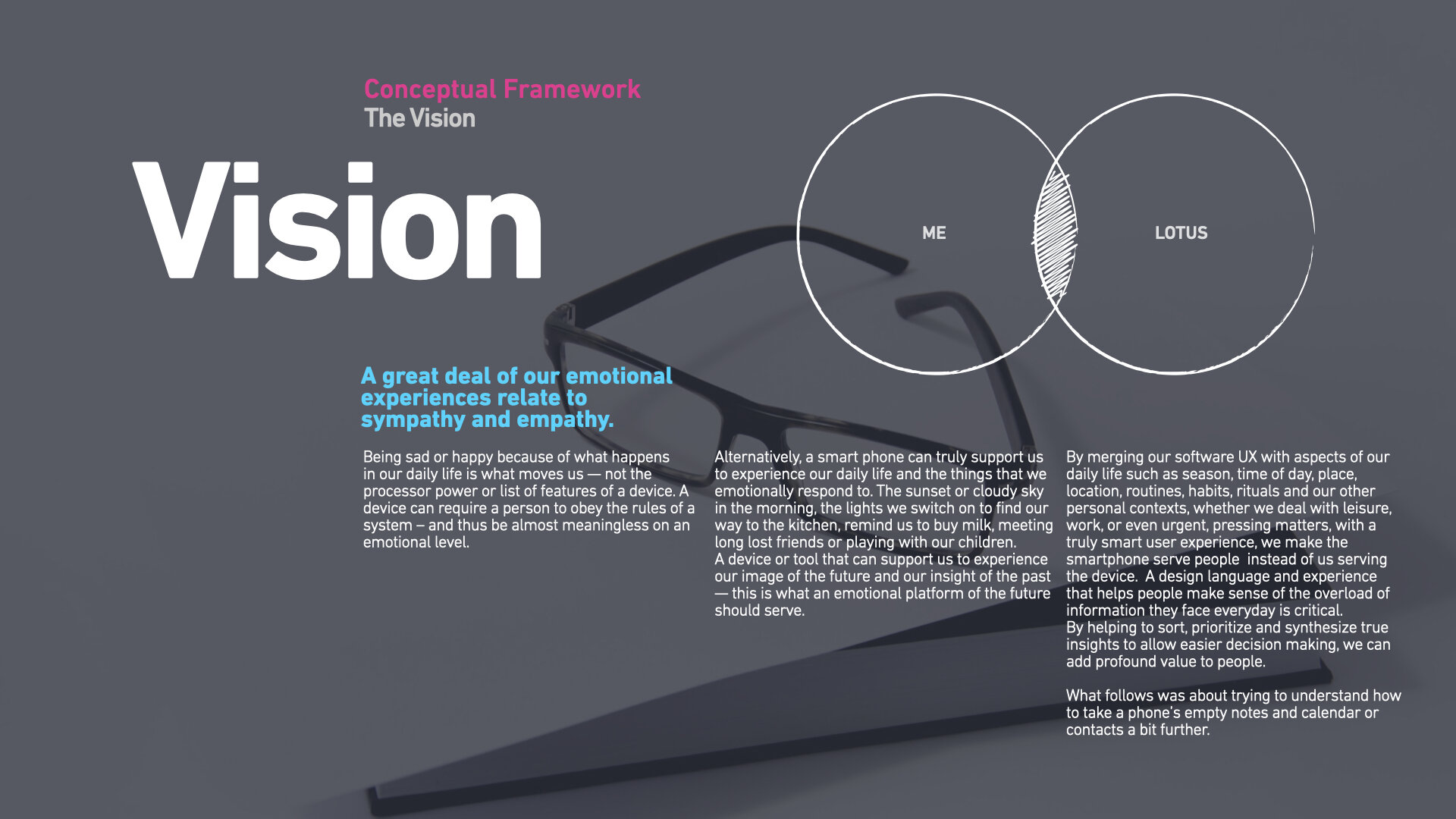
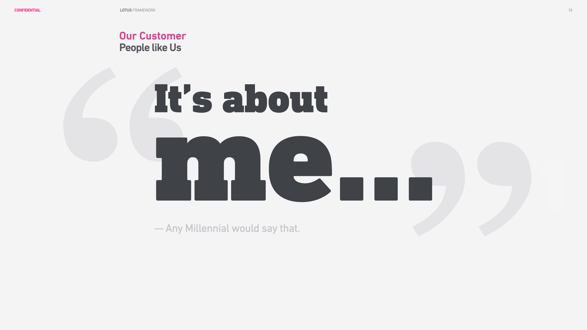
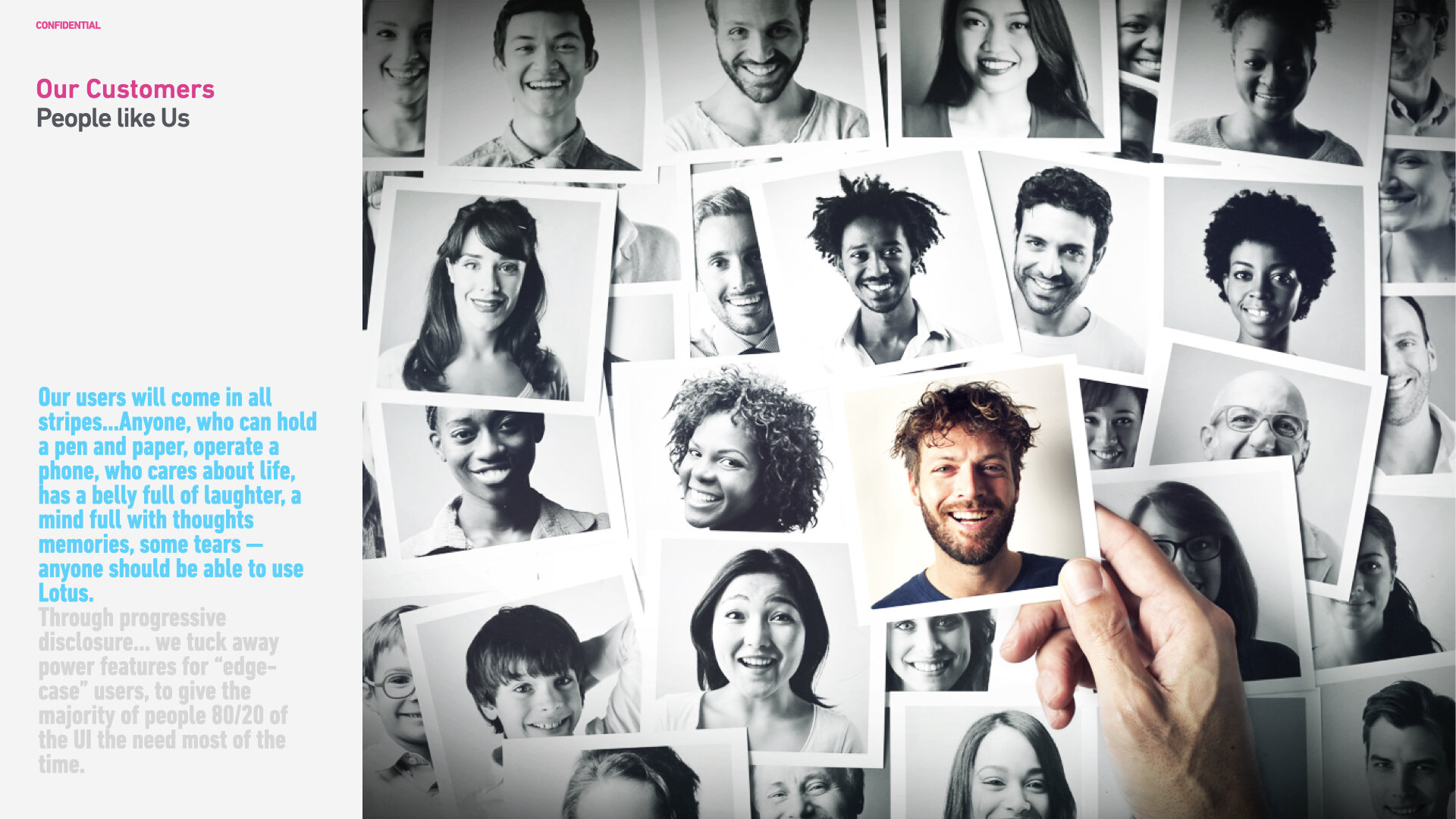
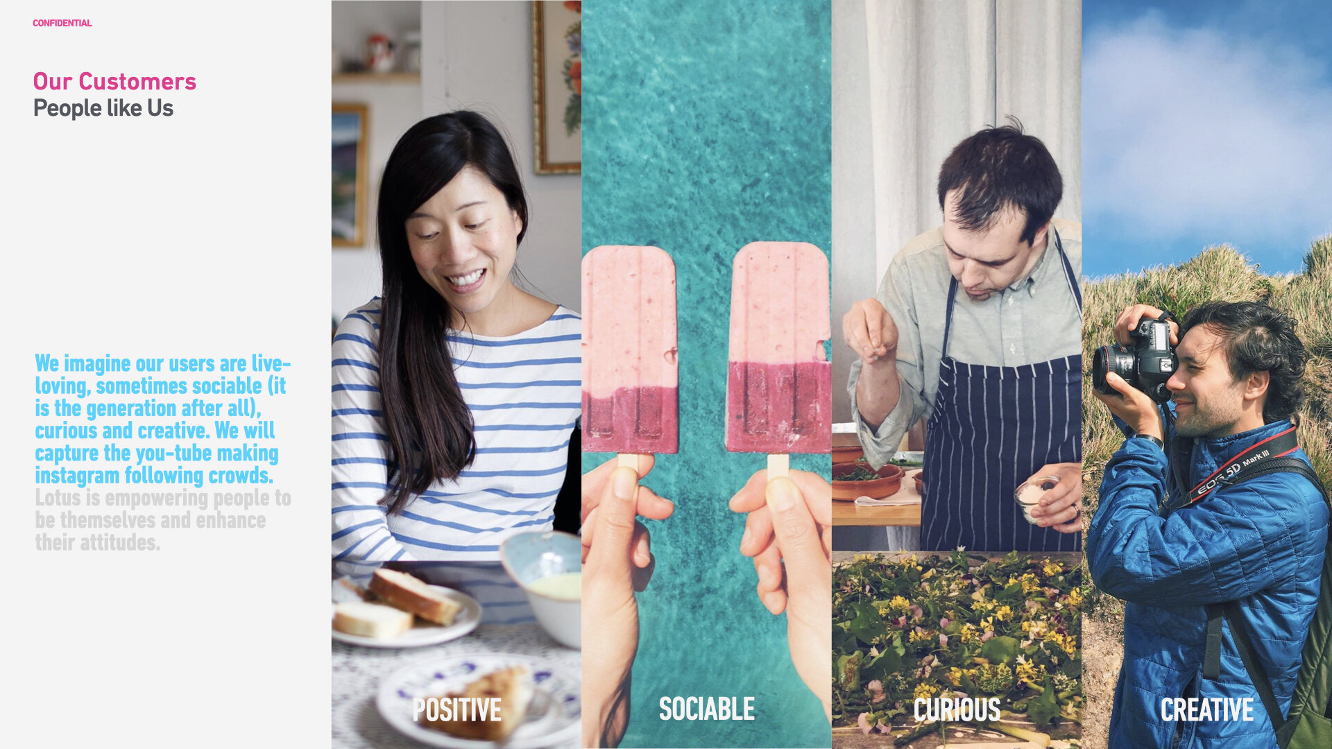
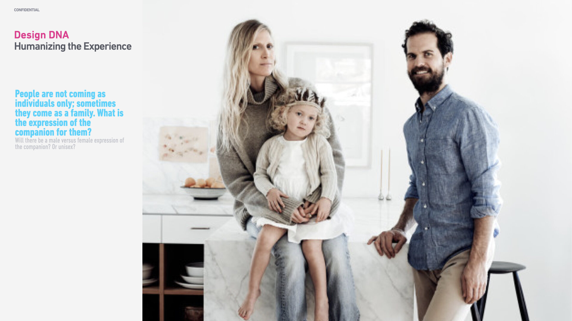
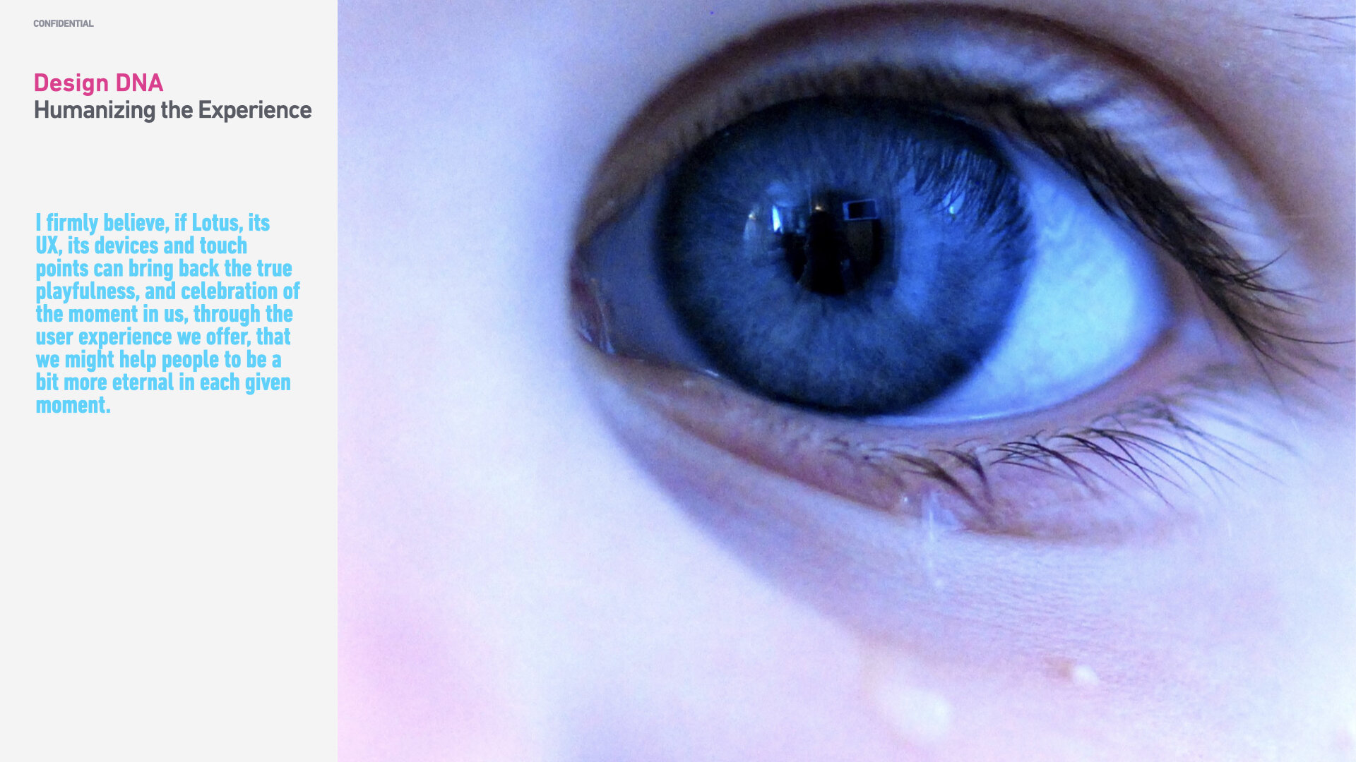
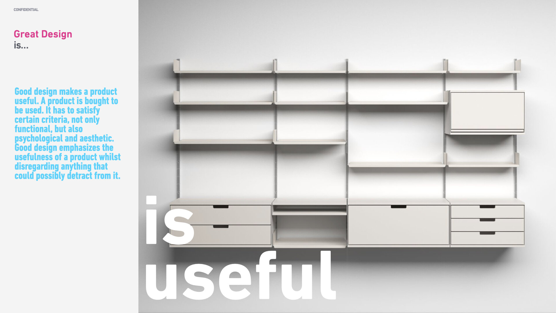
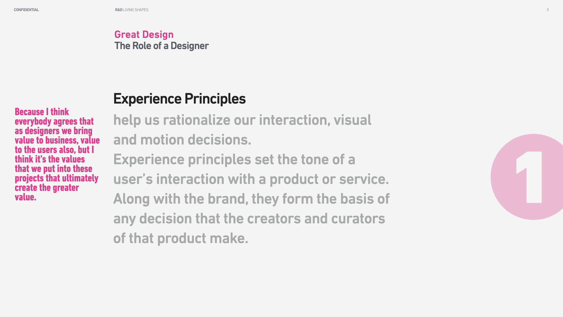
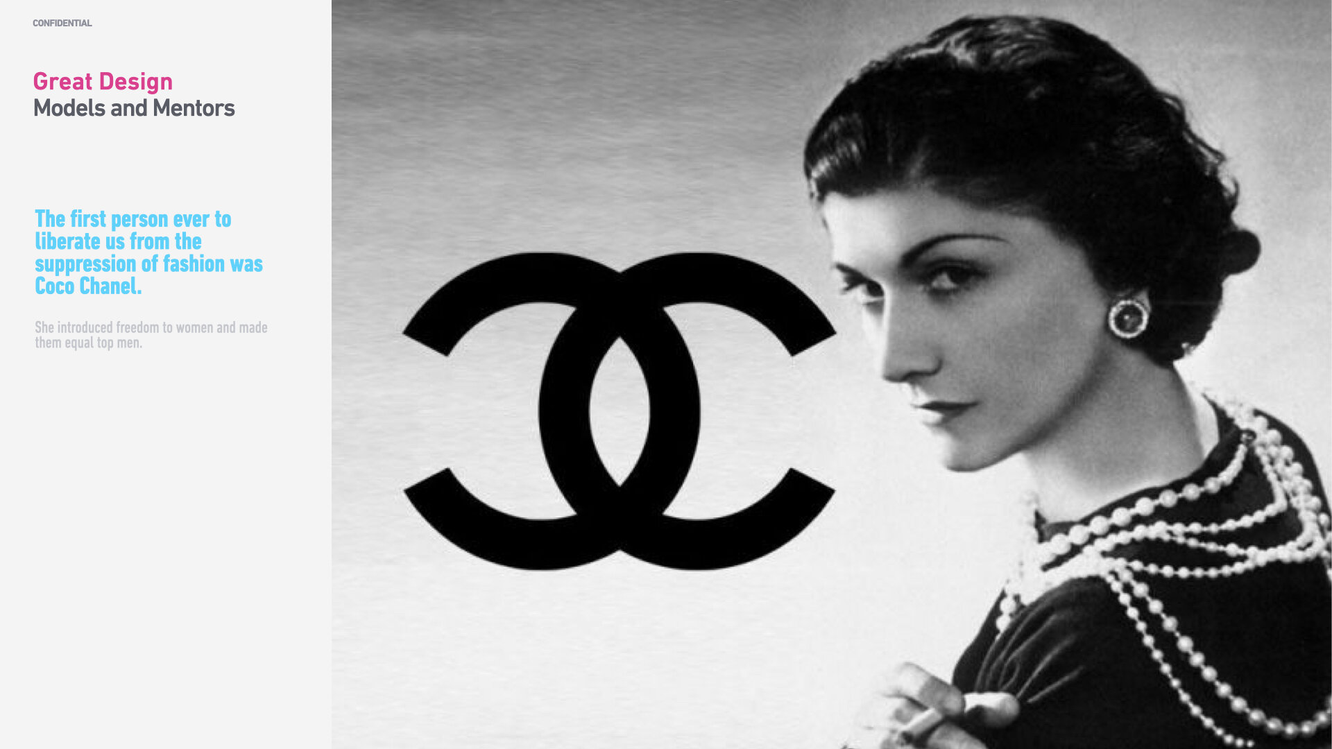
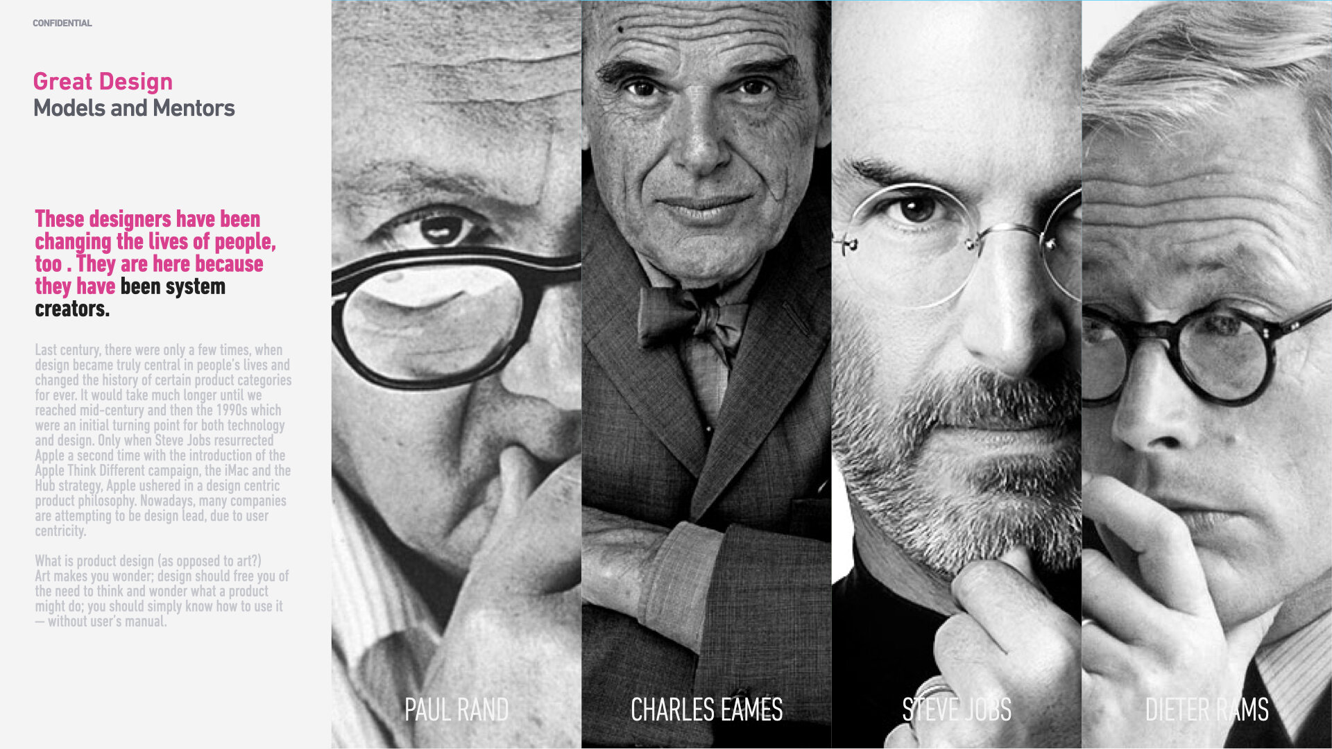
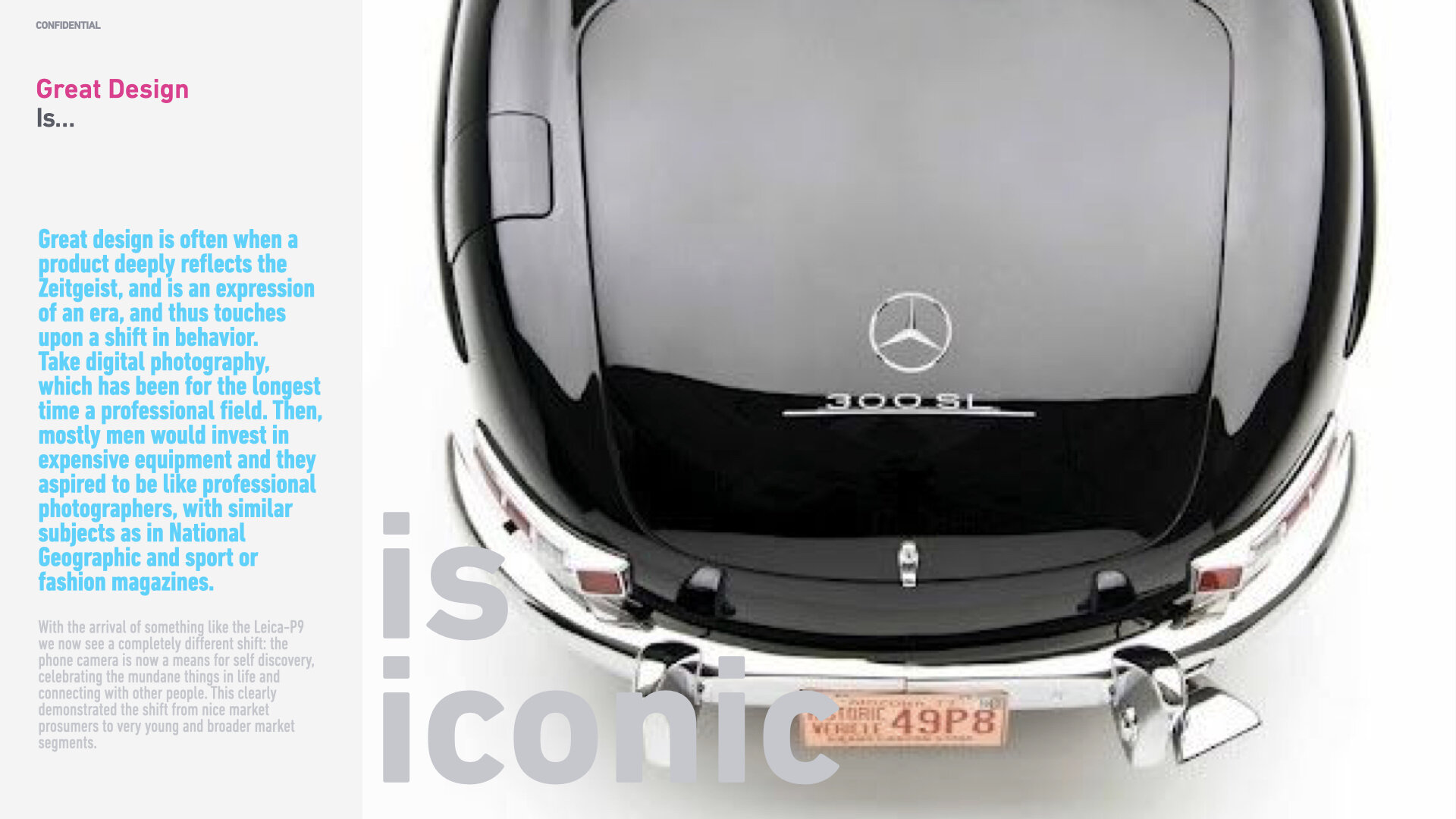
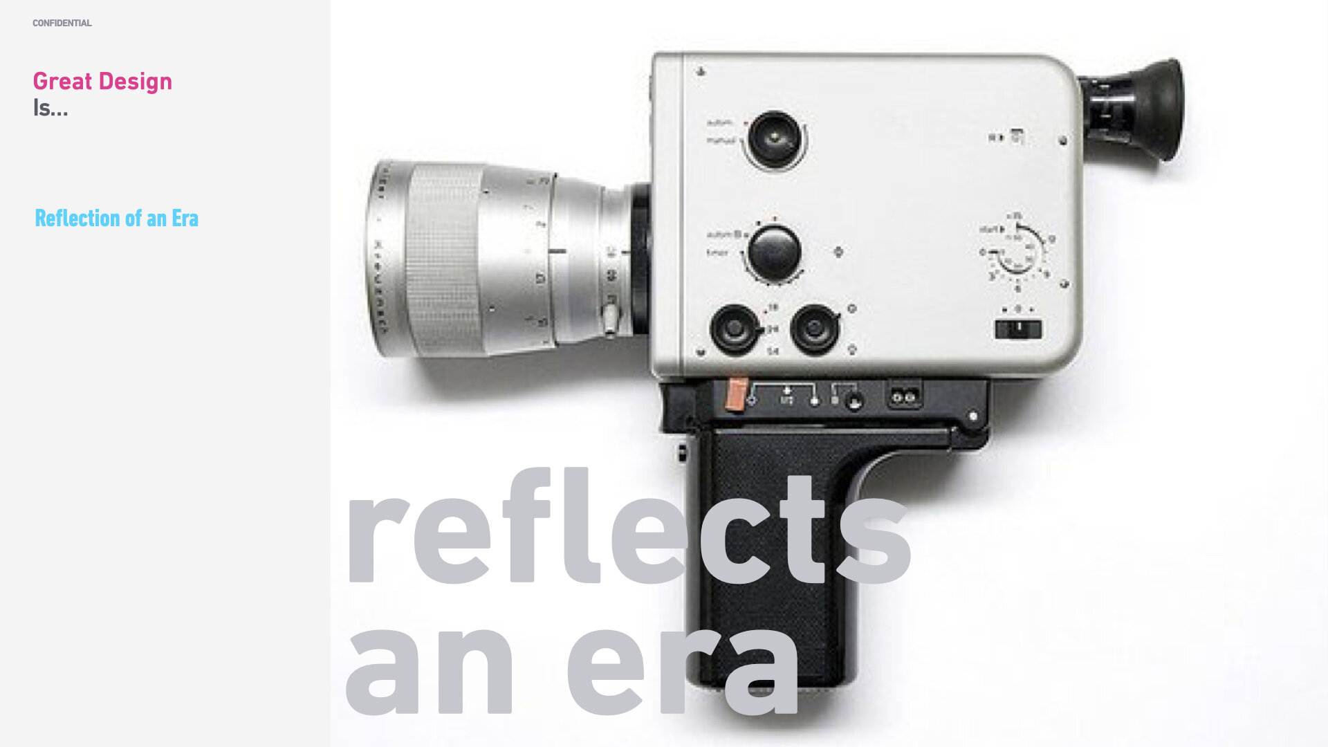
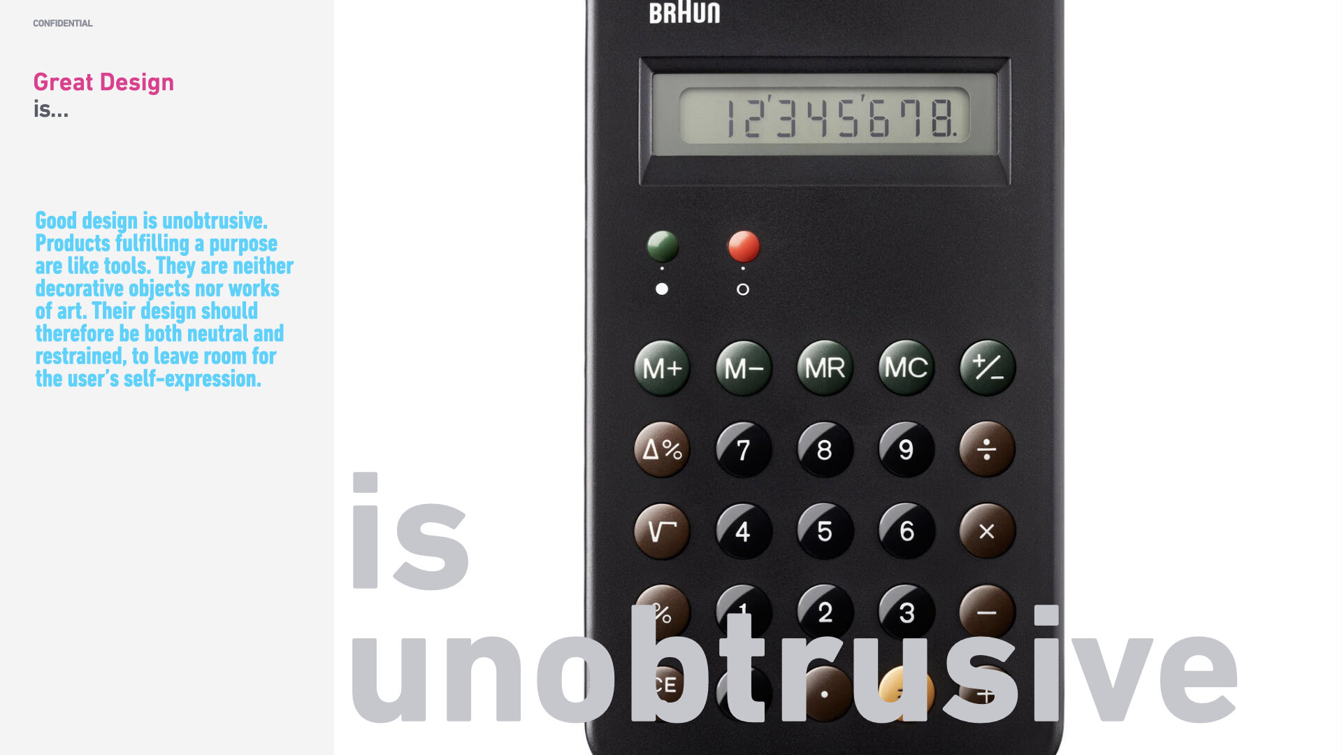
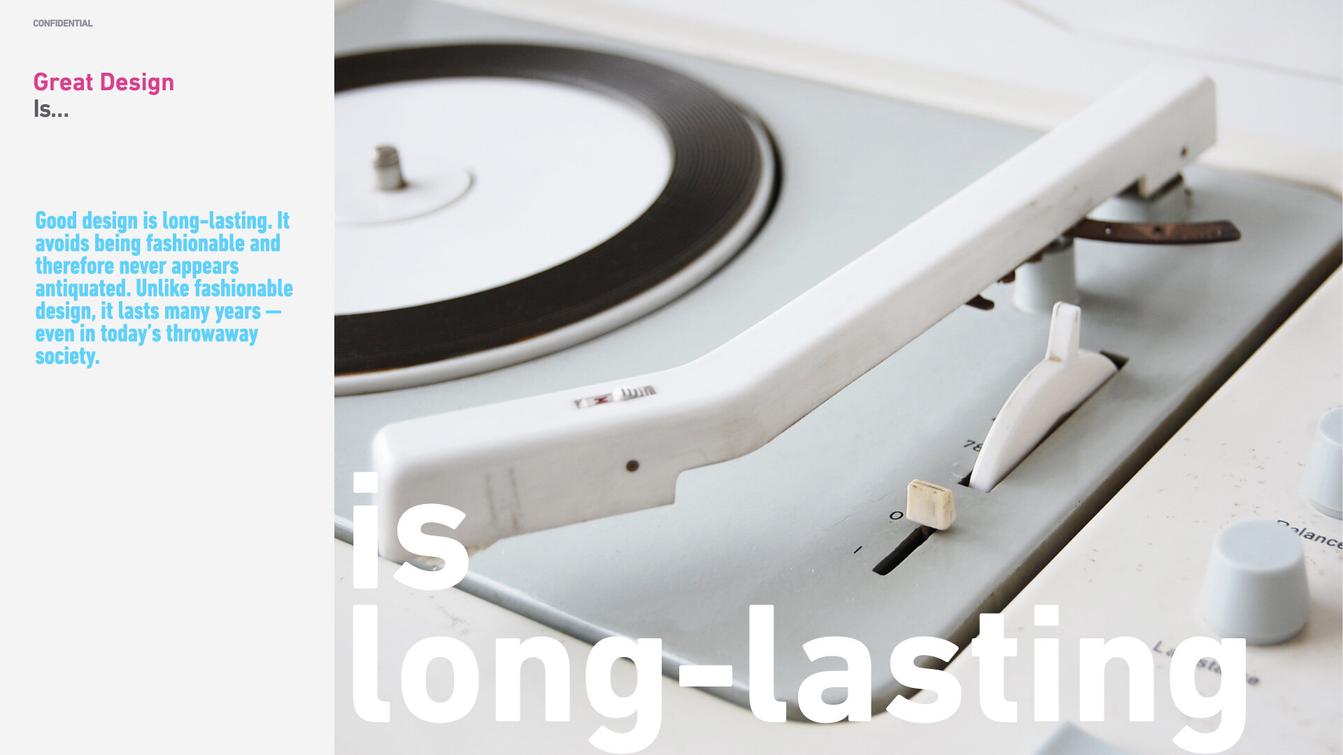
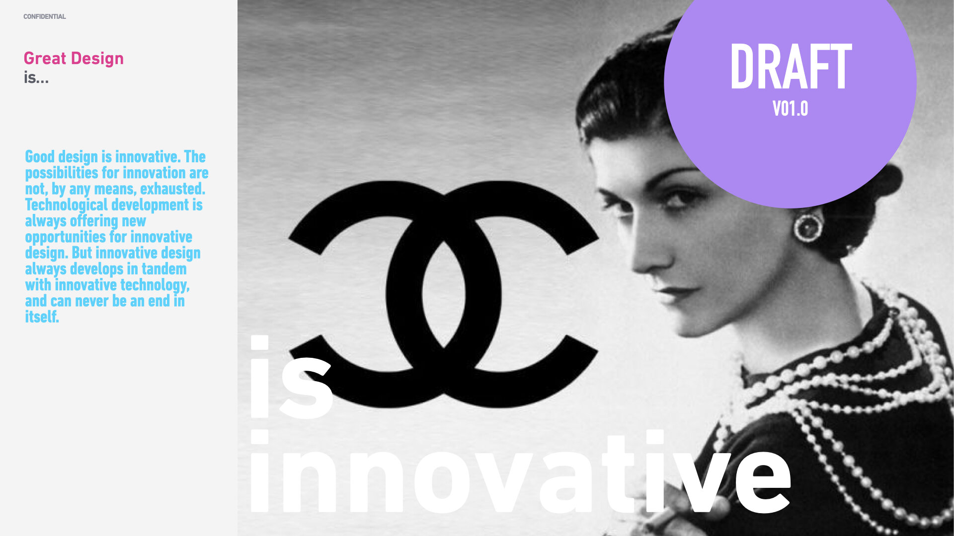
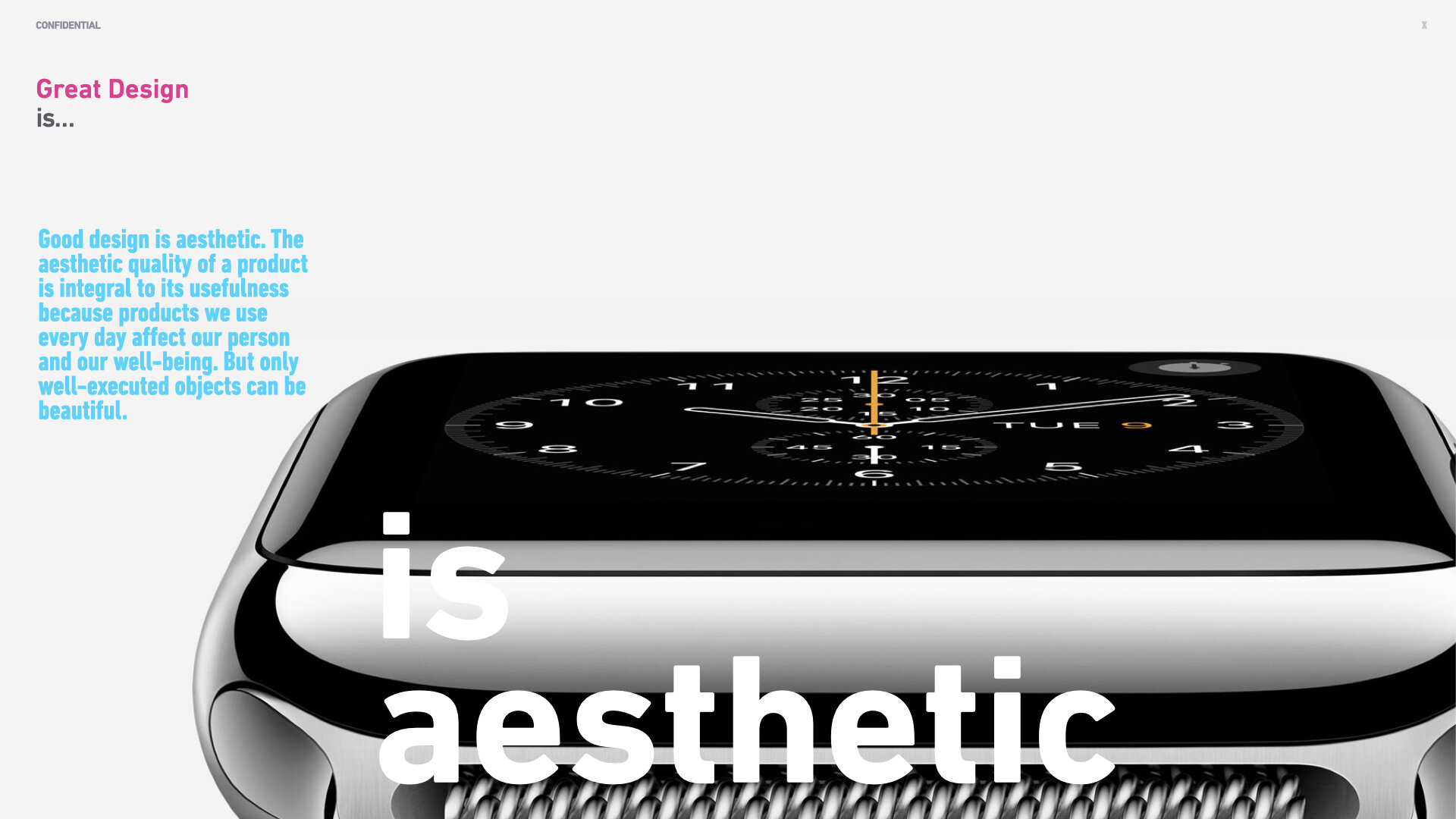
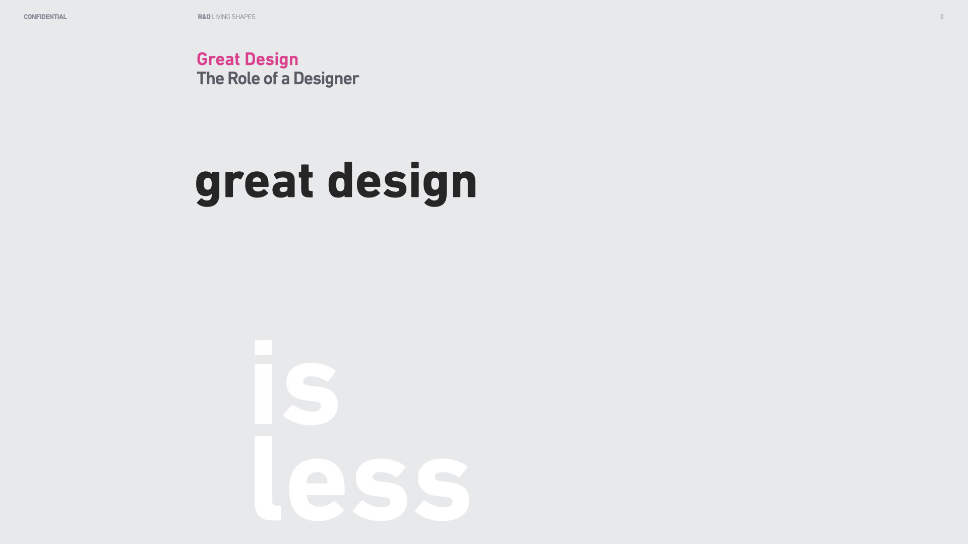
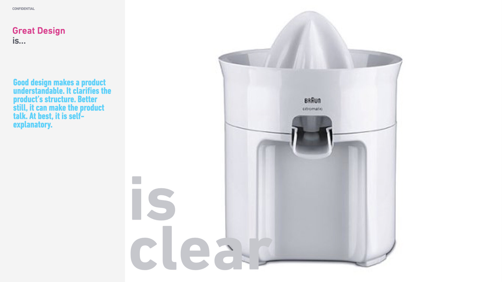
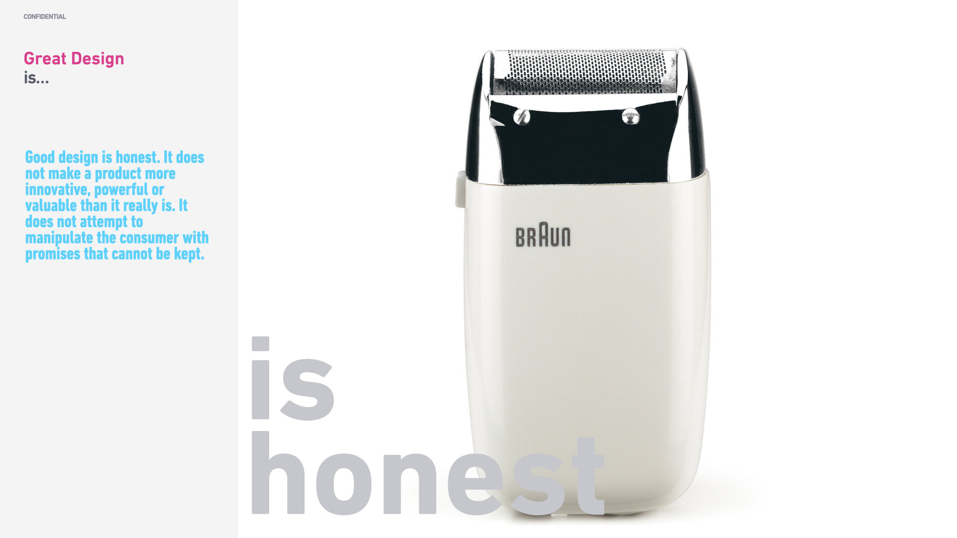
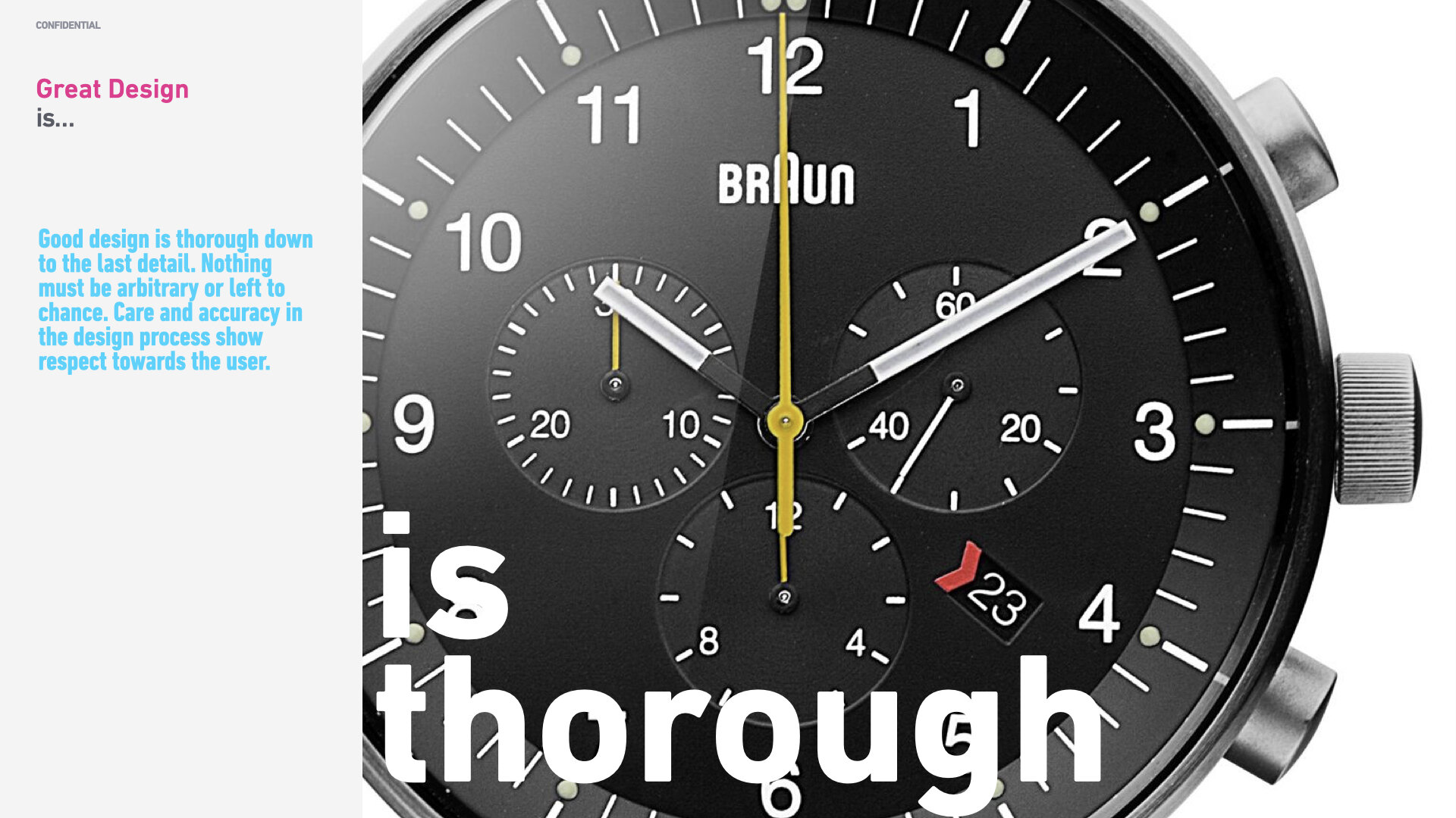
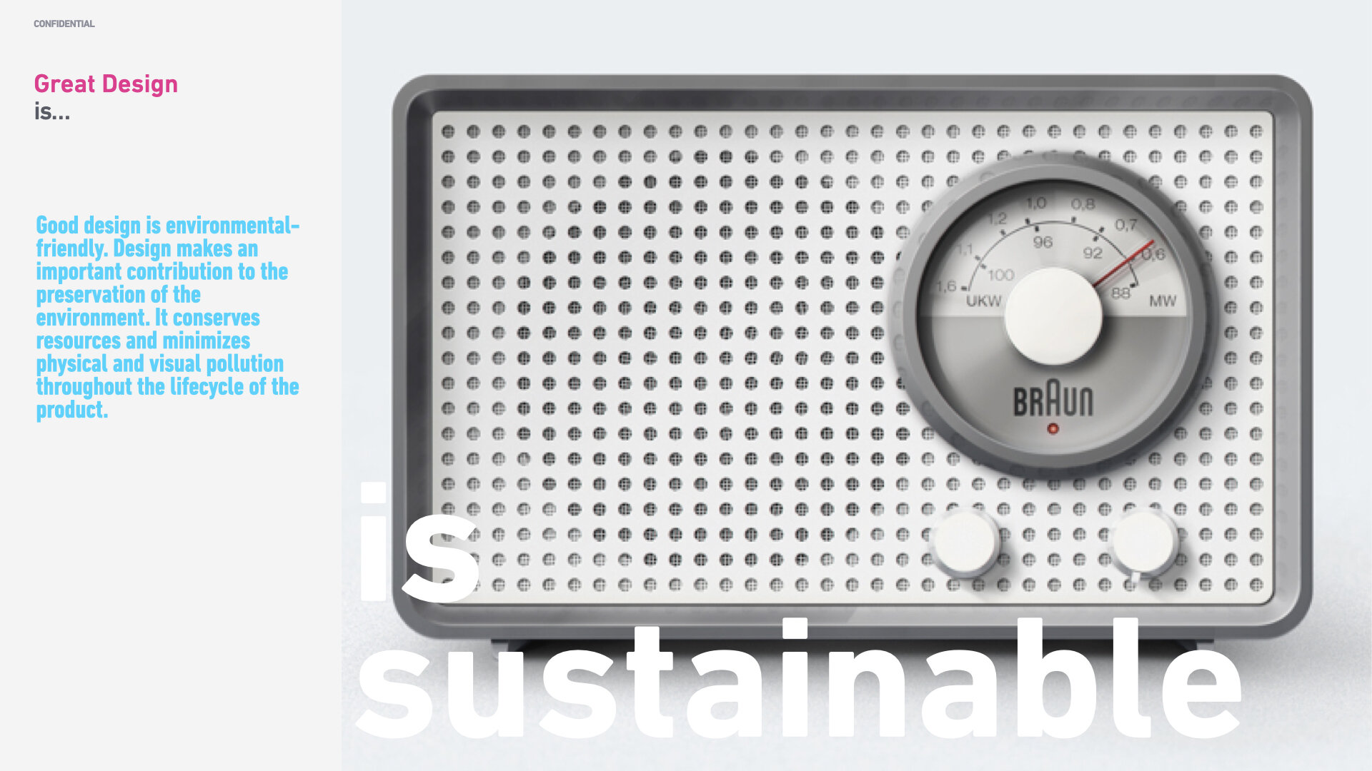
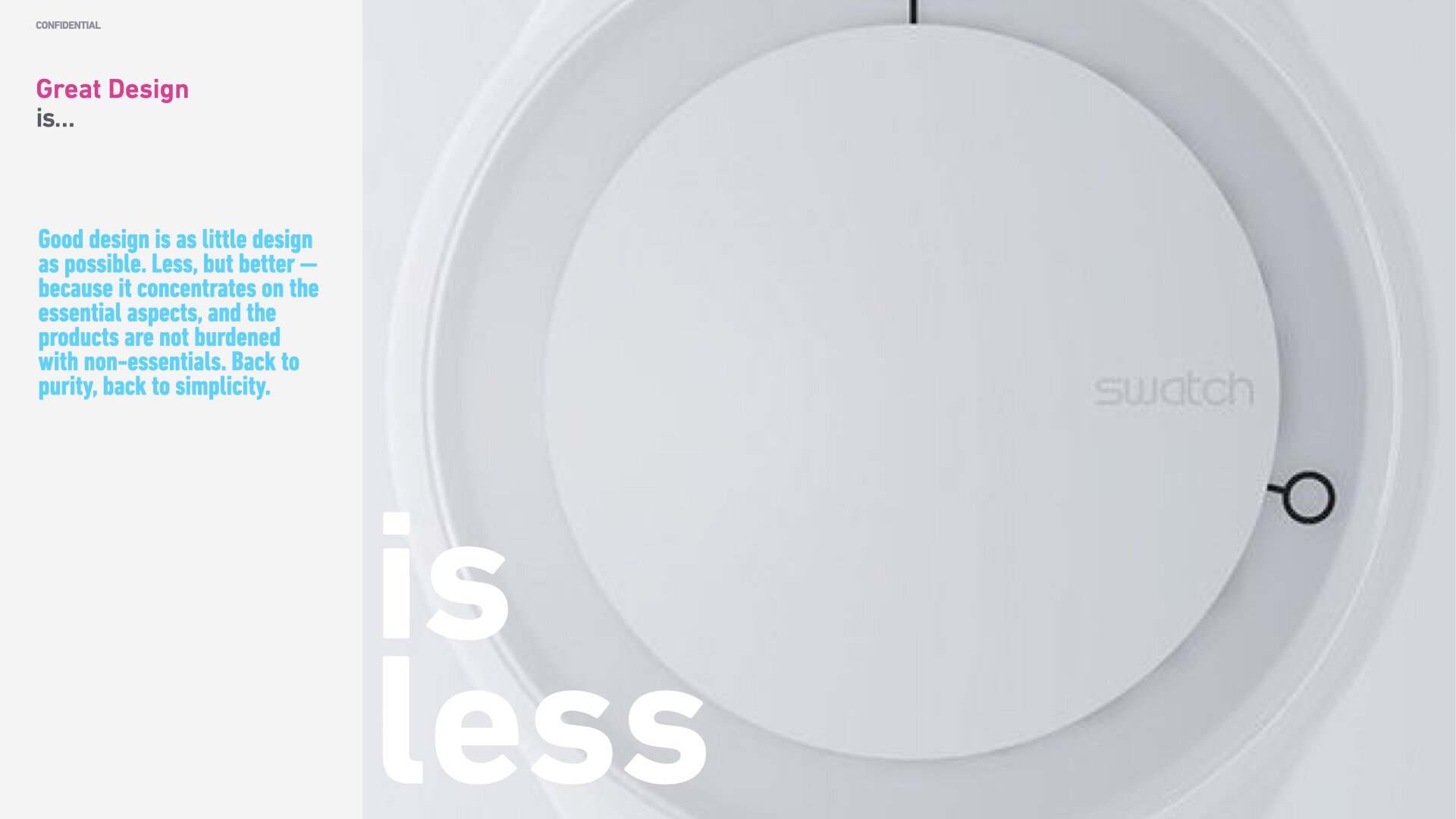
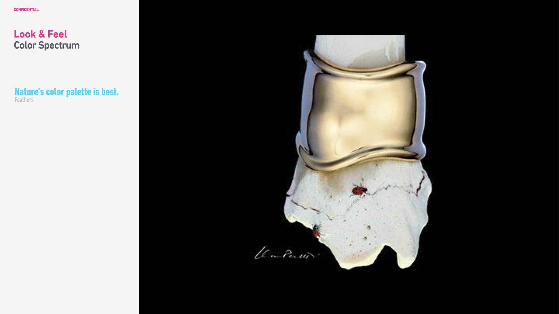
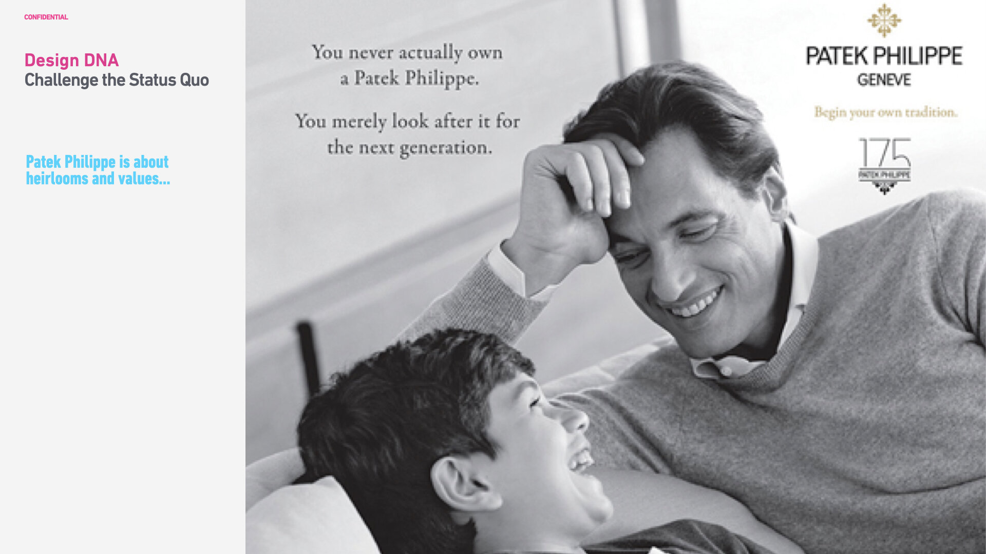
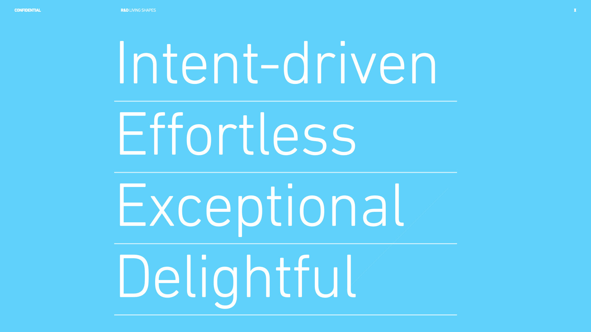
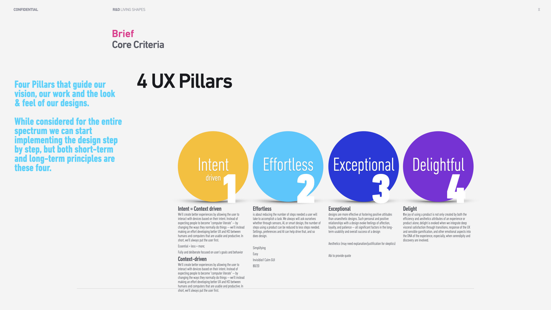
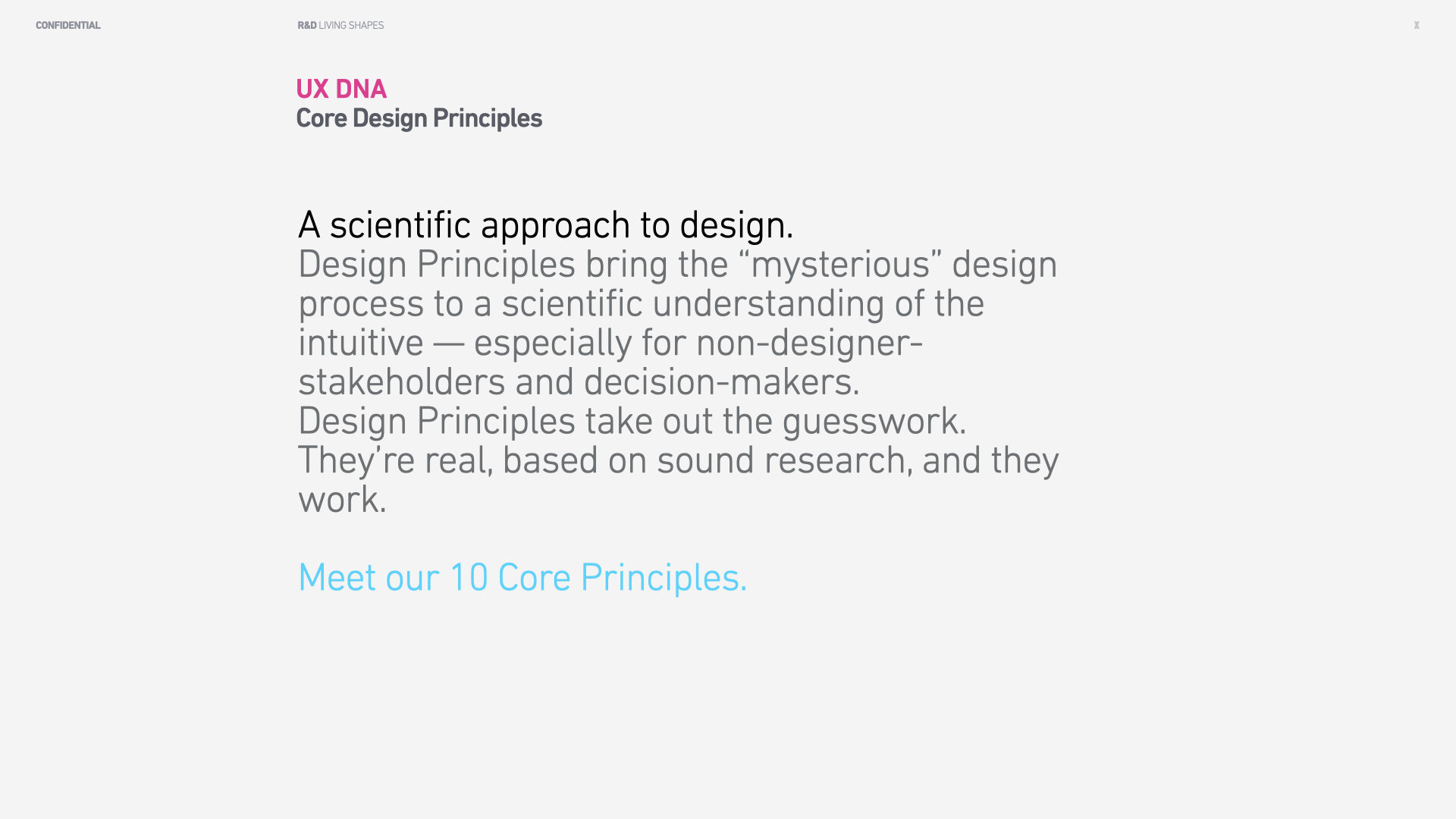
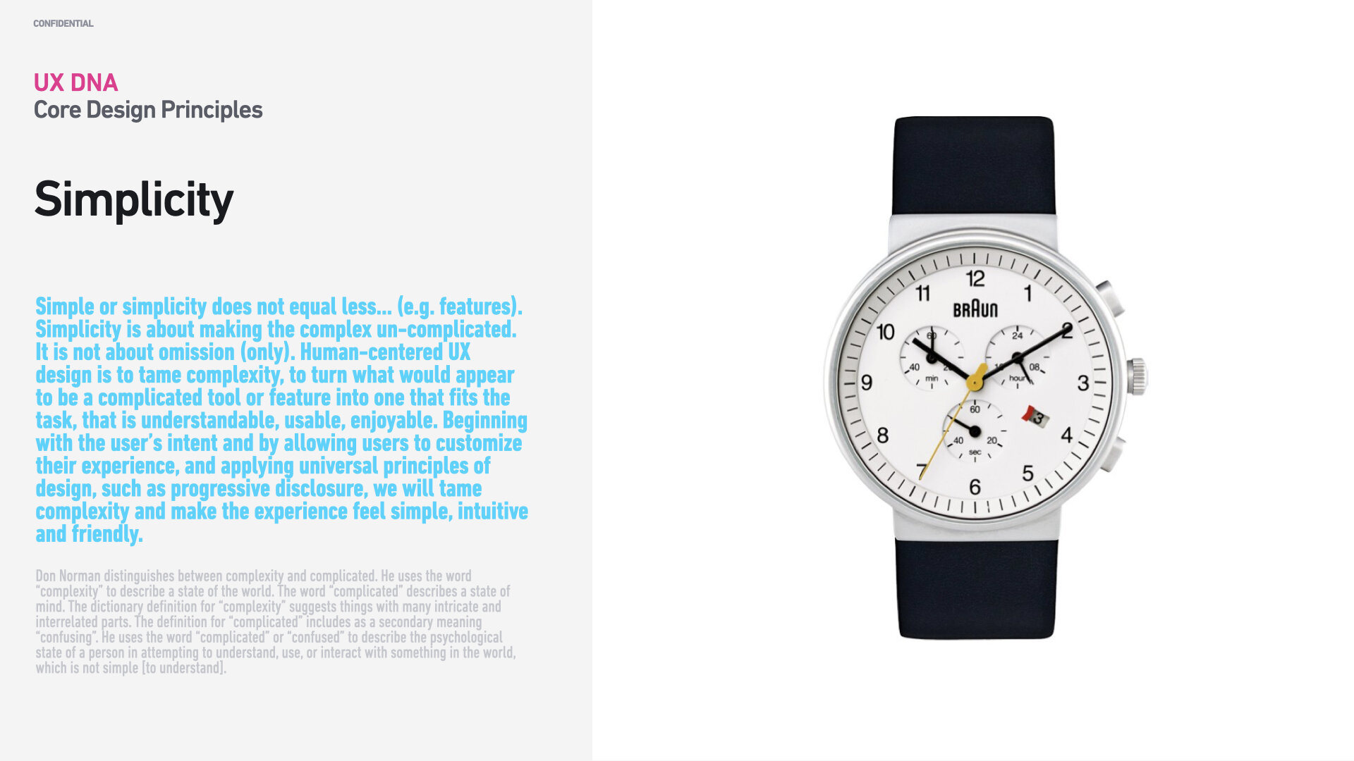
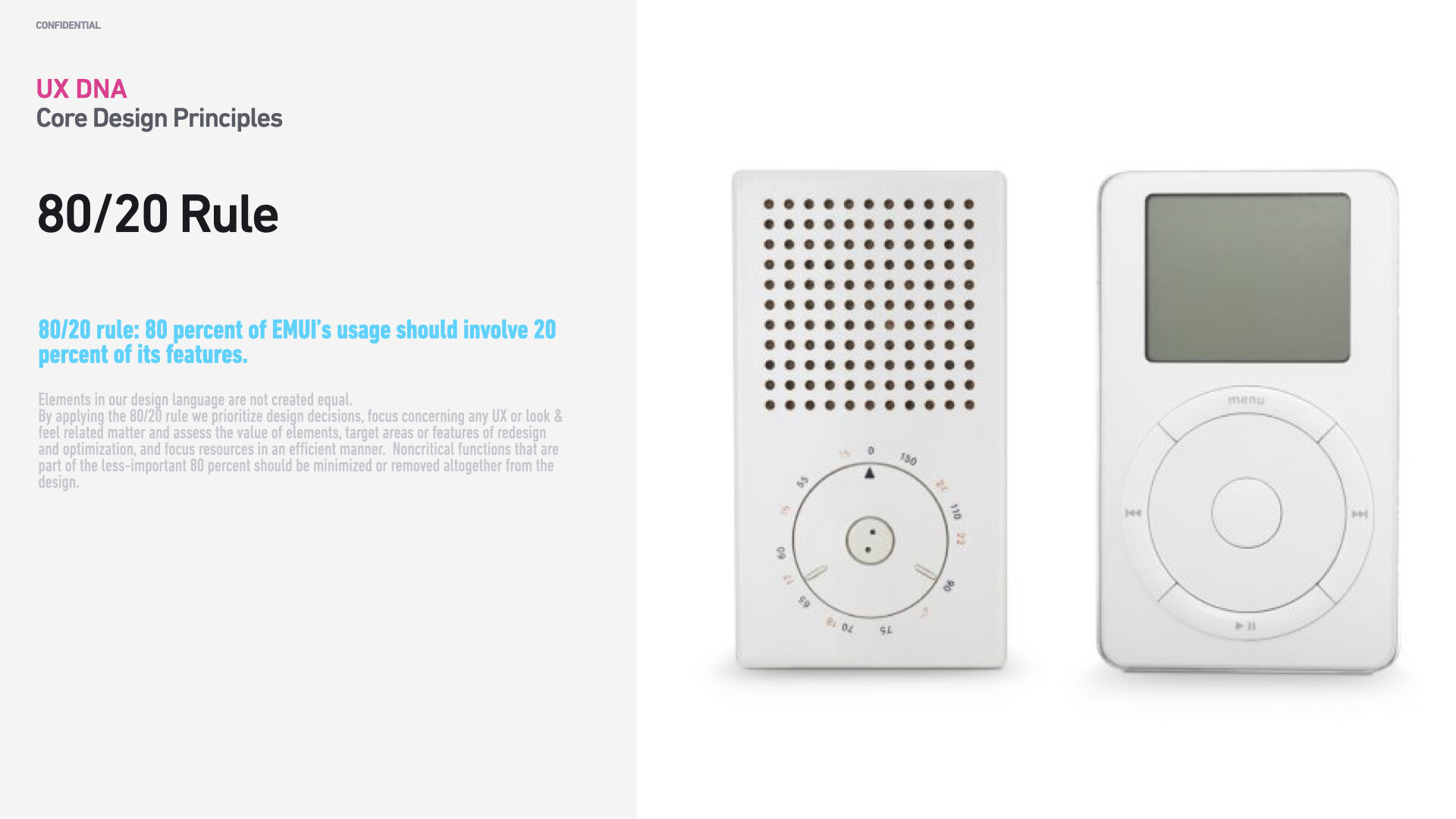
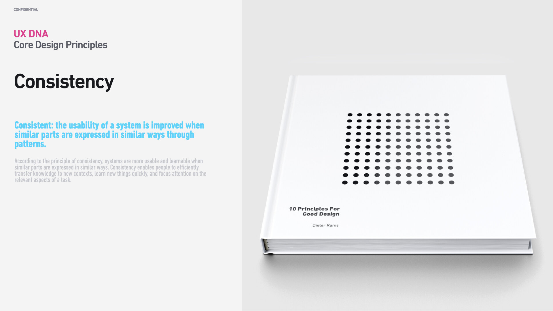
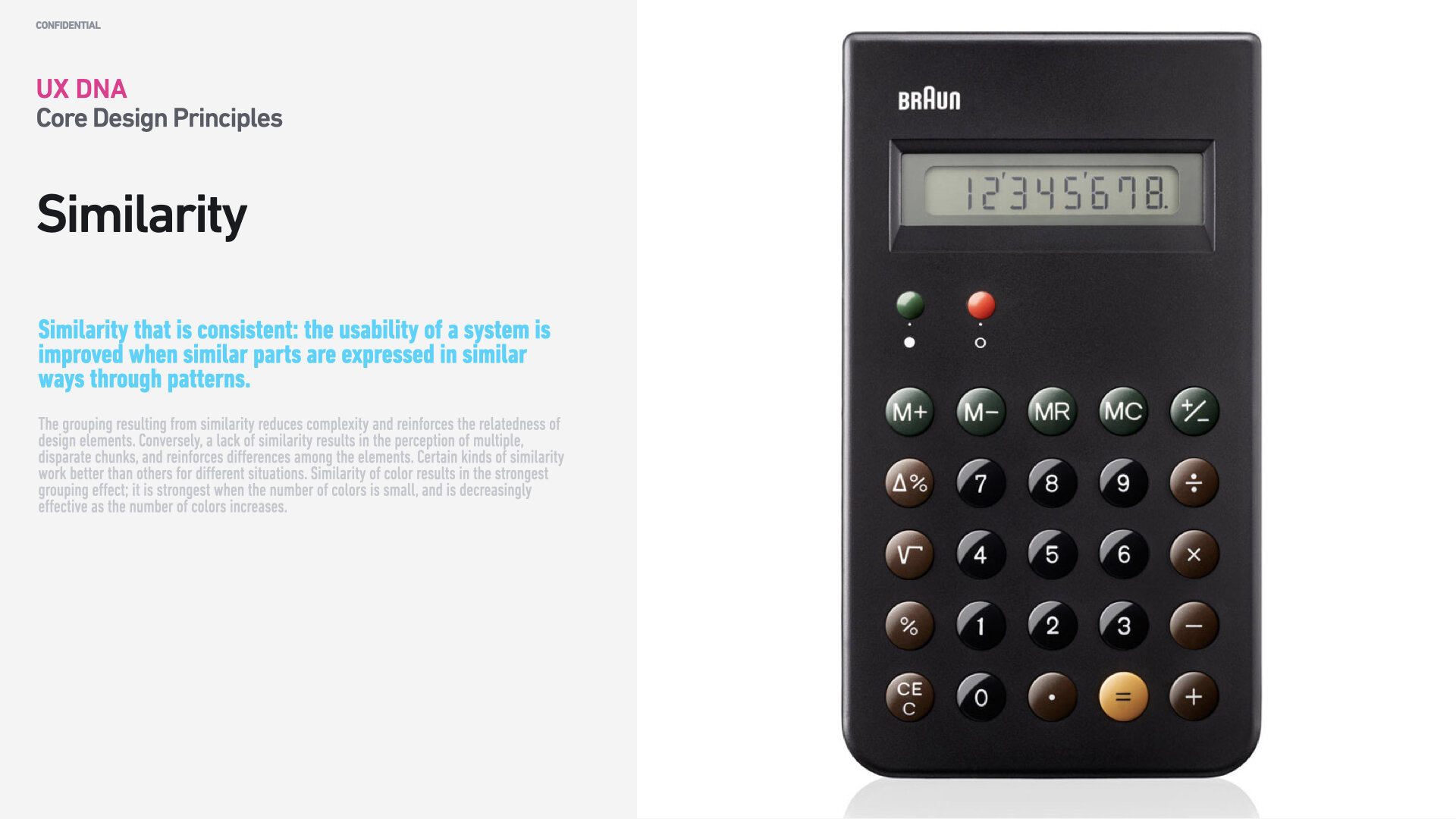
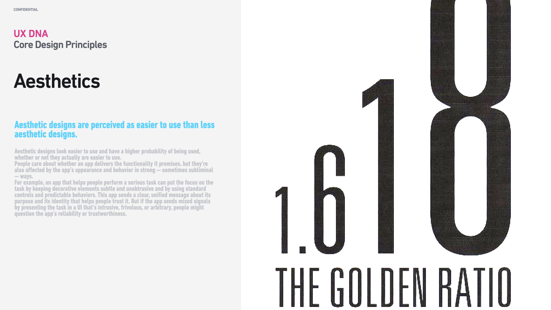
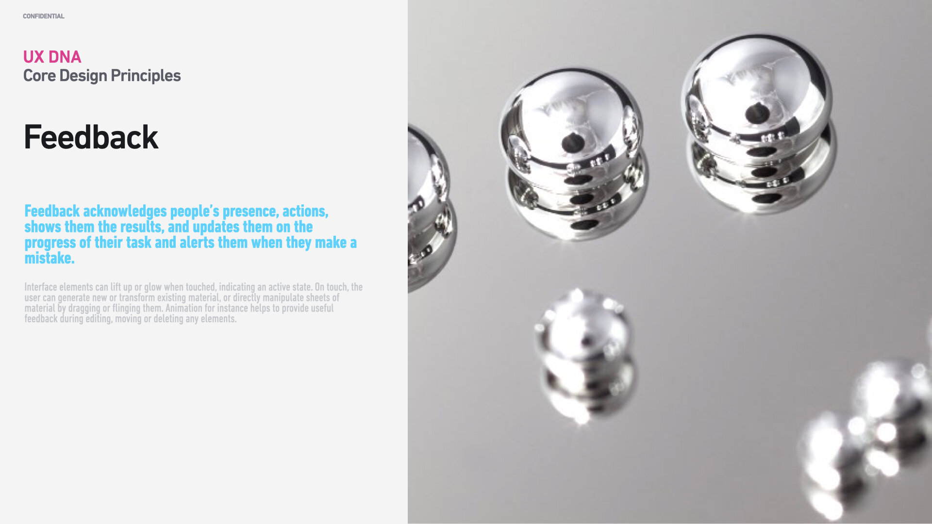
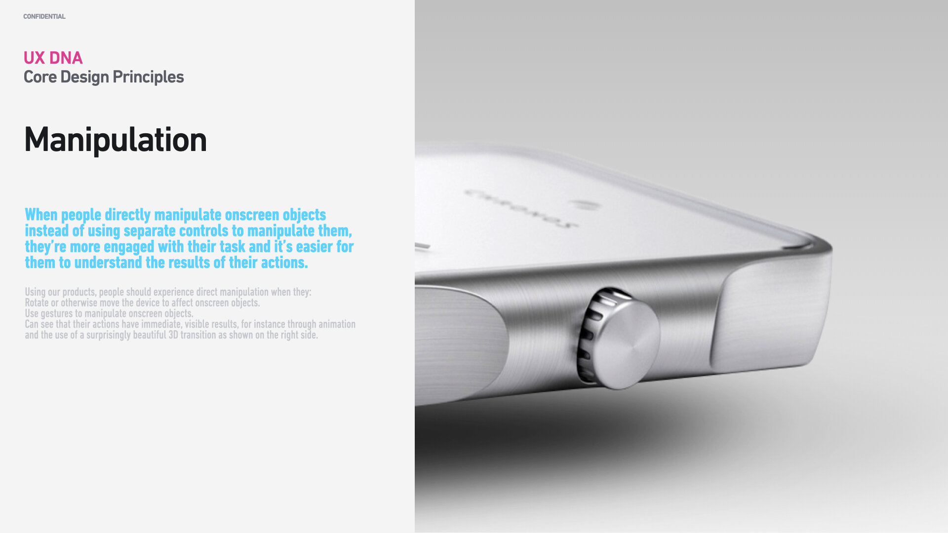
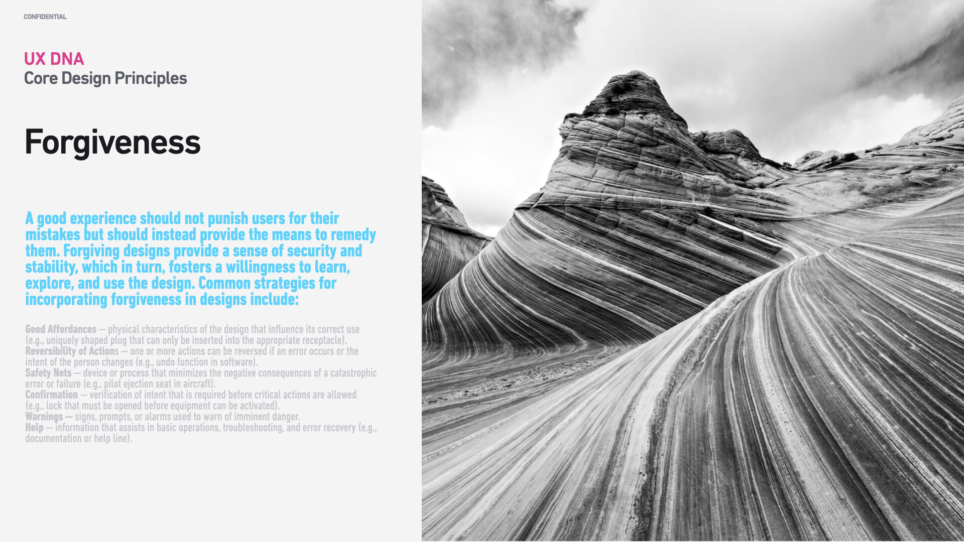
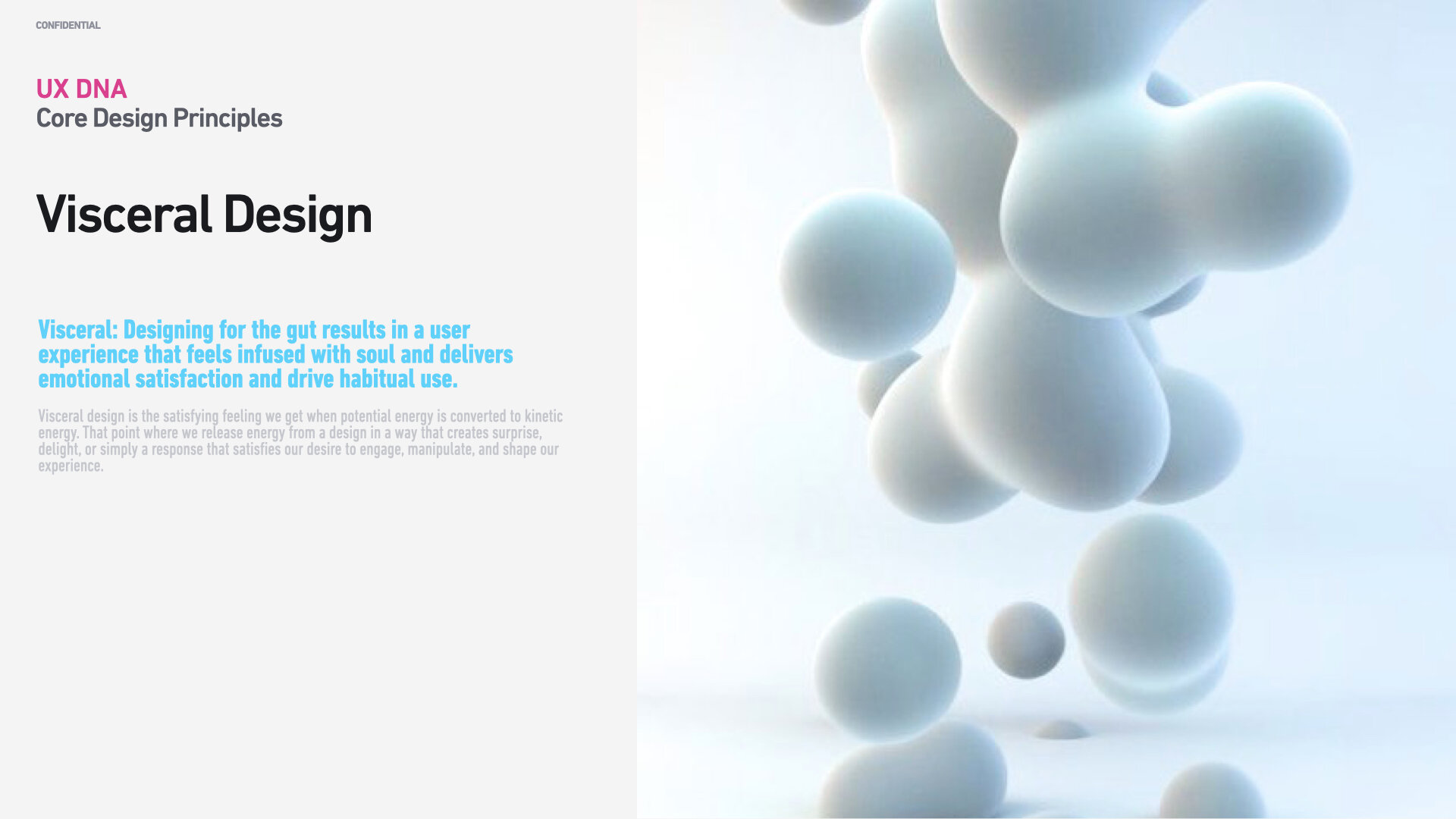
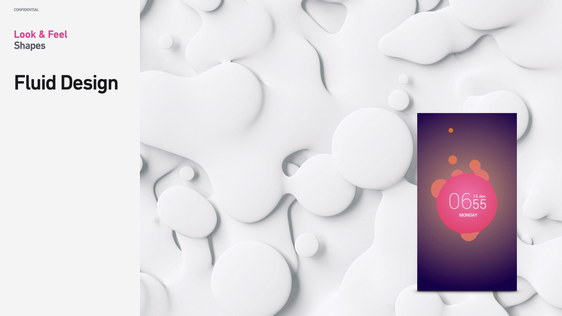
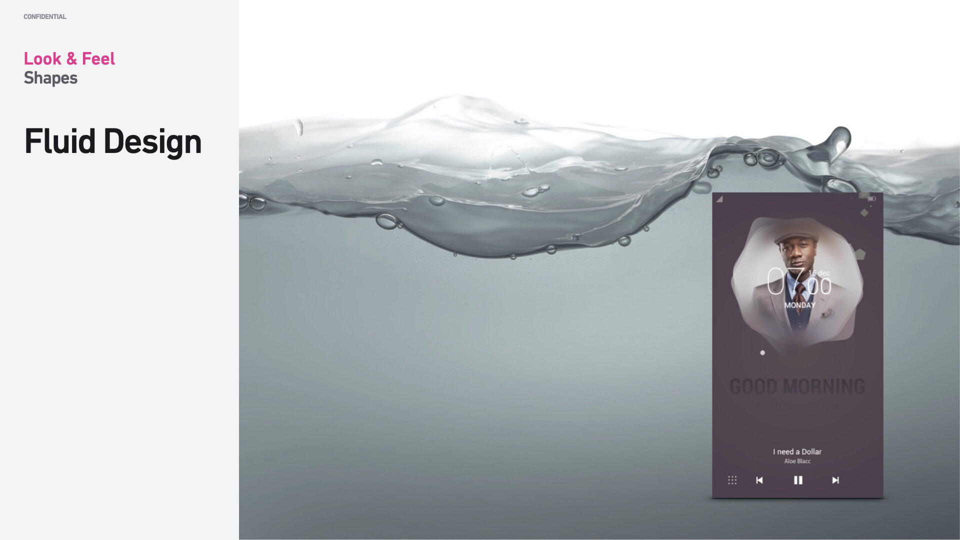
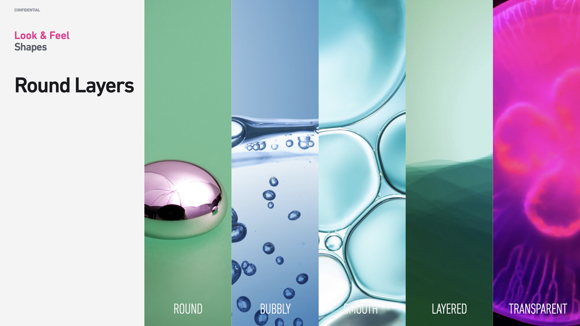
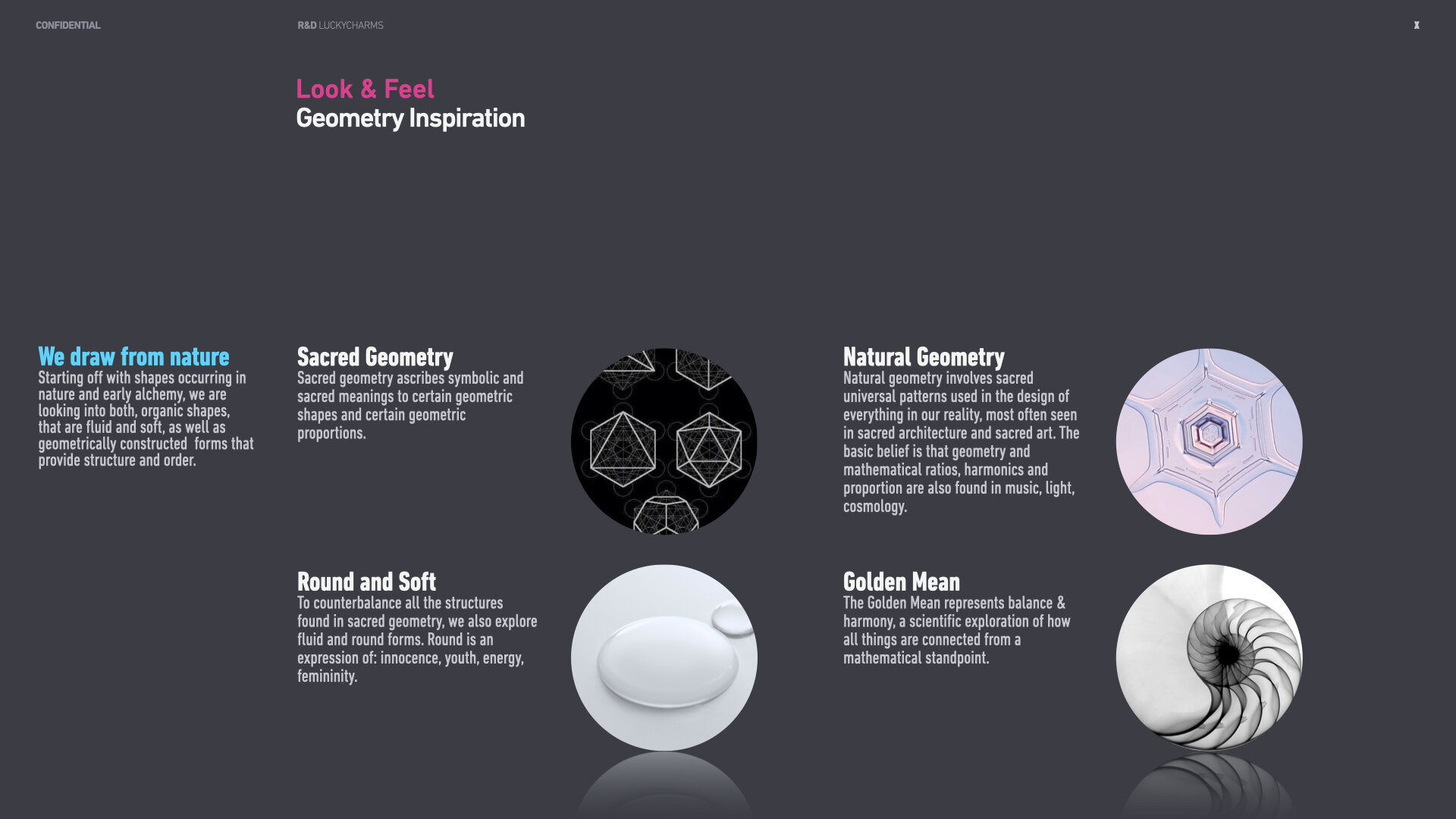
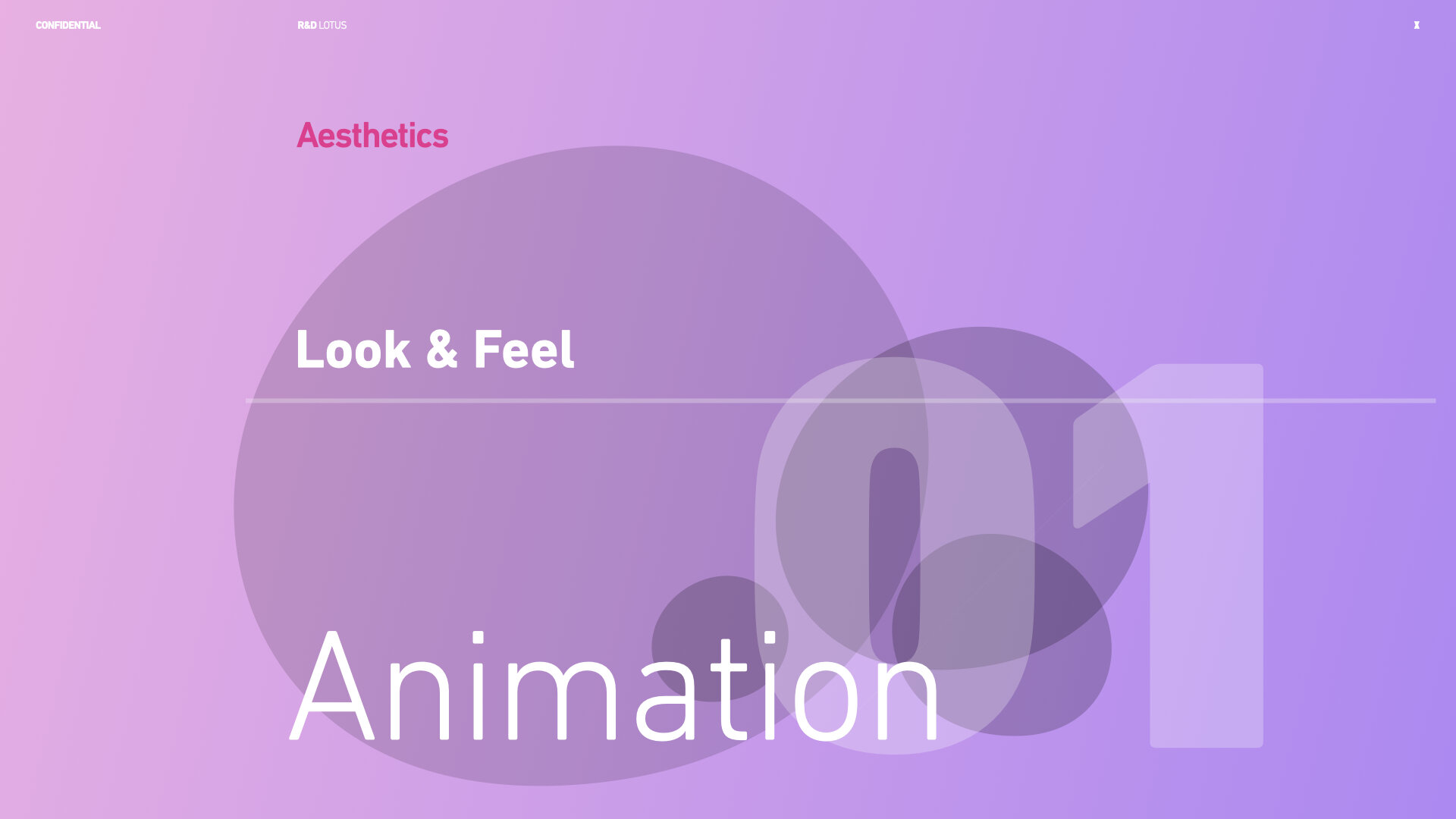
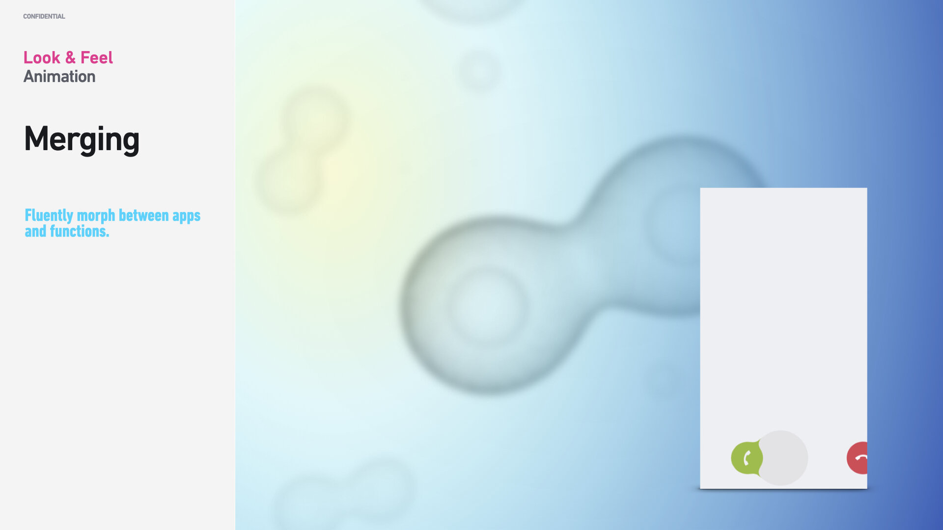
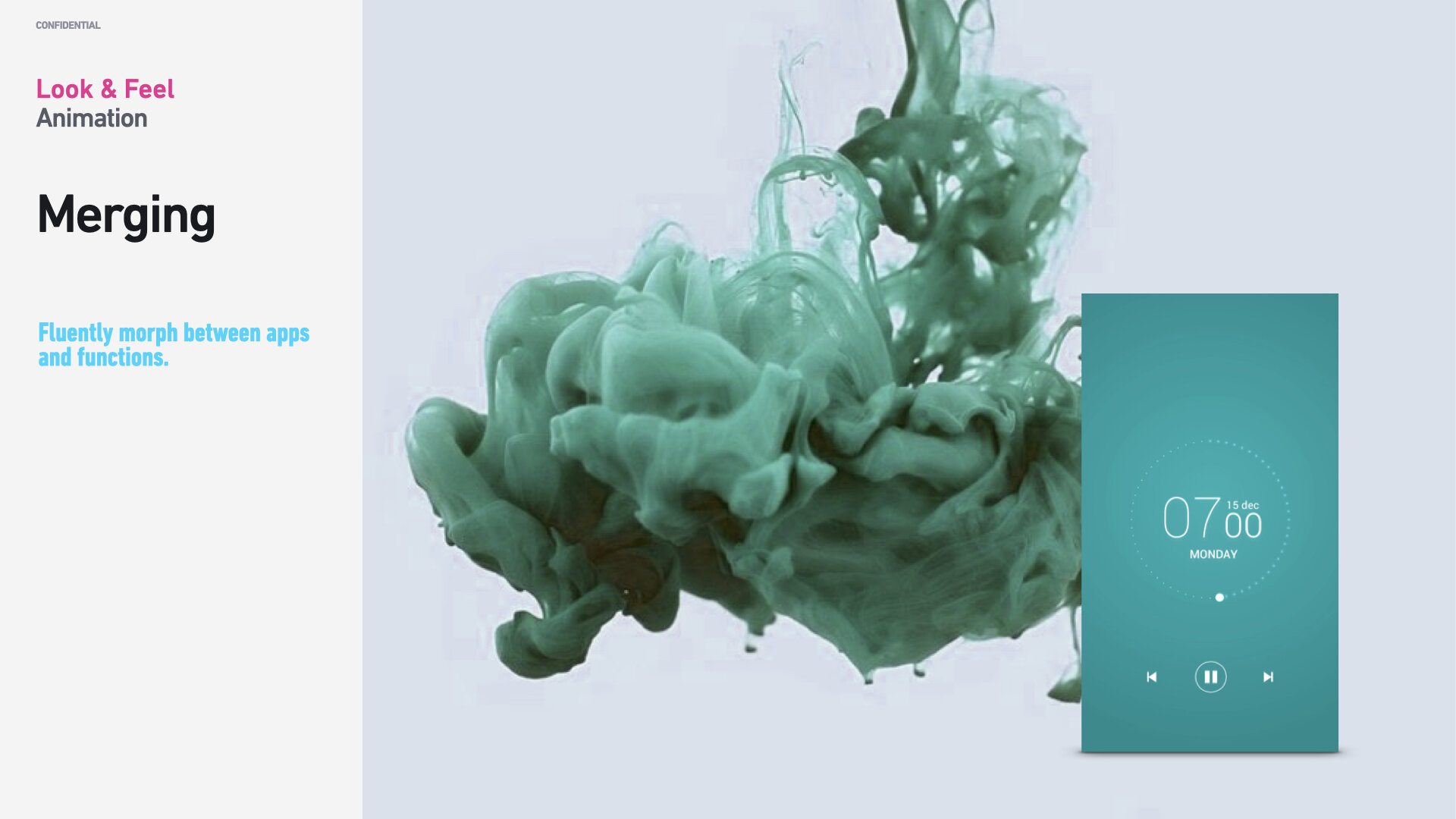
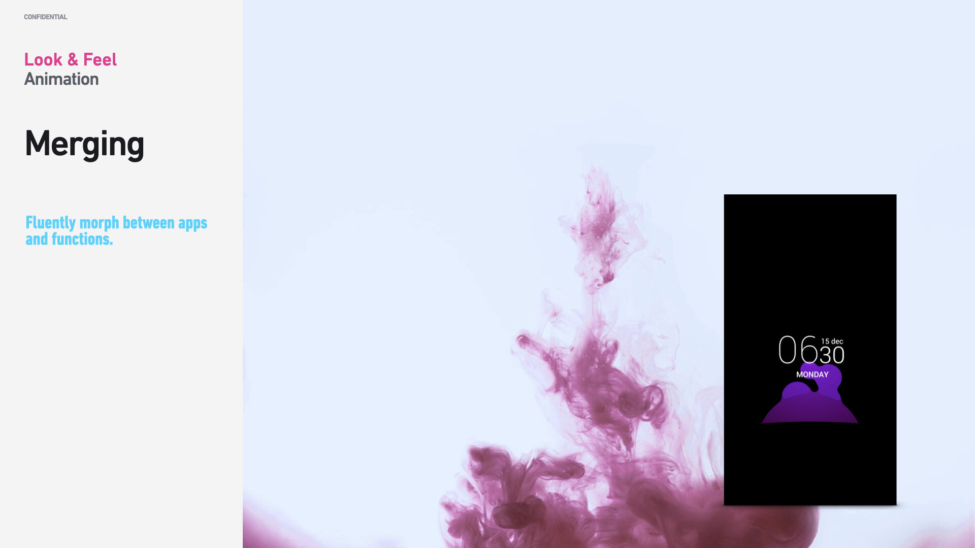
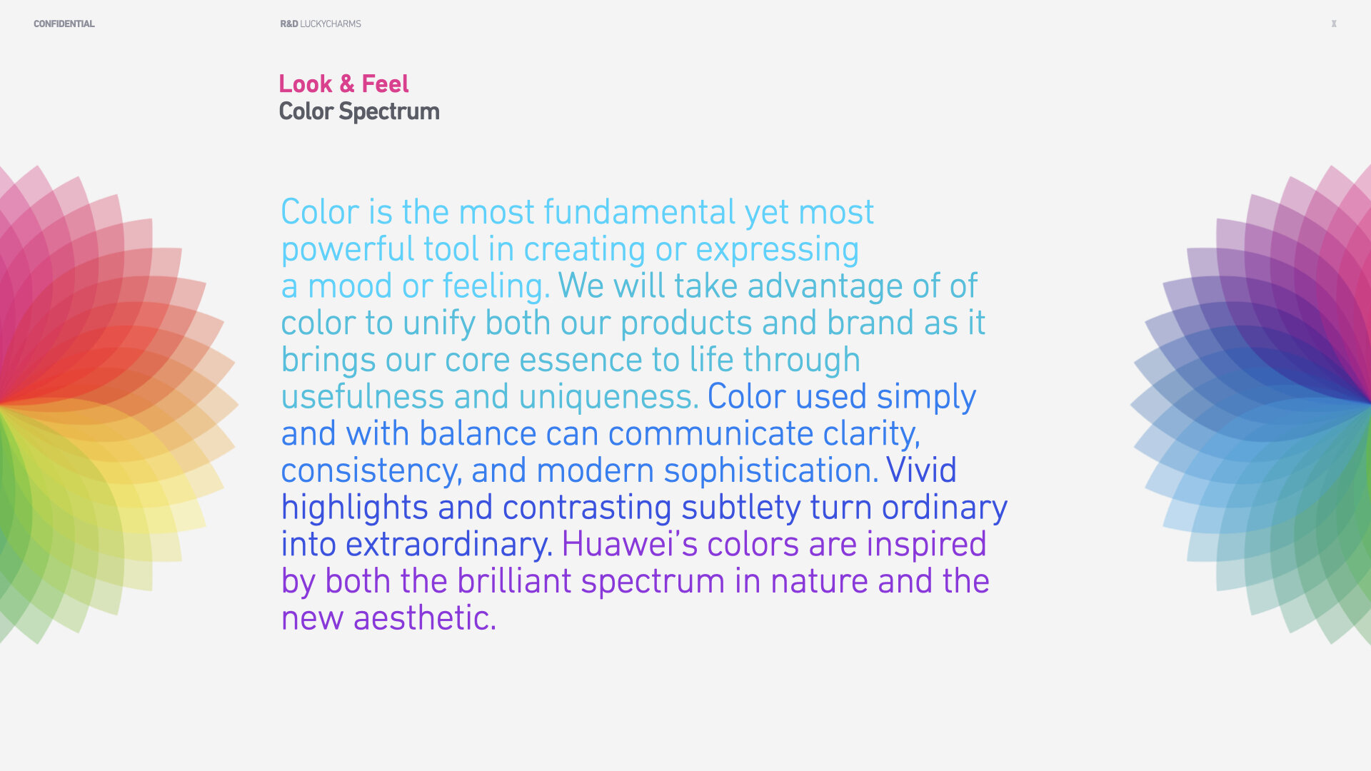
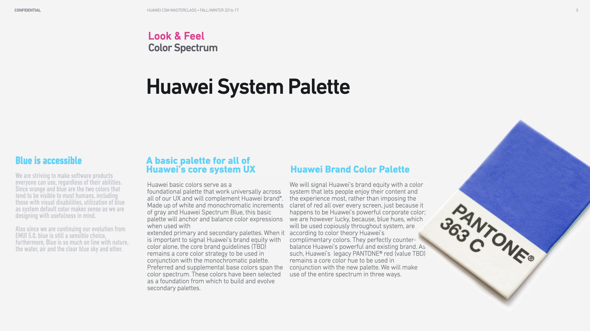
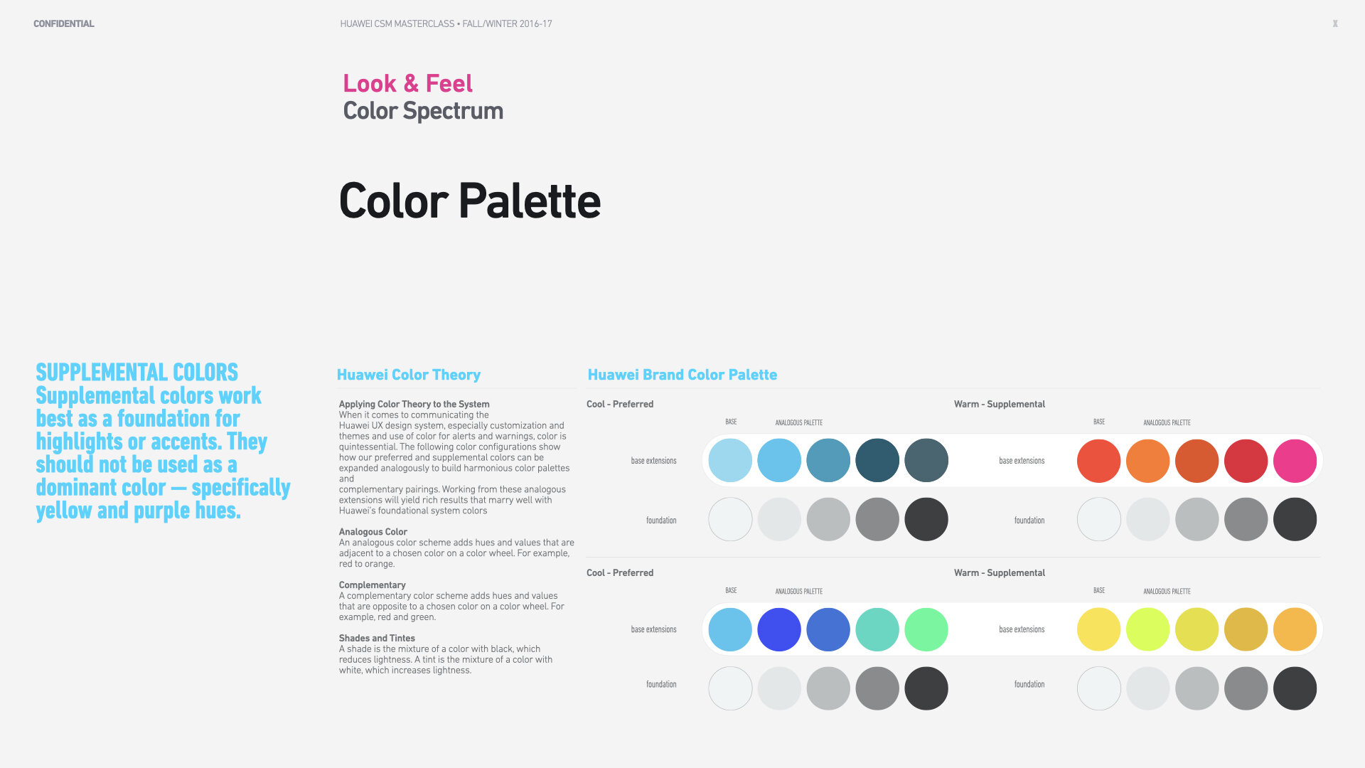
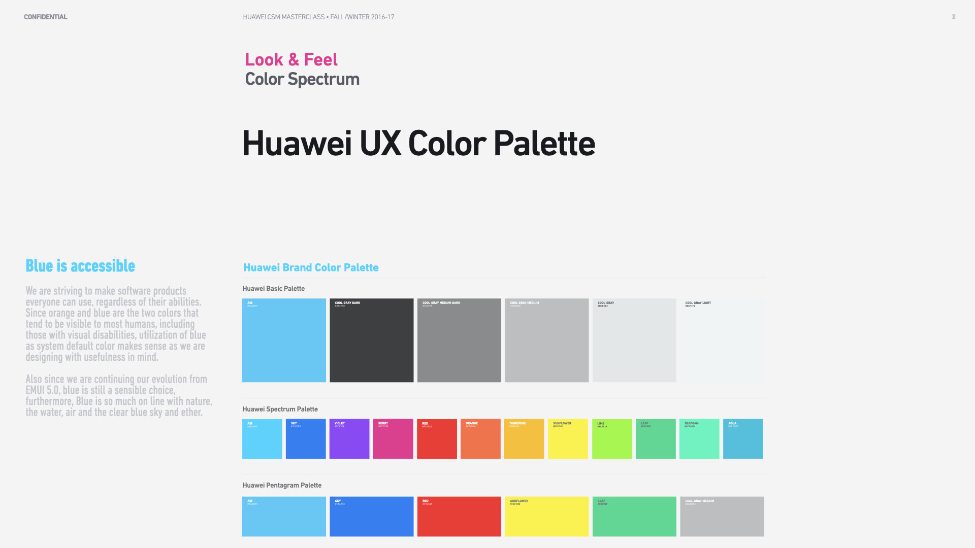
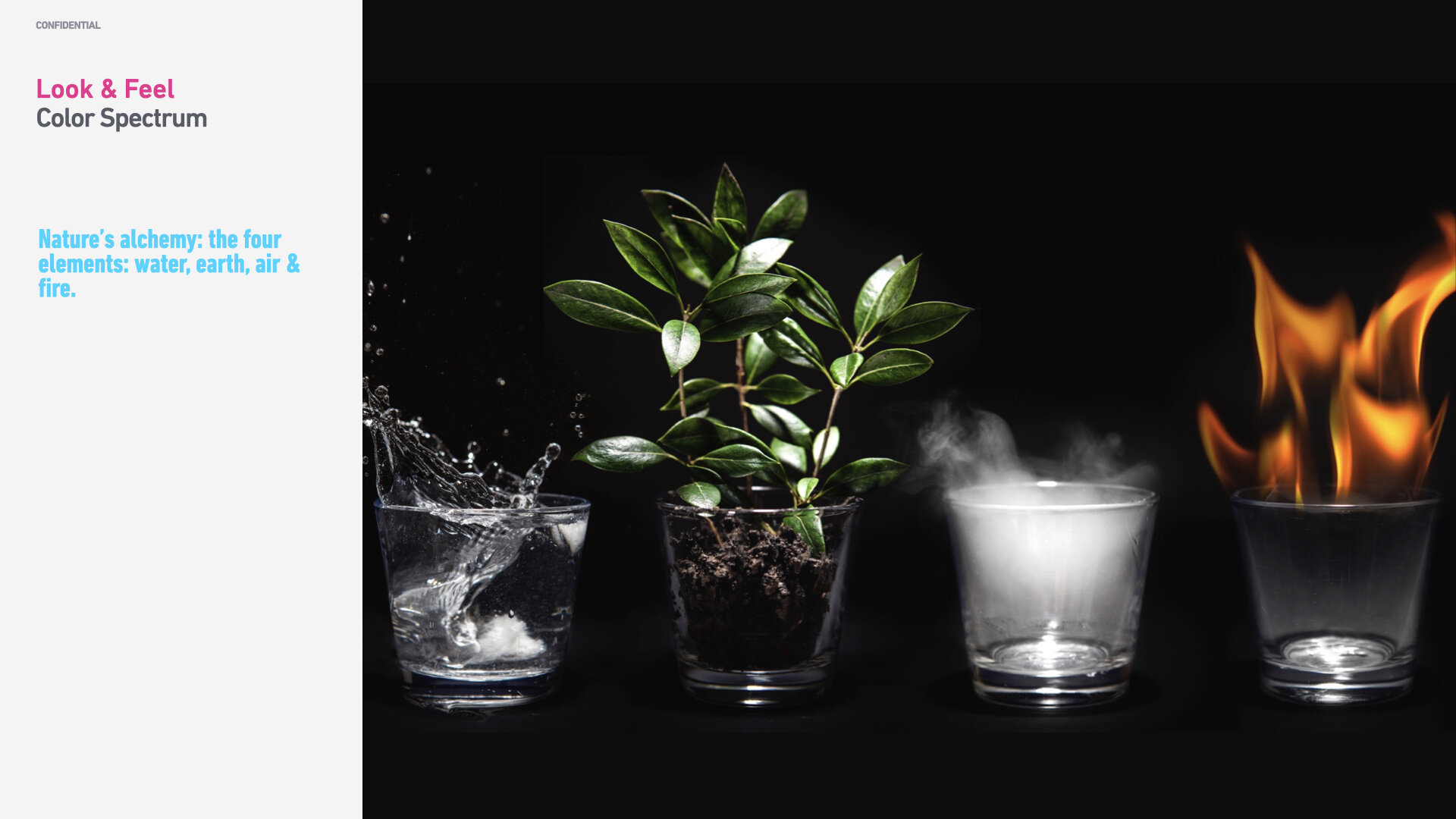
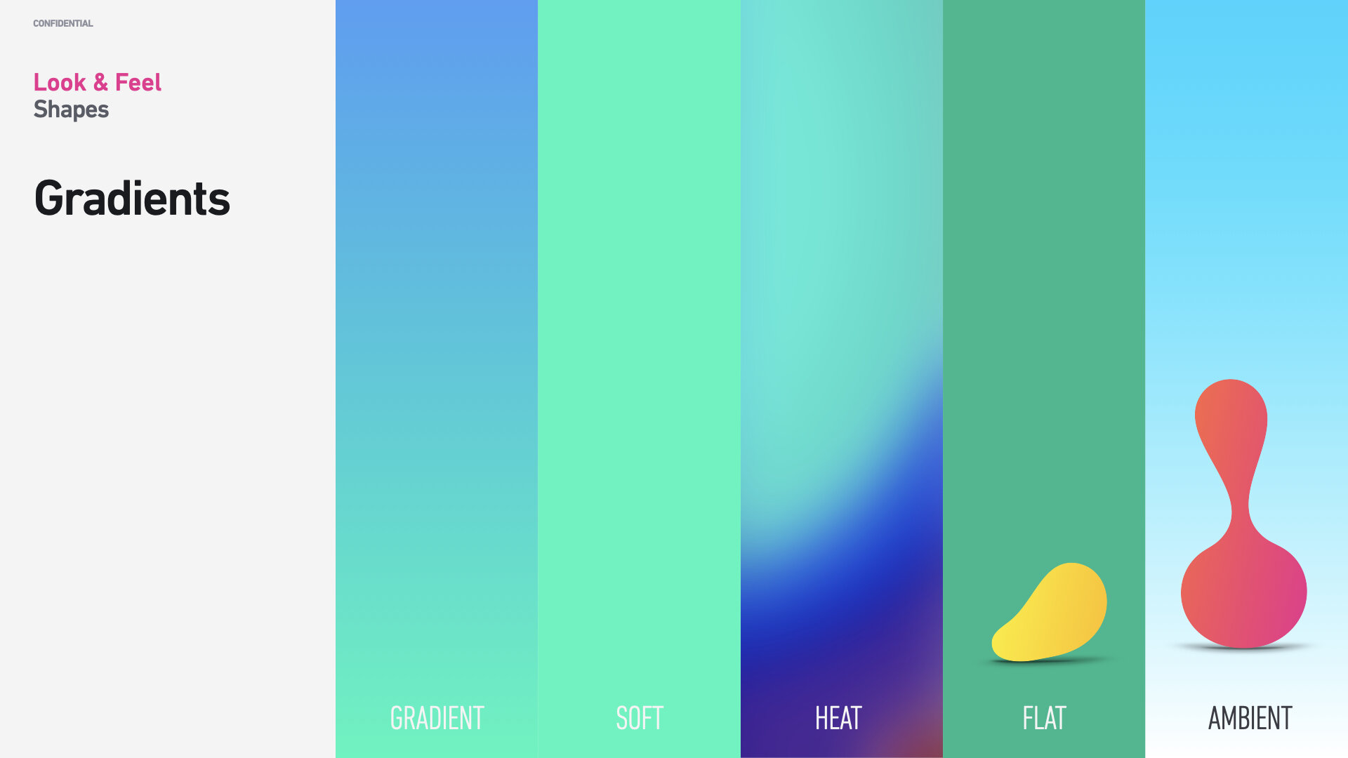
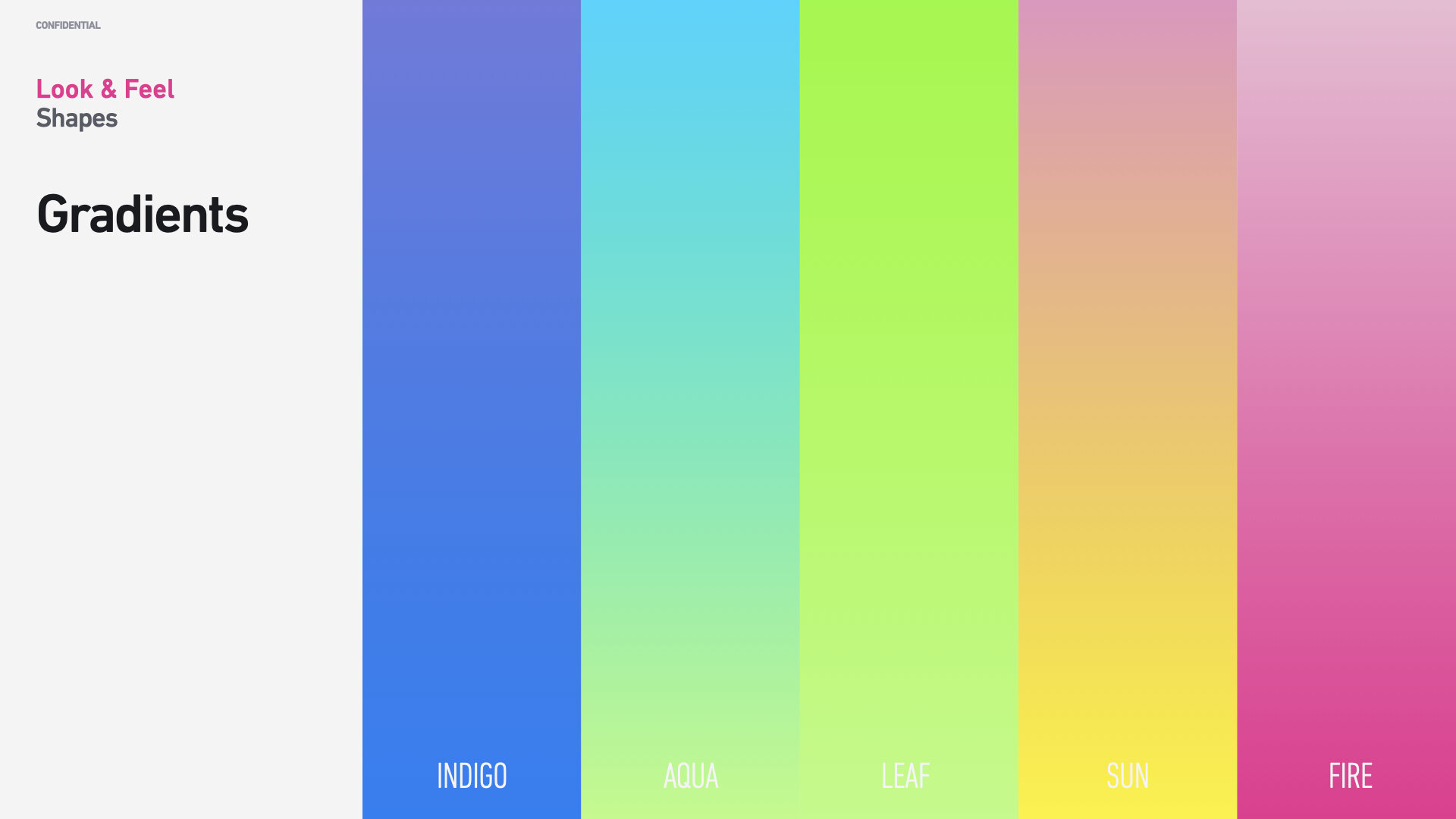
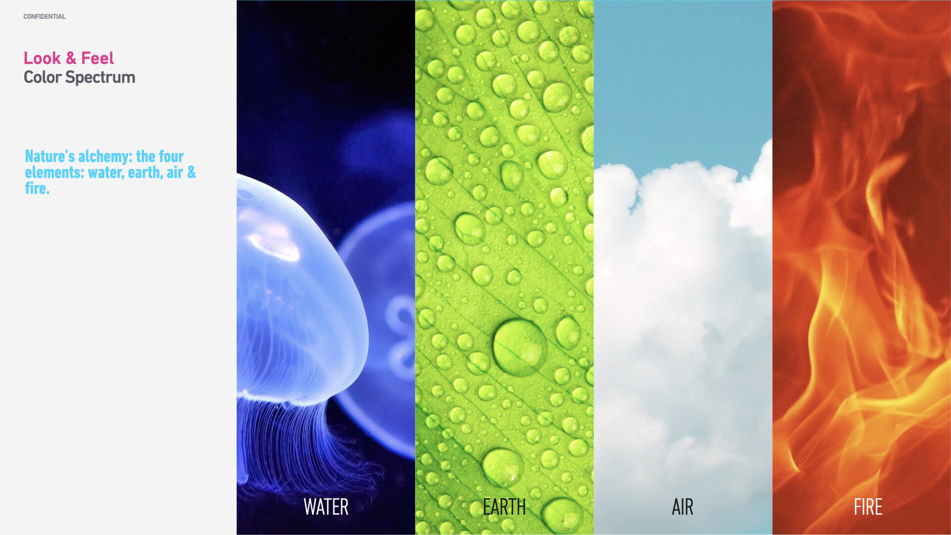
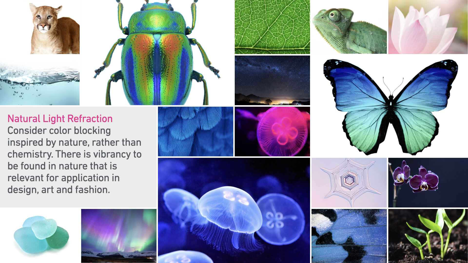
We created a framework based on design principles and a deep understanding of our customerbase.
These slides were publicly shown during a design masterclass that I led on behalf of Huawei Consumer with Central Saint Martin’s College in London, UK. More…
Layout and Hierarchy
It was not only cosmetics that we needed to address but also address the interaction design and layout. We looked into one of the most common problems that user’s complained about. Mobile screens have become larger and larger, but the site of key functional elements in Android remained the same — the screen’s top area. As a result, users had to stretch their fingers or change their grip to interact with the elements.
Since I was part of the team designing for Apple’s first iPhone, where we optimized the layout for single-hand use, we made sure that we placed the essential and interactive elements in an area easily reached with the thumb for the EMUI design language. The version of EMUI that we redesigned was a customized version of Android, and many controls were out of reach. We addressed this problem with EMUI 5.0.
Today a bottom-area navigation is an industry-standard for Huawei’s devices, but back in 2015, the situation was very different. We worked with the engineering team to move critical interactive and functional elements to the bottom.
Thumb-friendly design
In his analysis of 1,333 observations of smartphones in use, Steven Hoober found about 75% of people rely on their thumb and 49% rely on a one-handed grip to get things done on their phones. Pictured: EMUI 5.0 camera and photo layout.
Functional controls are located at the bottom of the screen — in an easy-to-reach area.
A harmonious design system
According to our philosophy, EMUI should help to achieve harmony between people and nature. When we worked on our visual language, we focused on incorporating natural forms (smooth curves and organic forms) in our visual design. As a result, all visual elements, such as buttons, icons, and shapes, had an organic design aesthetic.
This video (early prototype) demonstrates the powerful but subtle visual effects we created for EMUI 5.0.
Organic design
First impressions of a product design are critical. And for that very reason, our key focus was on creating magical moments — surprise and delight users while interacting with the OS, especially after unboxing and during the onboarding experience.
We created a look and feel in line with Huawei Consumer’s impeccable hardware, such as the P-Series, co-engineered with Leica.


Process
Adding meaning in a system
Like we have grammar for spoken and written language, we use rules for creating and assembling design elements in a design system. Strong semantics is what make a design system efficient. When creating EMUI’s design language, I took two tenets into account:
There mustn’t be any random visual element or attribute in a visual language. Every detail serves a purpose and must be the result of a deliberate design process.
There aren’t any isolated units in a well-crafted design language. Every element or aspect in a visual language should be a part of a greater whole.
The design of EMUI was an iterative, and thorough process. We used whiteboards, post-its, wireframes, mock-ups in Adobe Photoshop, Adobe XD, and other tools. No detail was left to chance.
We evaluated designs via an interactive prototype and compared them with previous versions. By printing mockups of “hero screens” that we pasted on boards, designs, and versions could be viewed side-by-side, and we could quickly annotate the printouts. Team members gathered together during regular design reviews to discuss the progress.


Design system as a toolkit
Pattern libraries (reusable building blocks such as toolbars or menus), style guides, and design principles (principles that allow developers to propagate design language in their apps) are essential design language elements. They are the foundation of the design system — a shared resource that teams use to create cohesive interfaces.
We established a toolbox and guidelines for EMUI to maintain consistency during development and implementation.


Conclusion
The EMUI project was a vital project for Huawei Consumer. It was essential to ensure that the language we defined would work for the users; it would also have to raise the bar for Huawei’s digital design by moving the needle and transforming Huawei into a design leader posterchild.
The only way to measure our design concepts’ viability was to test and preview our designs as soon as possible. We’ve followed an iterative and simple but effective technique — build, measure, learn. By following this approach, We didn’t postpone testing design and quality control until the release. We incorporated the visual language into functional prototypes and tested them both inside our group (dogfooding) and outside (with real users). The feedback collected during the testing allowed us to understand what worked and what didn’t work well.
A powerful visual language for a design system can have a dramatic impact on user experience. It’s able not only to reduce cognitive load and friction by making the user experience more predictable but also to create delight. By pairing great form with excellent function, we will have an exceptional user experience. When you build a design system and visual language, you establish a new ecosystem for designers and engineers, and this ecosystem creates harmony between different teams involved in product development.


