
Huawei R&D Studio
Look behind the scenes at the San Francisco Design Studio
My role: Chief Designer and Vice President, Huawei Consumer + Individual Contributor
These snapshots document the hard work of a passionate and well-oiled global design team.
In 2015, when I became Chief Designer and VP of Huawei Consumer, I opened a new R&D design studio right in the heart of San Francisco’s bustling South of Market district. It is located at the corner of Mission Street and First Street.


Studio Floor Plan
We opened a 15-strong R&D studio in San Francisco for Huawei, which has been spearheading an innovative design methodology called “Adaptive Design for Intelligent Systems.” This enabled us to rethink how machine learning and AI systems impact product design and implementation.
About
All work shown on this page has been done in collaboration with incredibly talented people at Huawei and external agencies, including the talented team at Fantasy. I wish I could give credit to my very talented team members, everyone; however, that’s simply not possible: thanks to you all. In the pictures below, you might recognize the familiar faces of our designers and CEO Richard Yu of the Huawei Consumer BG.


It took many talented people to partner, create, design, integrate, and together launch Huawei’s EMUI interface design system used and enjoyed by hundreds of millions daily. This journey began in 2015 with EMUI 5, which was created by a joint effort between Huawei and an external agency, Fantasy, in California and China. Working through EMUI, 5, we have been successful in establishing user confidence in China and global markets. In 2018, Huawei surpassed Apple in Asia in mobile sales.


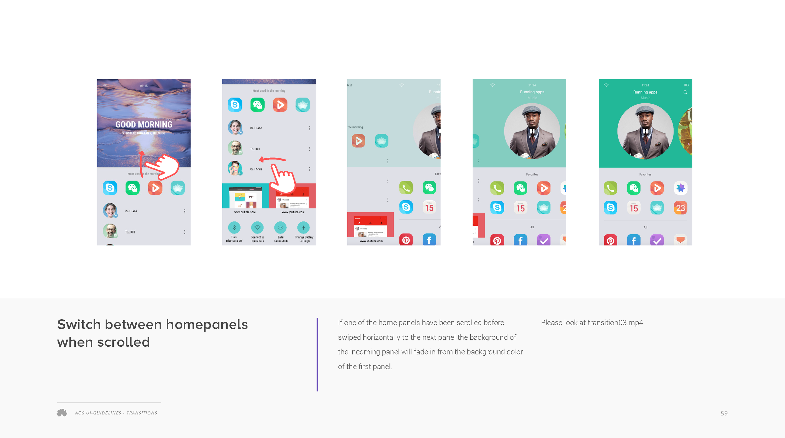


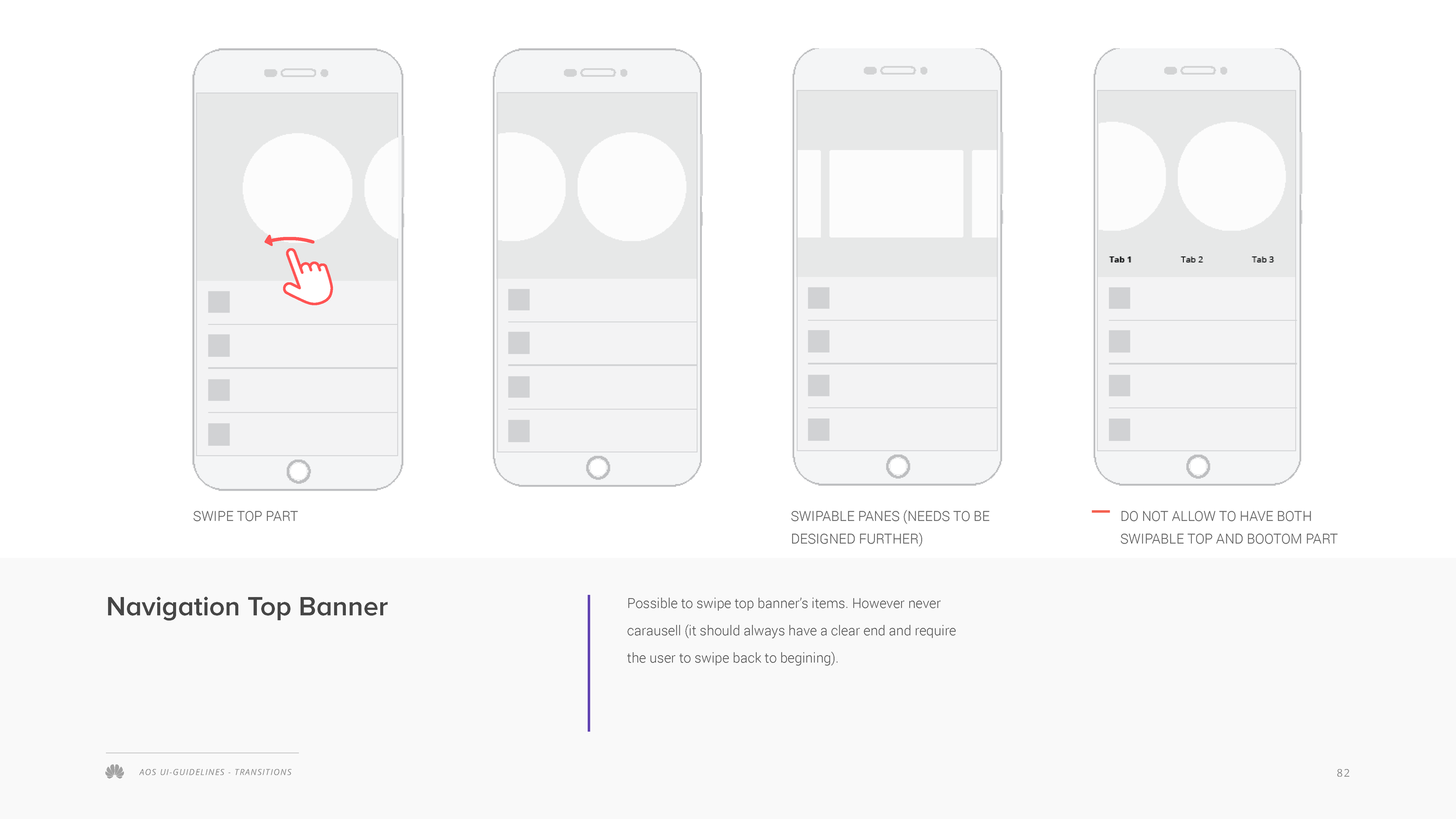




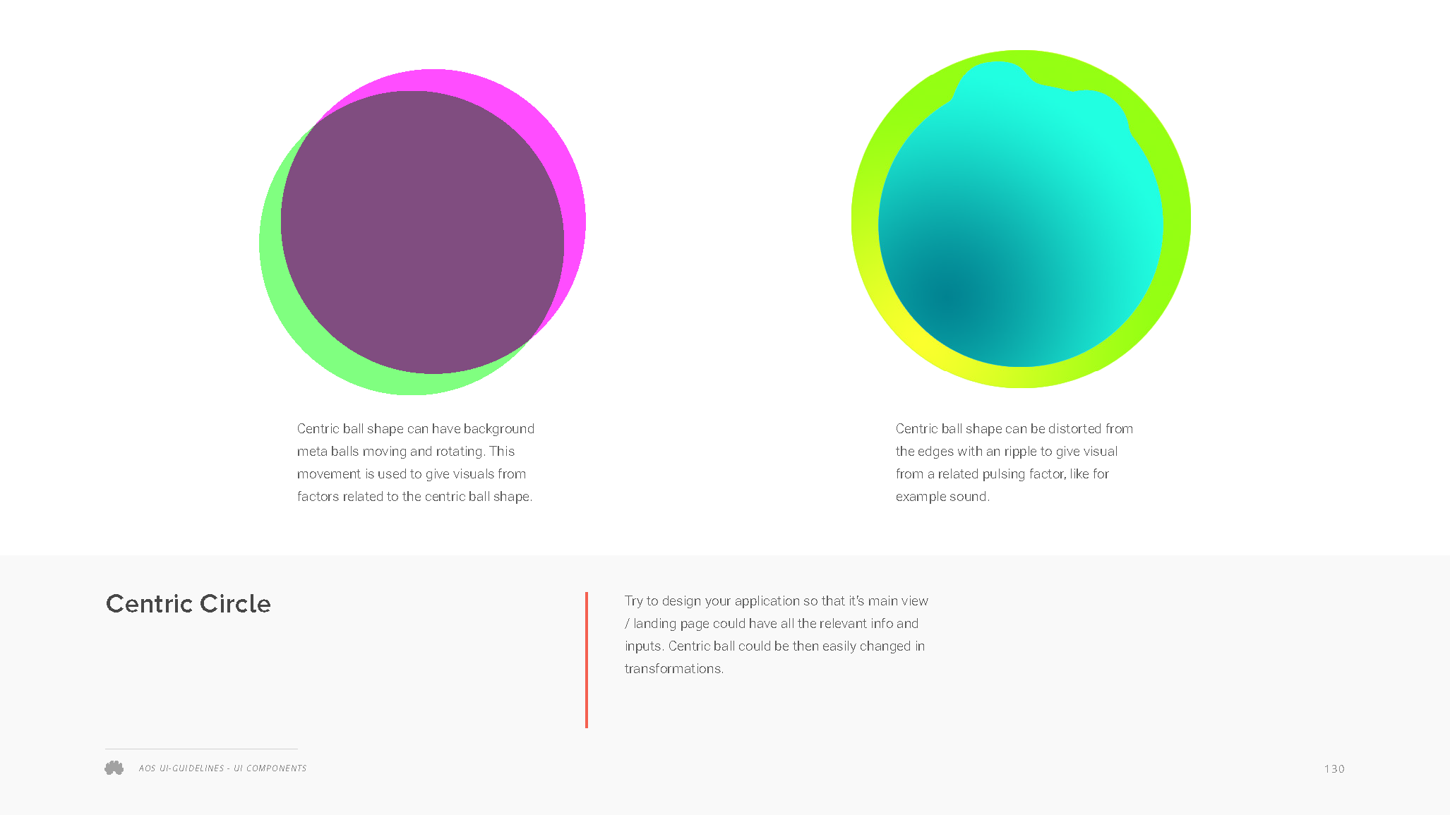


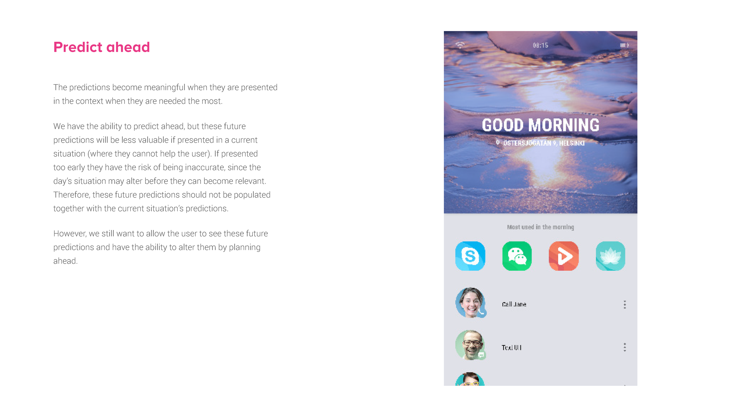

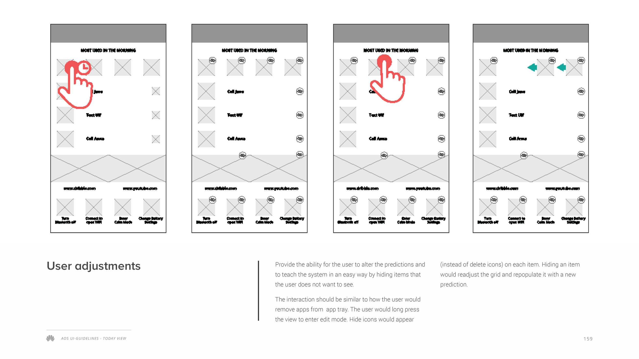


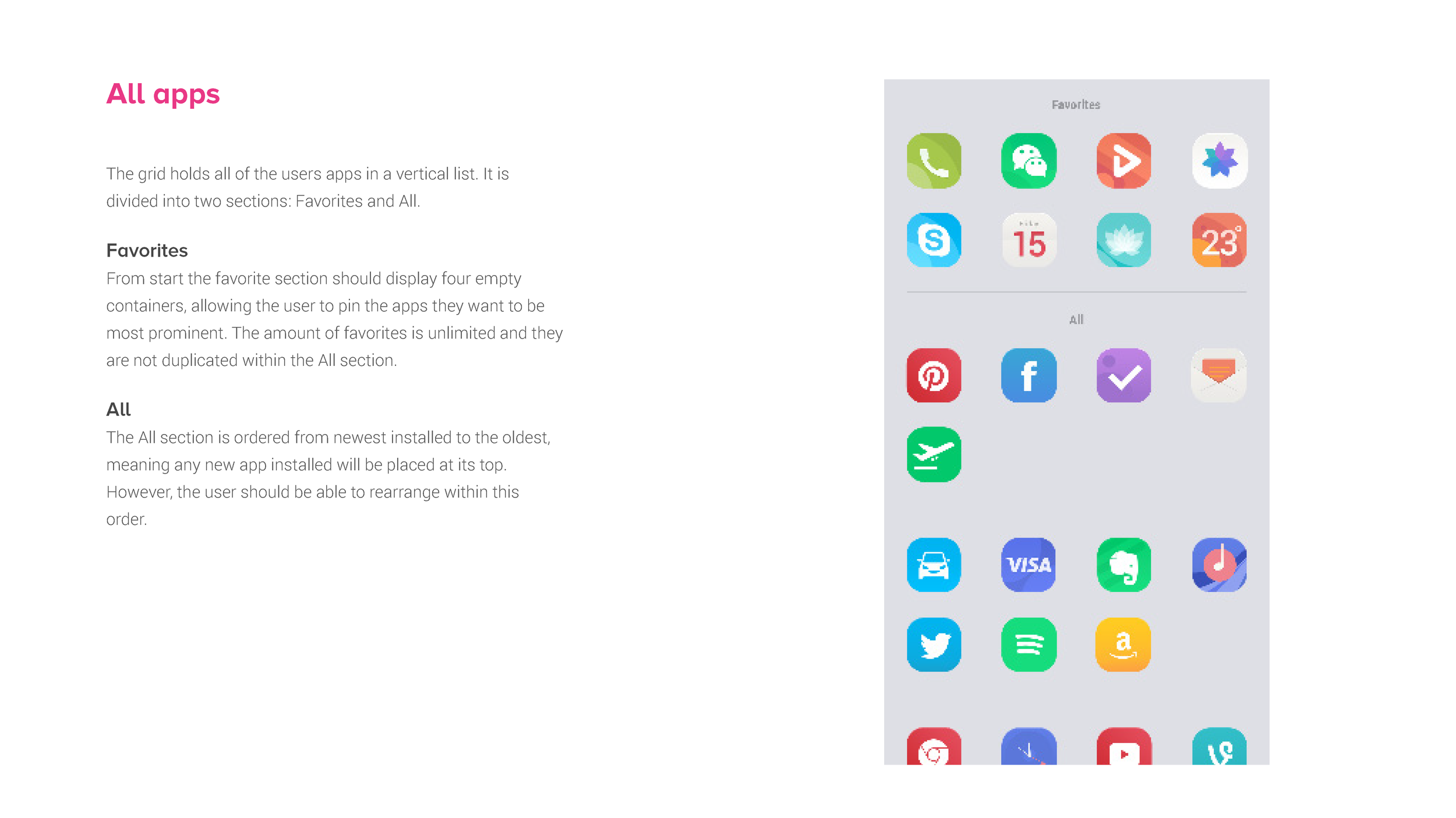


Atelier OS was the underlying design language and concept for EMUI’s innovative take on what we called “Living Shapes”: To support the continuing growth of complexity of Huawei’s information systems and the new opportunities of Huawei’s advanced technological development, we created a fresh approach to the underlying operating system and its user interface. These slides document early concepts of how we brought “the Living Shapes” concept to life and how it was supposed to be applied for a Huawei smartphone User Interface. The guideline document was aimed at the Application specification developers to help explain the functionality and design patterns.
Note: we cannot show all guidelines and not the final document for confidentiality reasons, but these should convey the basic idea for Huawei’s most advanced design.
