A thing of beauty
Have you ever wondered, whether your software (or product) could be as beautiful as nature and touch humans in a similar way?
What if technology could be as beautiful and meaningful like a butterfly wing, or have the depth of a night sky in the desert? Or, what if it was almost invisible and soft like balmy air if it is only your content that matters, say when you want to edit a movie or sound clip, or write your novel or research material for your memoir? These are the type of questions my team and I have asked ourselves for over 20 years when designing products for the world’s most iconic companies, typically, with amazing outcomes. For instance, when designing ProKit, a new design language for Apple, we got inspired by glow in the dark creatures living in the lightless depths of the ocean, and the dashboards of a car, because we needed to create interfaces at Apple that would only show GUI elements on demand that people would use and need when editing film in a dark editing room.
Nature inspired the interfaces of today.
At Huawei when we created the look of the P-Series and needed to update EMUI, and give it its own ‘hallmark’ look and feel — different from anything that the world had seen before — we turned to nature again and got inspired by both, nature’s palette and forms. While we ensured that the human interface would fulfill all requirements of accessibility, it turned out that our preferred and primary color palette for EMUI, with a blue hue as the primary default color and an expanded palette with both analogous and complementary accent colors was an excellent choice, both from an aesthetical point of view. and in terms of usability: the user interface turned out to be clear and robust: clear because it helps people navigate the interface with distinct calls to action. Robust, because we accommodate all kinds of users, including the color blind. We succeeded to lower the cognitive load by lowering distractions. We not only keep people’s eyes solely focused on the essential aspects of the interface, but also created delight by eliciting positive, visceral reactions.
P-Series ‘twilight’
Often some designers are criticized for wanting to create something beautiful. As if creating something that was a delight to the senses was superficial. I am a firm believer that design should not only be functional, but also aesthetically pleasing — to all senses, the visceral senses — also known as gut reaction — included. I also think that function and aesthetics aren’t mutually exclusive. I have learned, if you intend to create a product that works well, it should feel and look good, too. And, that being said, if something appeals, it doesn’t mean it was created to appeal on the surface only. Quite the contrary is the case. A deeply aesthetic design is usually the result of an elimination process where every element or attribute has been carefully considered until it has been designed and selected as a part of the final product or experience. Many nos to one yes. I am stating these observations not only from the perspective as a designer, but also as a student of the humanities and a musician — I was formally trained in classical voice and piano for many years, before I decided to focus on design at Art Center College of Design in the 1990s which were an important decade and turning point for design from analog to digital. Back to music: as many people know from their own experience, music is not only a great source of delight, it is also virtually impossible, to have people listen to a piece that’s performed somewhat out of tune and expect them to to enjoy it. Not without reason, humans love harmony. Something similar happens when people eat or prepare food. If there are too many ingredients in a dish, or the wrong kinds coming together, something isn’t right. Yet when the right flavors are combined, sometimes in a very unexpected way, magic happens. Therefore, great attention to every detail in design matters. This is my take on design, because everything can and should be in harmony, both functionality and aesthetics, not only those that appeal to the eye, but to other senses, too.
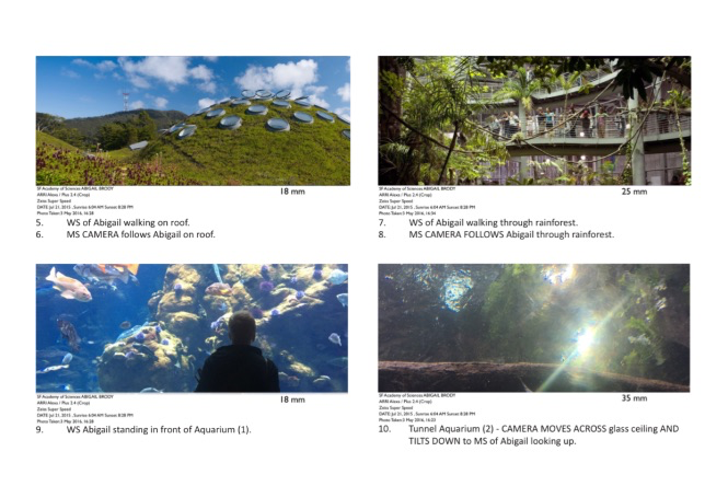
I visited with my team the California Academy of Sciences many times to learn about the life of color and other exhibitions. The Naturalist Center is home to hundreds of specimens and hands-on activities for all. We shot a Huawei documentary at the academy while creating the look and feel of EMUI and the new P-Series device.


