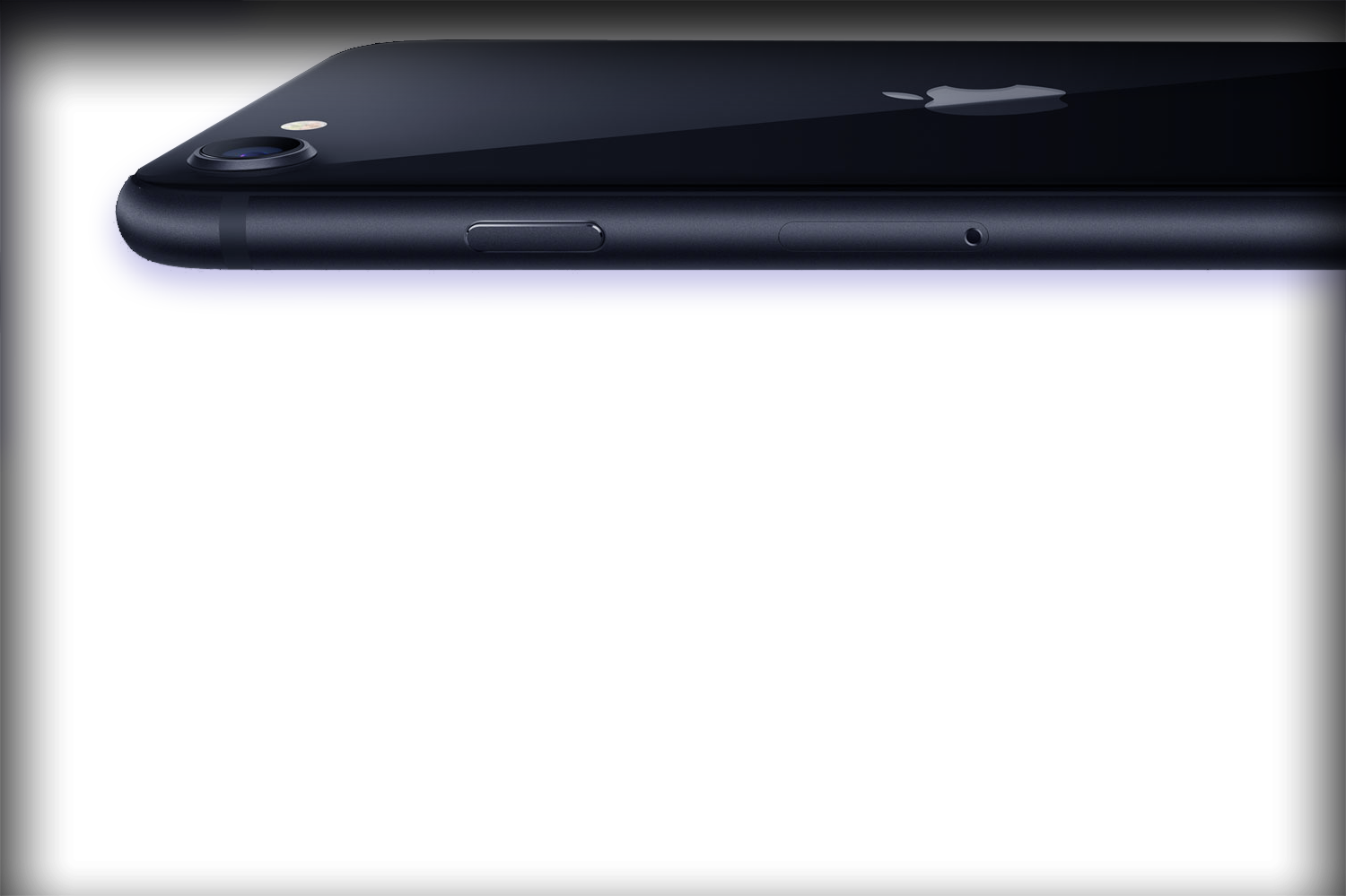
Apple iPhone
The design of Apple’s iconic device
My role: individual contributor, human interface designer, and inventor
The original iPhone was a total game changer when it was launched in 2007.
Life without Apple’s iPhone is unimaginable today. Learn how we designed the first iPhone and other wearables, such as the Nike+, and what role I played in creating one of the world’s most iconic and beloved products that have demonstrated that technology can be human, friendly, and delightful.
About
When it was launched on January 9, 2007, the iPhone combined three products all in one:
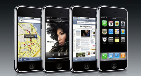
A revolutionary mobile phone, a widescreen iPod with multi-touch controls, and a breakthrough Internet communications device with desktop-class email, web browsing, maps, and searching — into one small and lightweight handheld device. Apple has now sold more than 1 billion iPhones, making it not only (at one point) the most valuable but also the world’s most iconic company of all time. The One Device, a book about the history of ‘the invention that changed everything’ and became the most profitable product in the world — describes how the iPhone is bigger is the sum of its parts, and the result of uncounted, tremendously talented people working on it and I’m fortunate that I’m one of them.
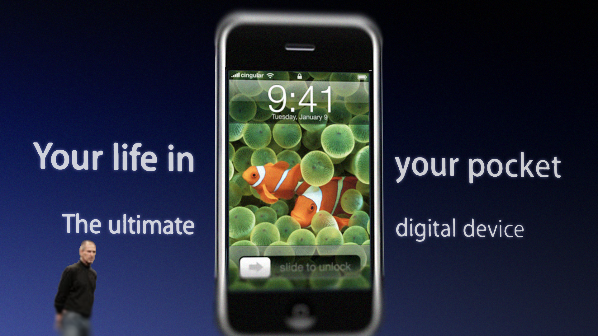
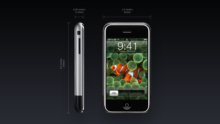
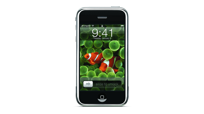
I was fortunate to be at Apple at the right time when we were about to make history. One day a couple of years before the iPhone was launched, I received a call from Apple’s executive leadership team to assign 95% of my time to help create a novel look & feel for a mysterious multi-touch device code-named “P2”, aka project “purple” — code-names for the iPhone project. While I was not fully disclosed, some of my work was integrated into the signature look & feel of the phone, including the wallpaper and key elements on the home screen on the day of its launch.
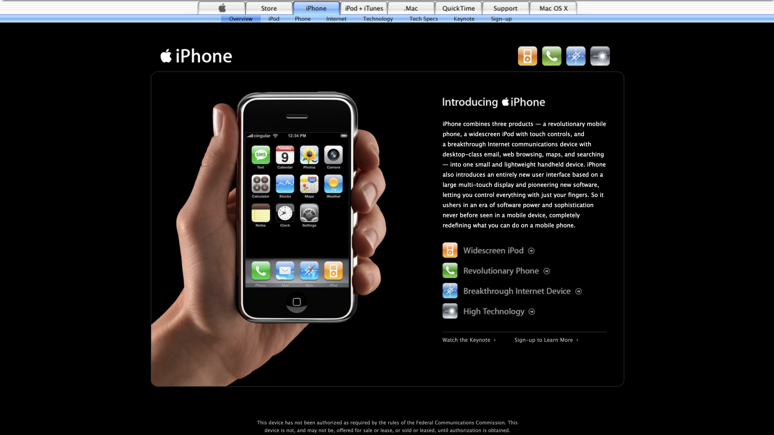
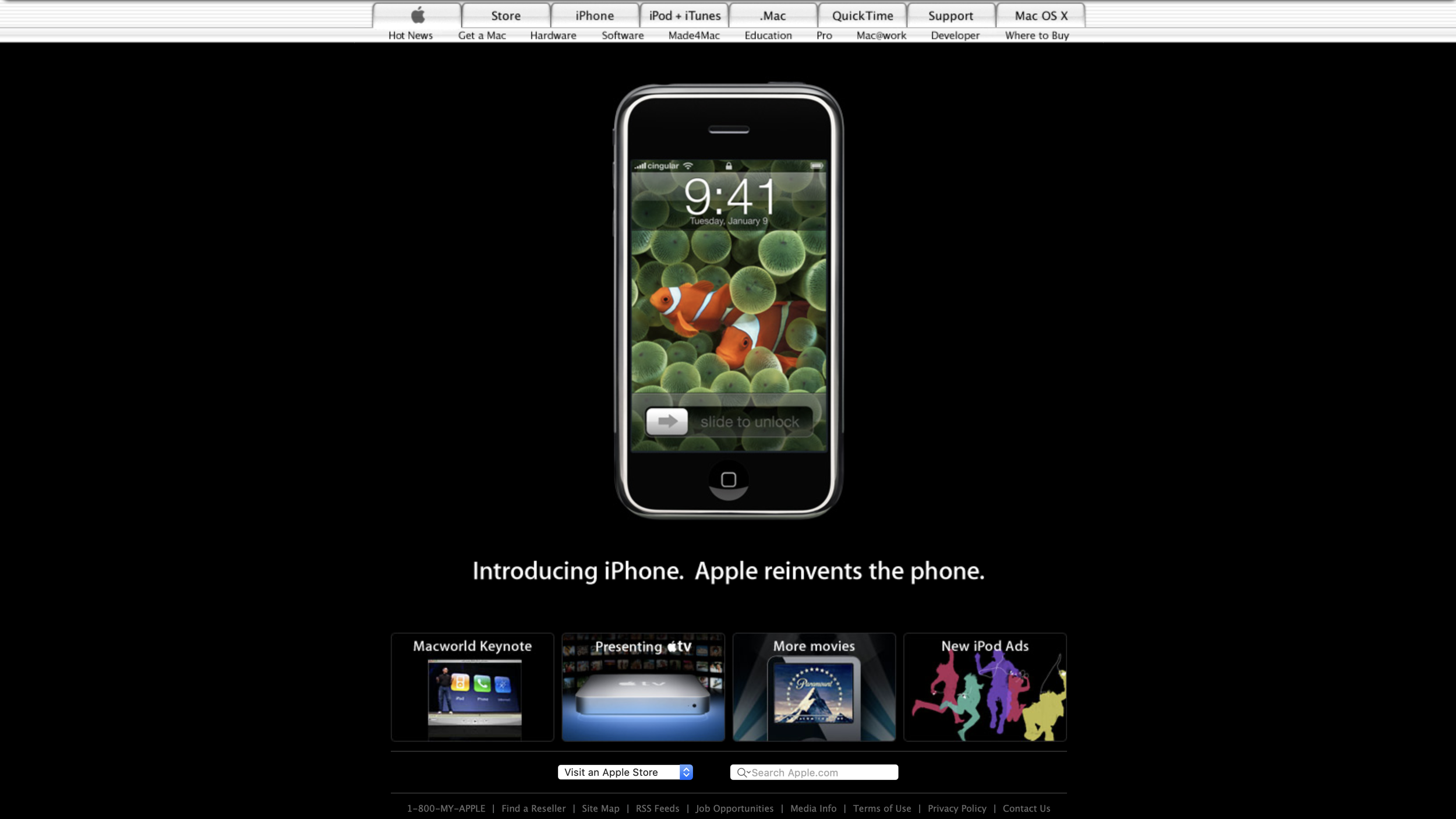
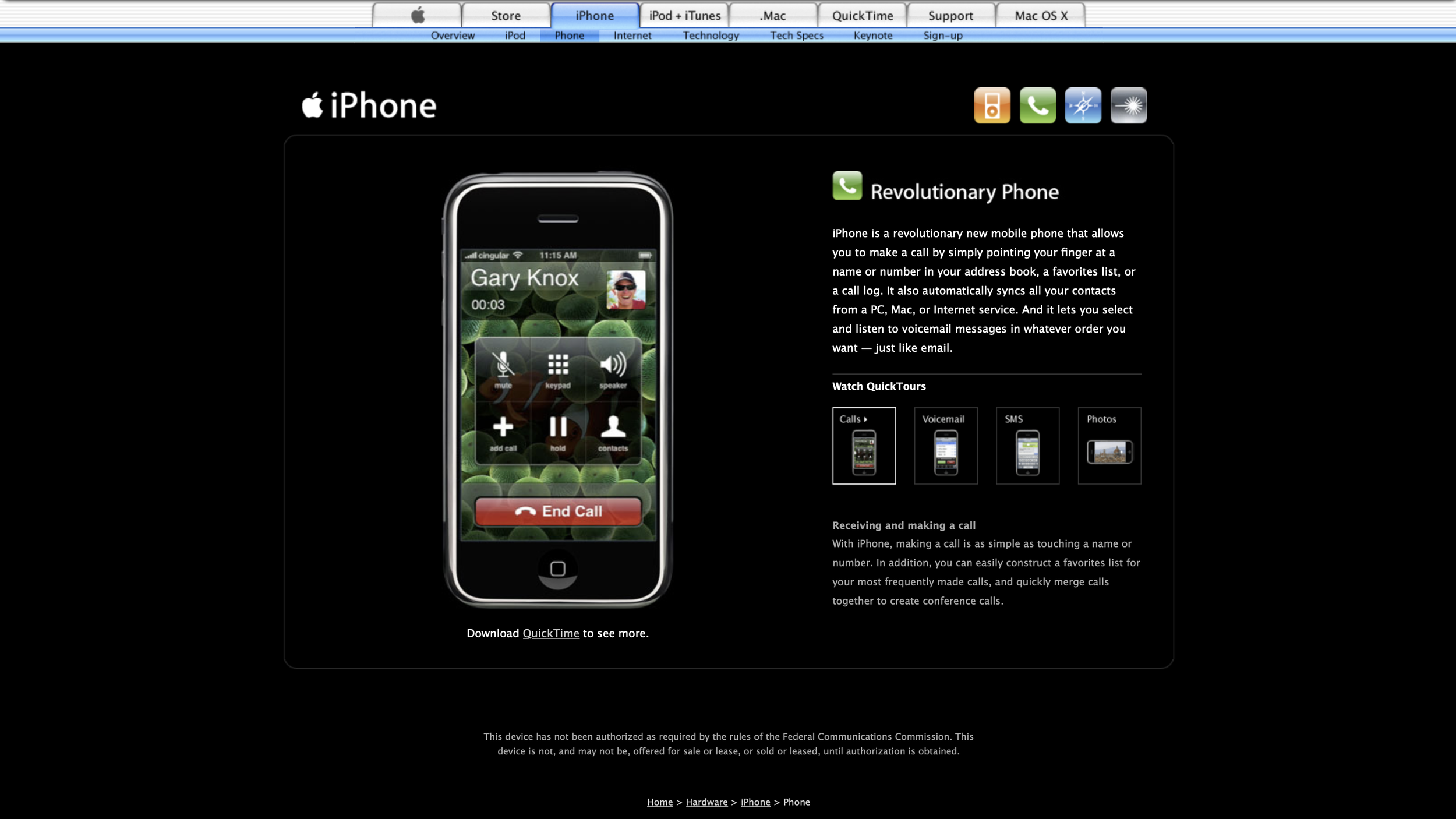
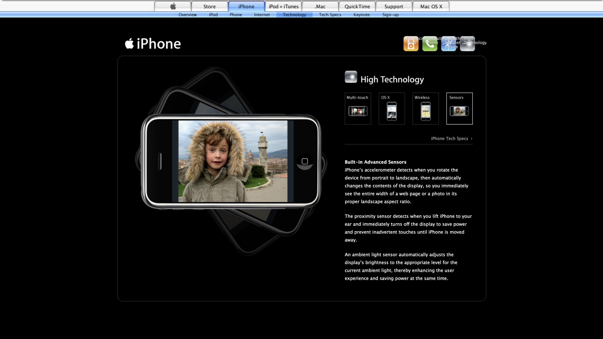
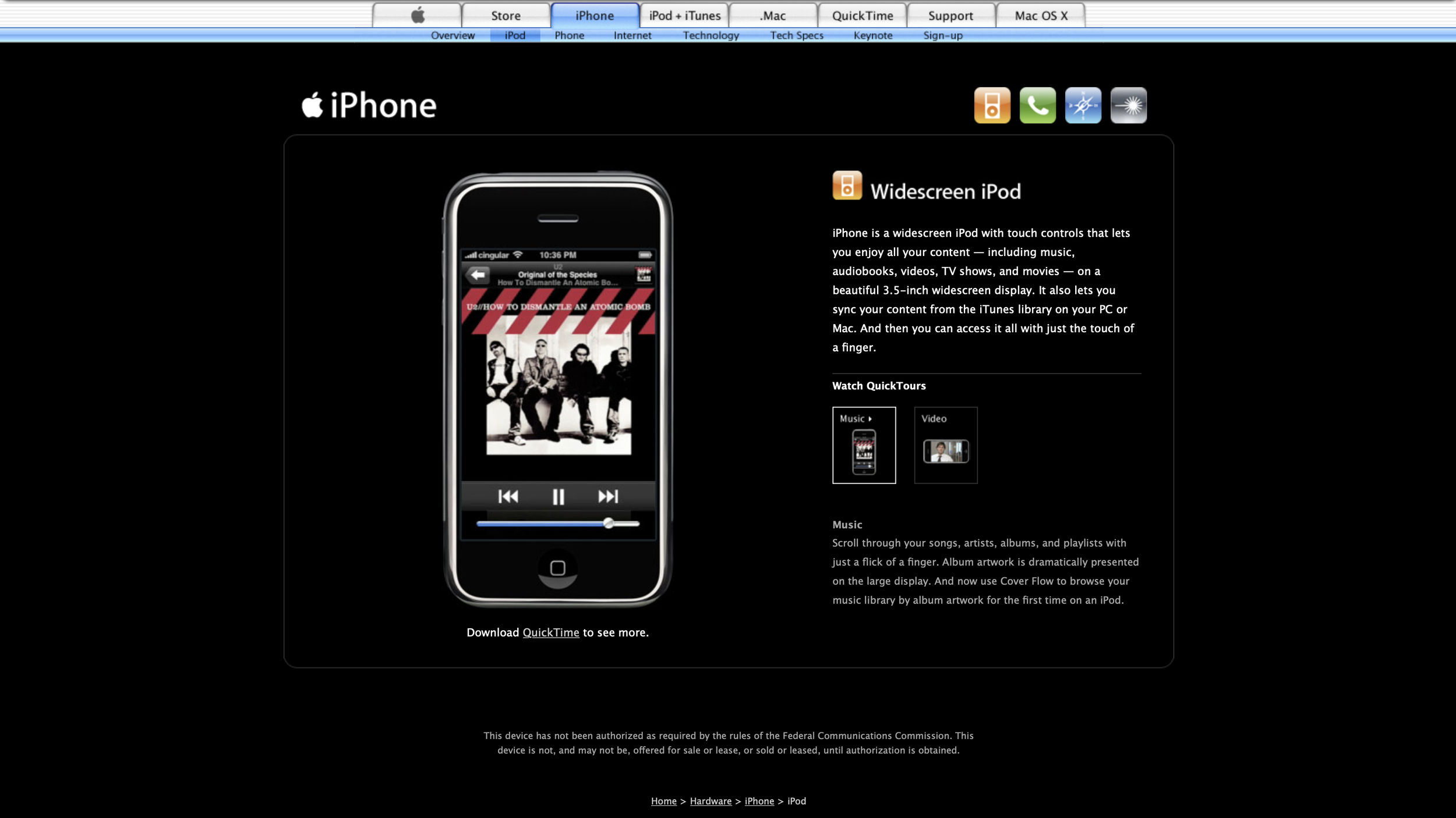
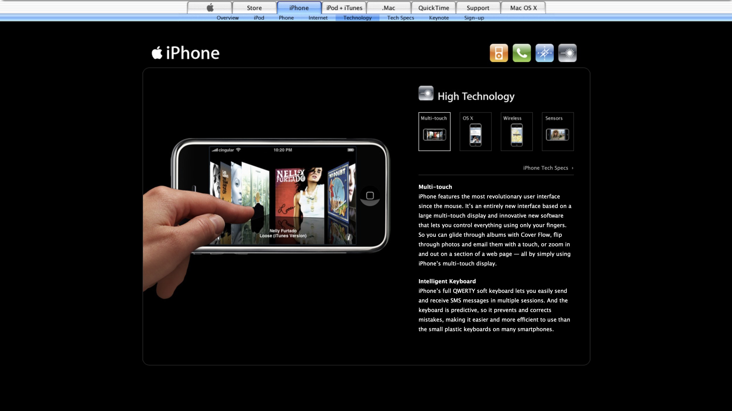

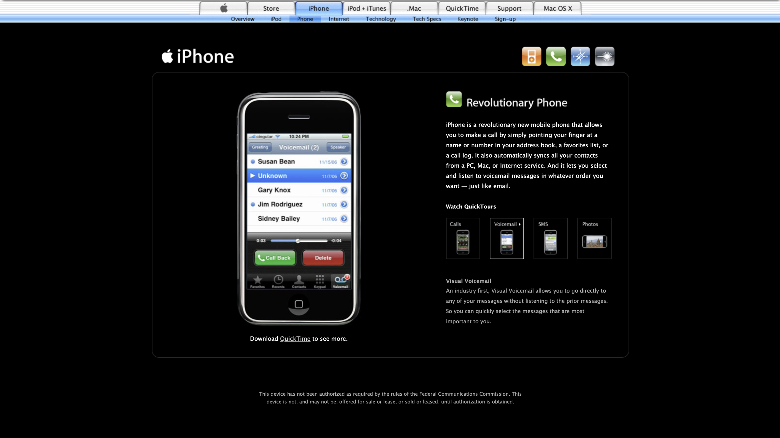
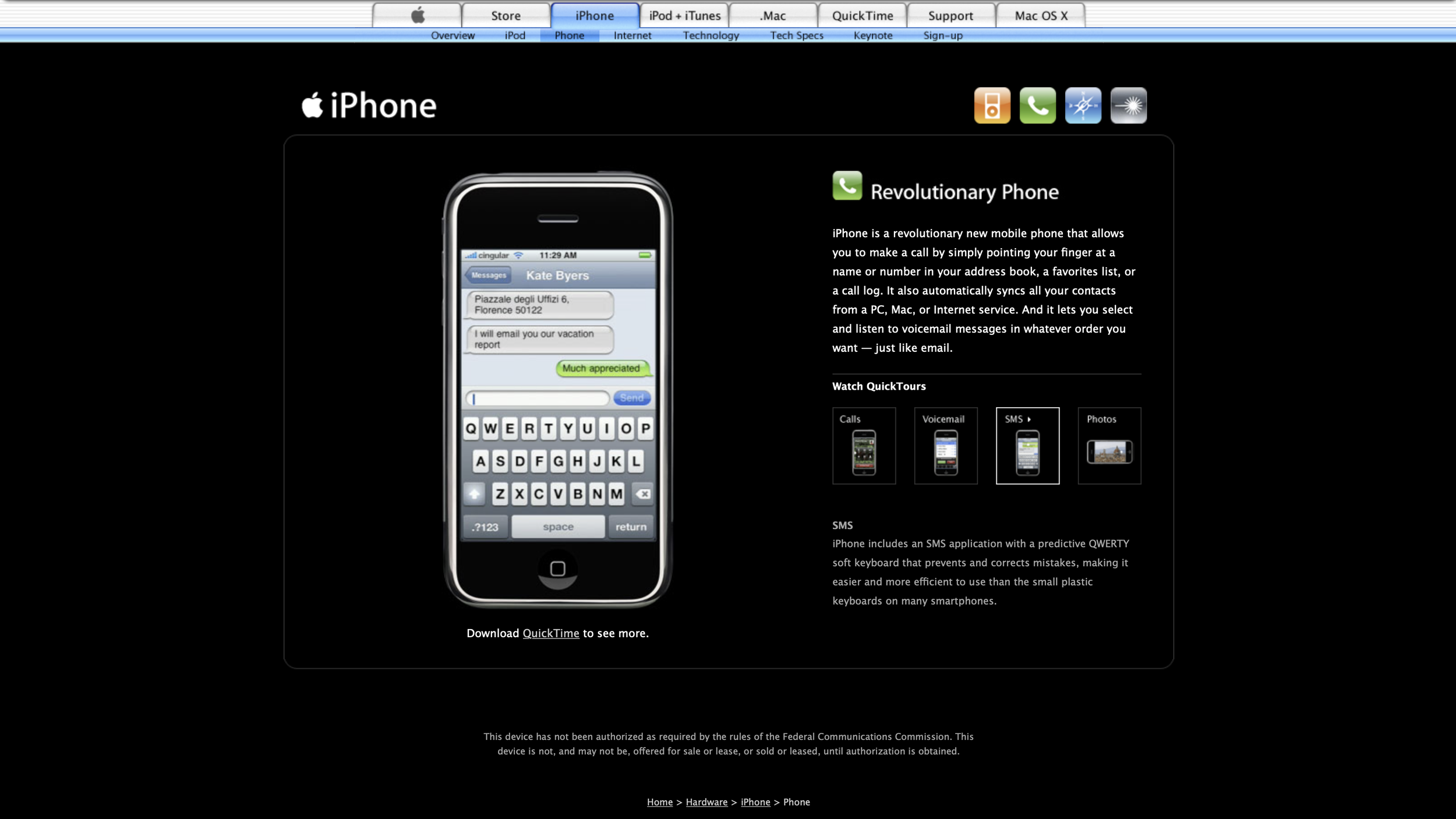
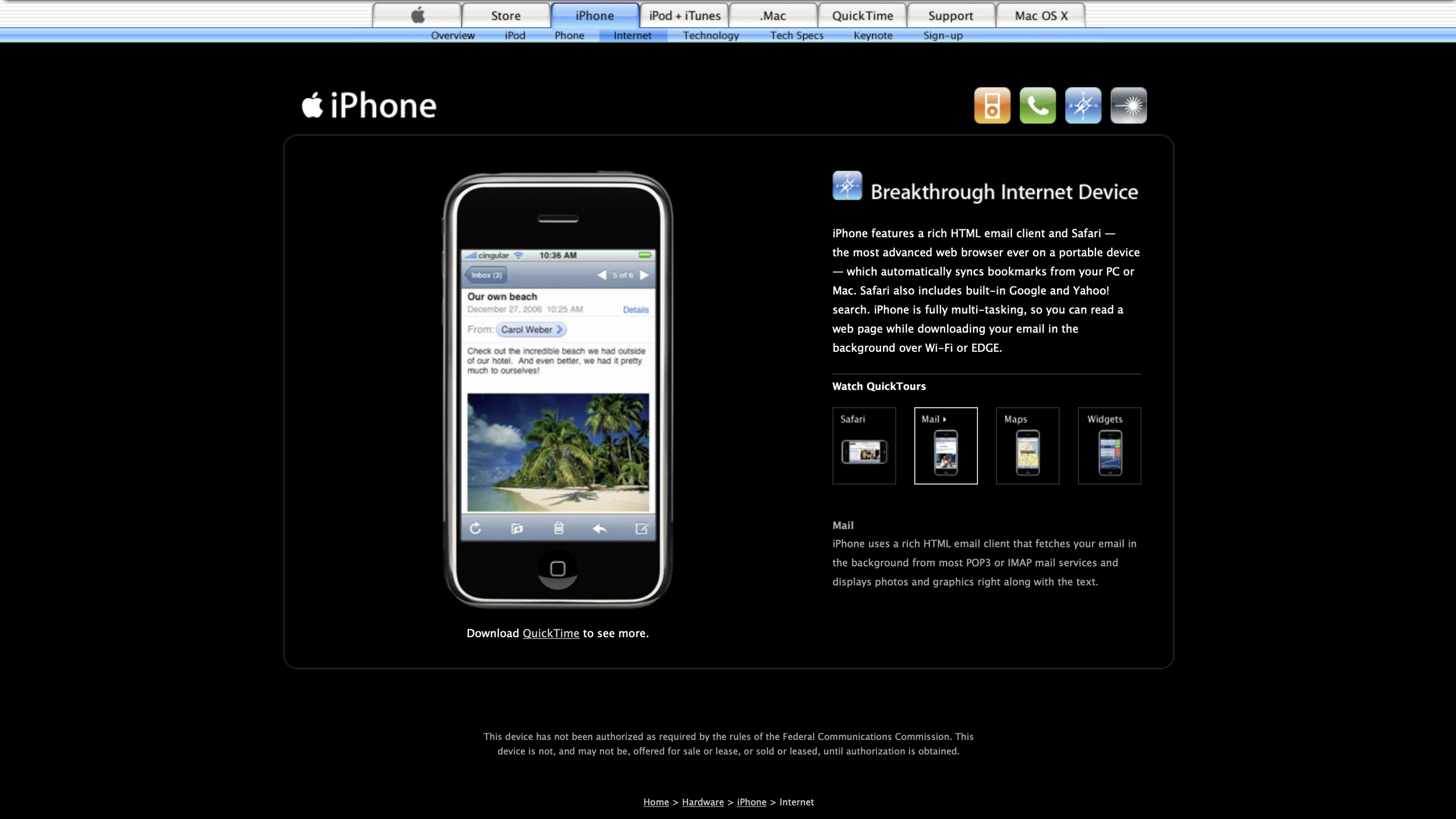
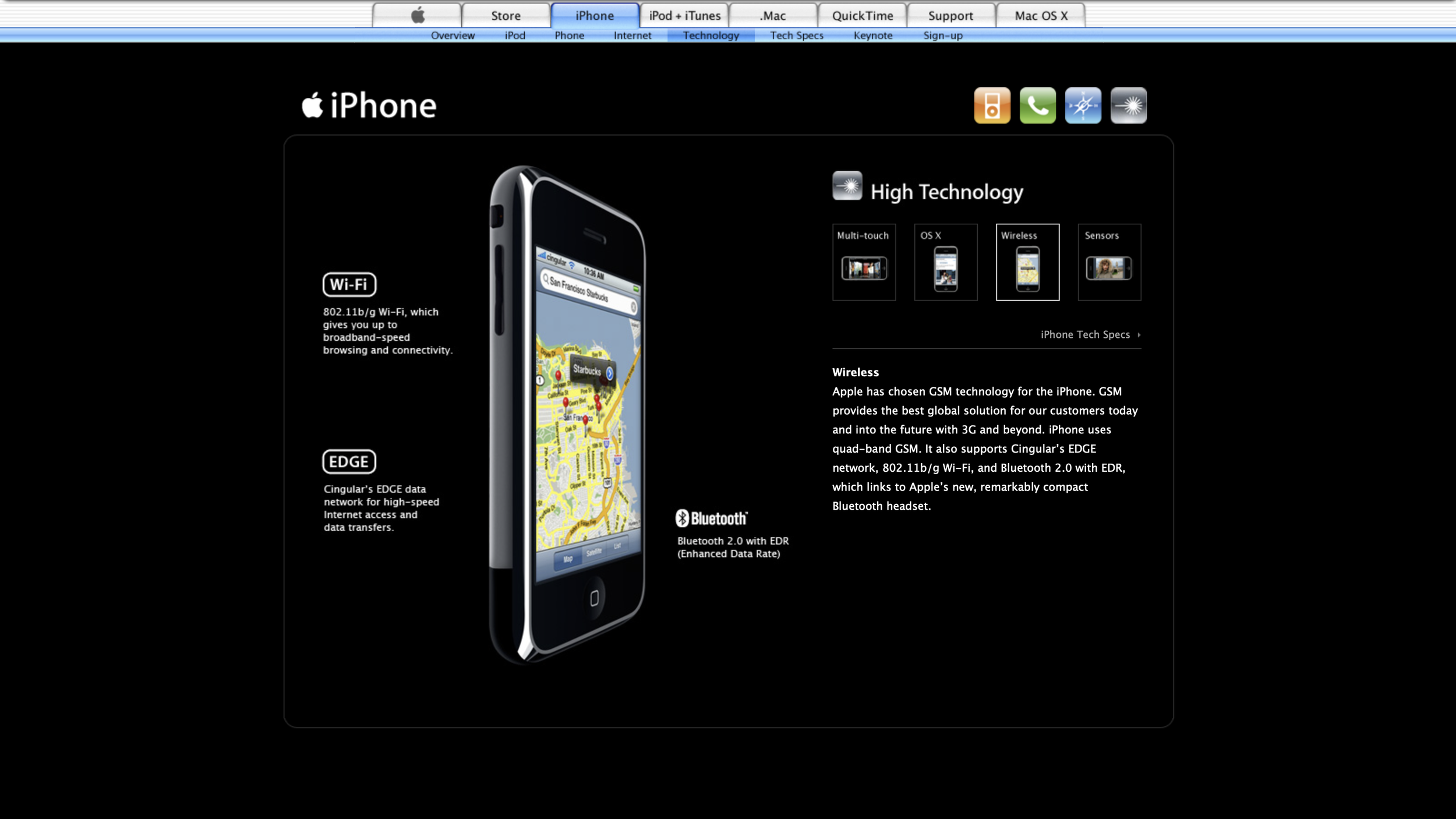
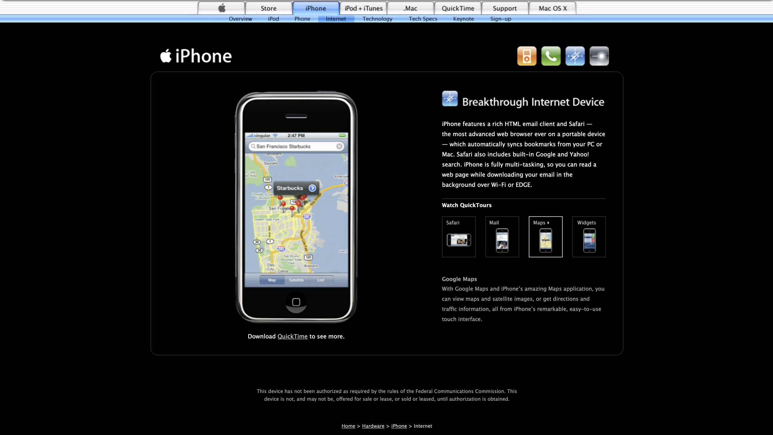
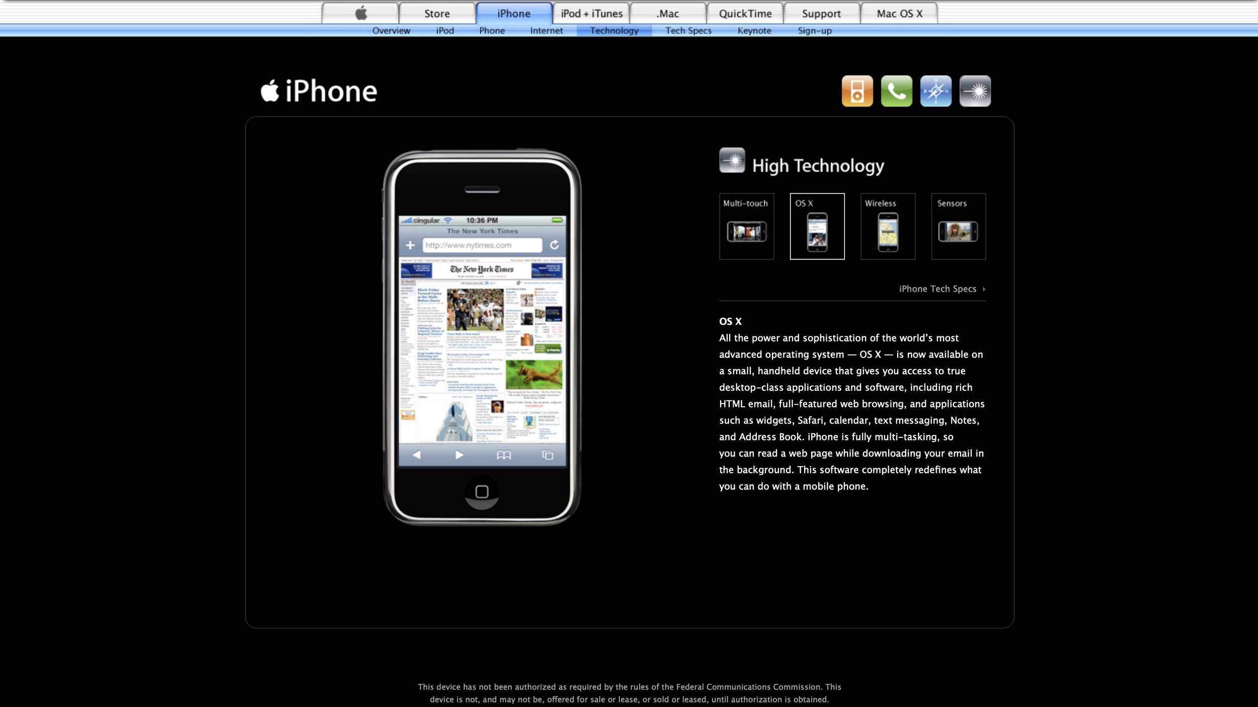
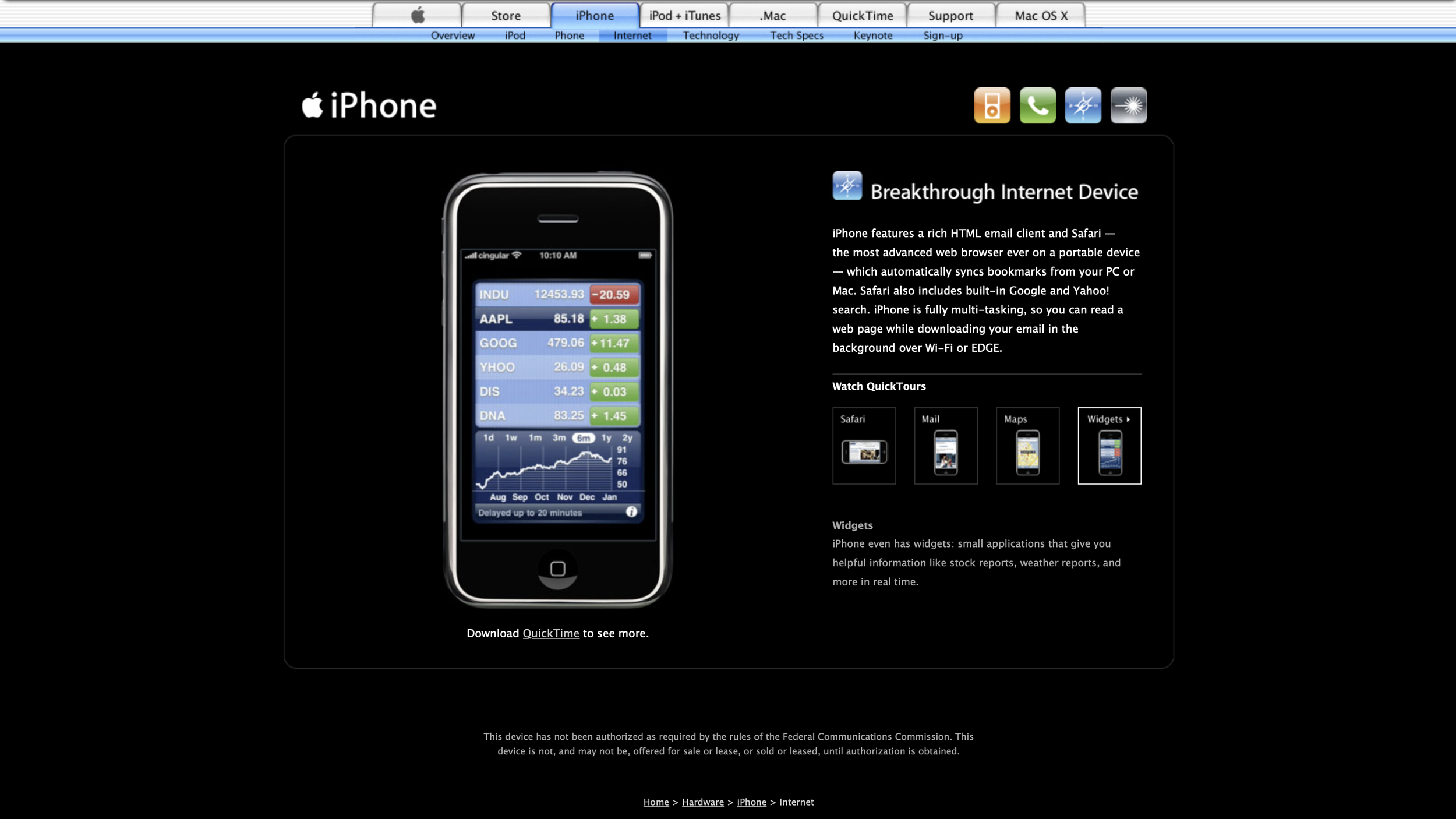
anecdote:
I saw some of the early design ideas I’d put together for the mystery P2 project mockups and hero shots, including the big white lettering for the digital time and clownfish wallpaper, again, on stage for the world to see in Steve Jobs’s demo for the first time. I was as surprised as anyone and honored.
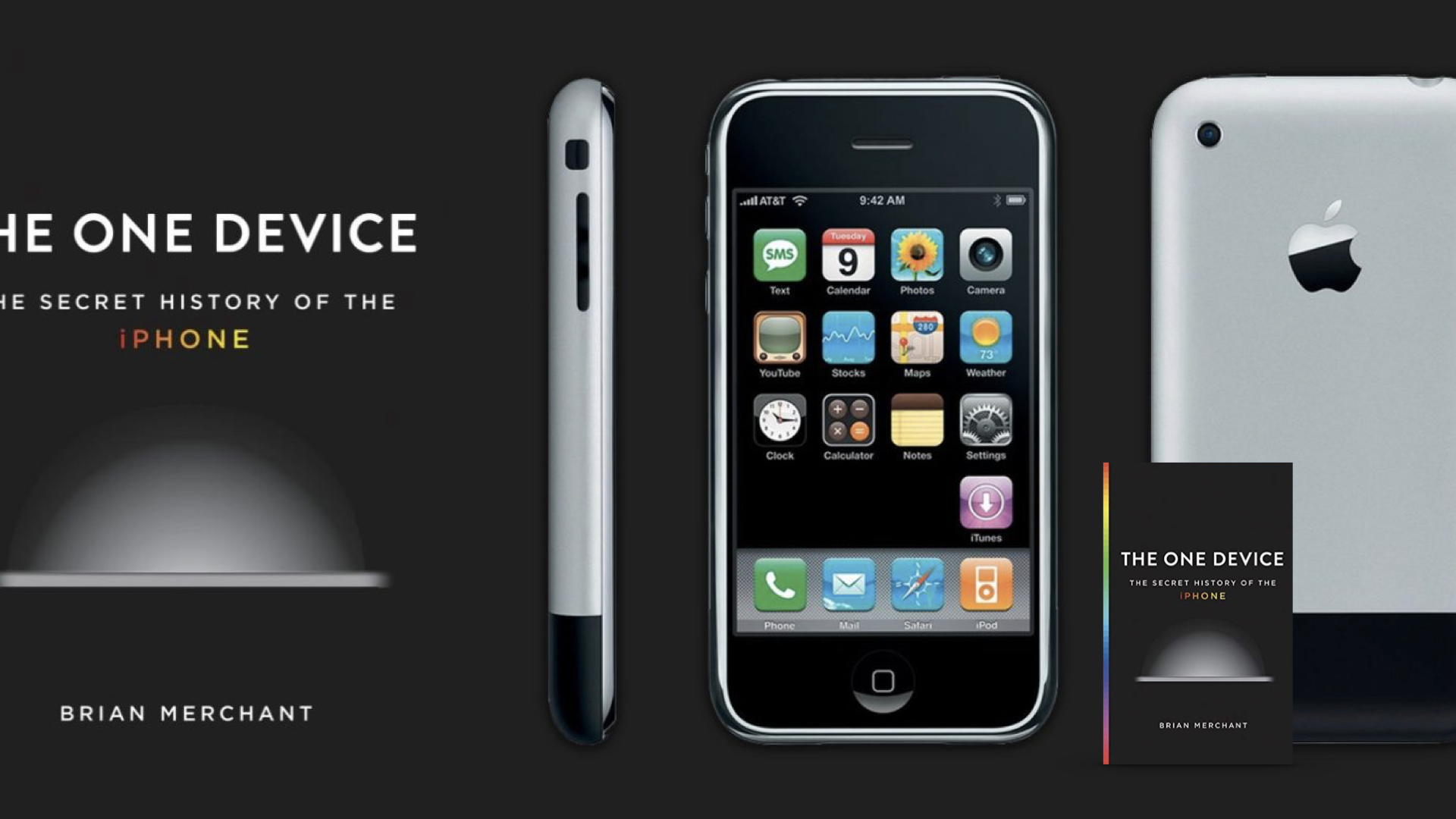


The One Device
The One Device, a book about the history of the invention that changed everything — and became the most profitable product in the world — describes how the iPhone is bigger in the sum of its parts and the result of uncounted, tremendously talented people working on it. I’m fortunate that I’m one of those who’ve made a difference.
Design Principles
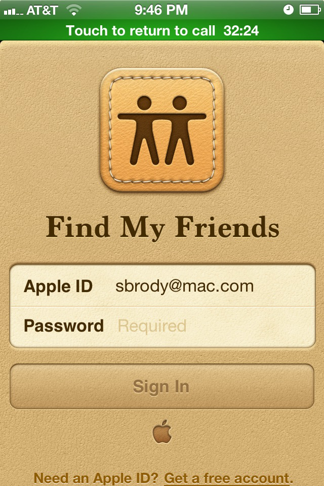
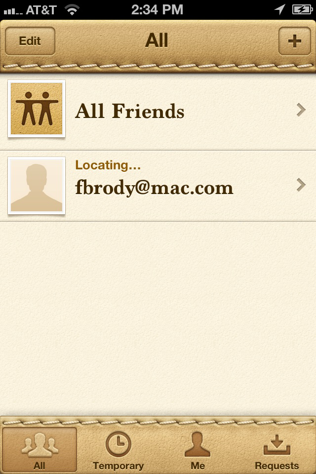
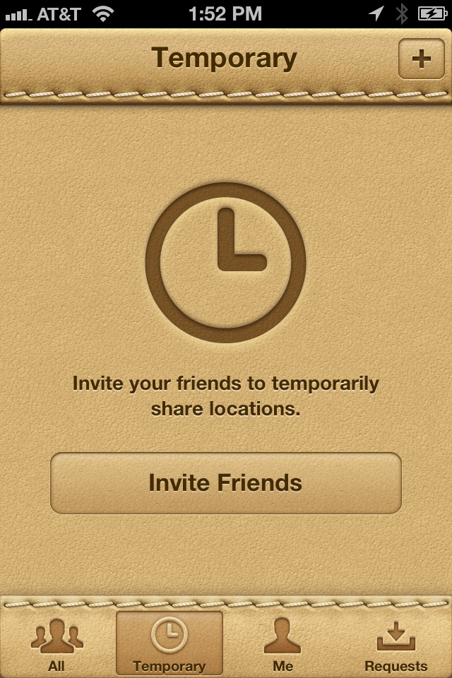
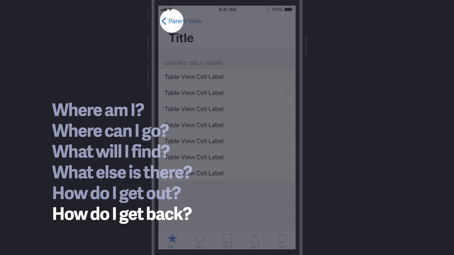
Principles like the ones below have been guiding my work at Apple. They informed early concepts for the first iPhone’s graphical user interface, which we always called the human interface at Apple: the principles of ‘clarity,’ ‘deference’, and ‘depth’ has been all about helping people to focus on their content, without any distraction through unnecessary elements of the surrounding user interface, while at the same time, for less experienced and novice users, bringing familiar and ‘bespoke‘ metaphors, such as stitched leather and paper, from the physical world to the new multitouch interface, making technology easier to decipher and both more easy and friendly to use, has been an important goal. We never designed with a trend or effect in mind, but always the people using and enjoying our products.
Clarity. Using best design practices throughout the system, elements are in a grid, text is legible at every size, icons are precise and lucid, adornments are subtle and appropriate, and a sharpened focus on functionality motivates the design. Negative space, color, fonts, graphics, and interface elements subtly highlight important content and convey interactivity.
Deference. Fluid motion and a crisp, beautiful interface help people understand and interact with content while never competing with it. Content typically fills the entire screen, while translucency and blurring often hint at more. Minimal use of bezels, gradients, and drop shadows keep the interface light and airy, while ensuring that content is paramount.
Depth. Distinct visual layers and realistic motion convey hierarchy, impart vitality, and facilitate understanding. Touch and discoverability heighten delight and enable access to functionality and additional content without losing context. Transitions provide a sense of depth as you navigate through content.

About iOS
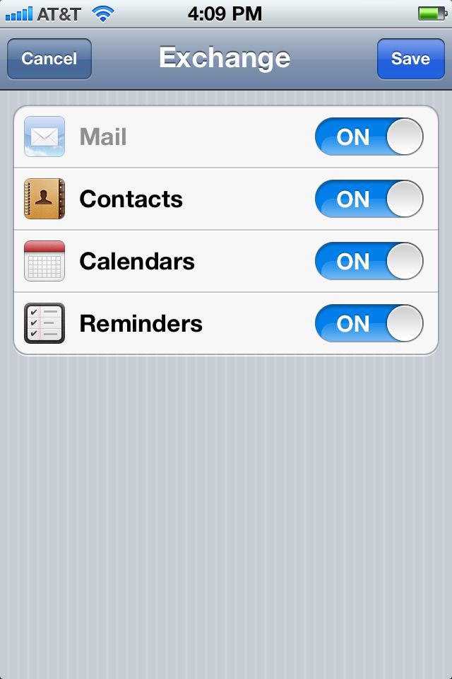
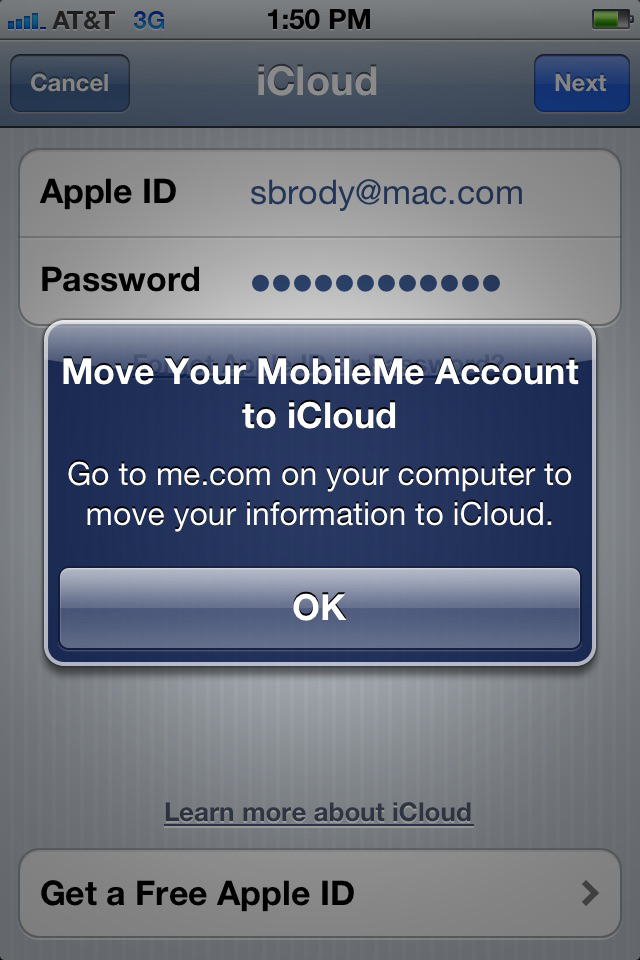
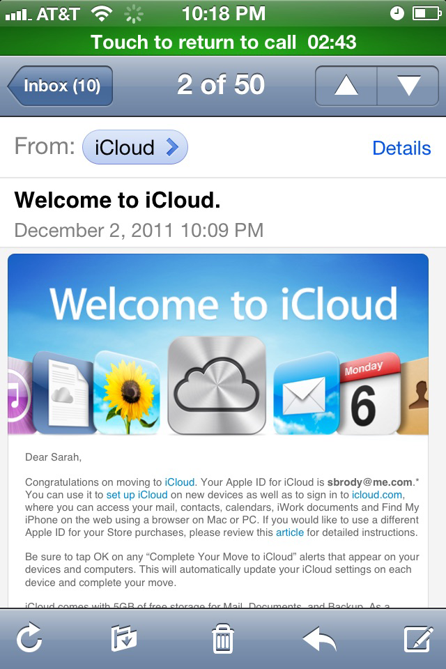
Originally unveiled in 2007 for the iPhone, iOS has been extended to support other Apple devices, such as the iPod Touch (September 2007) and the iPad (January 2010).* The iOS user interface is based upon direct manipulation, using multi-touch gestures. Interface control elements consist of sliders, switches, and buttons. Interaction with the OS includes gestures such as swipe, tap, pinch, and reverse pinch, all of which have specific definitions within the context of the iOS operating system and its multi-touch interface.
*As of March 2018, Apple’s App Store contains more than 2.1 million iOS applications, 1 million of which are native for iPads.[10] These mobile apps have collectively been downloaded more than 130 billion times.













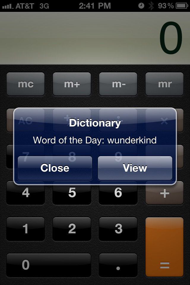


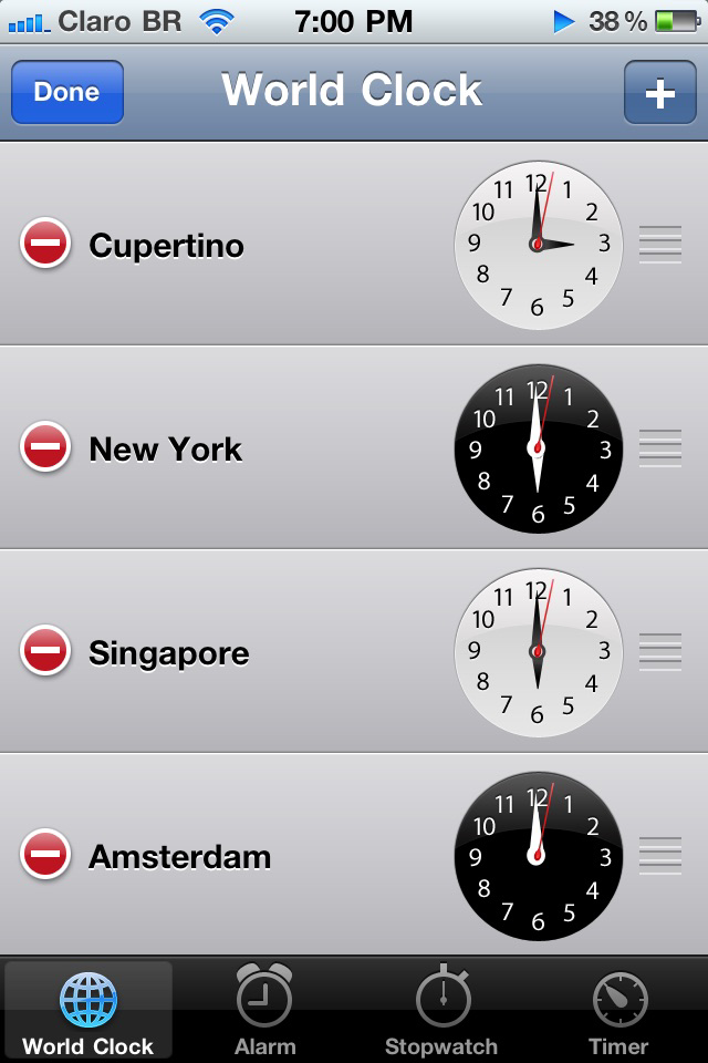

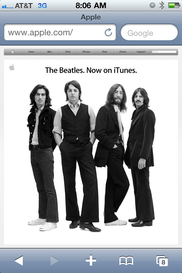
A natural evolution
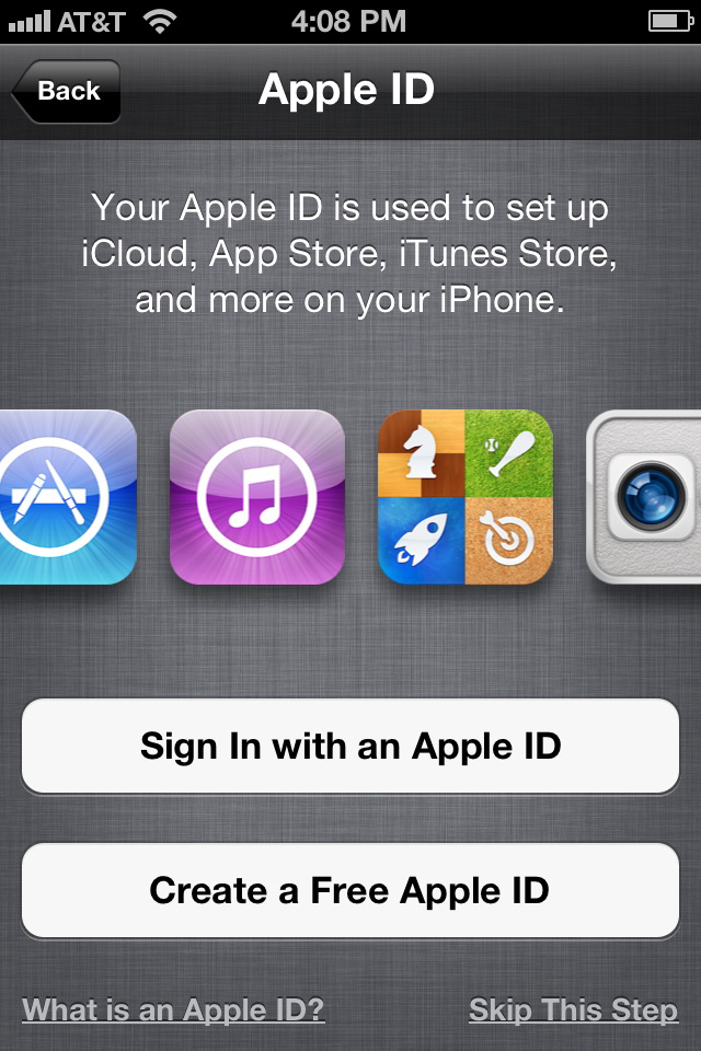
For the first release of the iPhone, it made not only sense to use both bespoke and familiar metaphors for iOS, such as paper mimicking the physical world, to introduce people to the new multi-touch technology, but it also helped Apple set itself apart from competitors by creating a barrier to entry. Creating a visually appealing user interface required coding skills and an eye for beauty and detail, including a refined sense for aesthetics, such as light and textures, colors, layout, hierarchy, typography, and white space name a few.
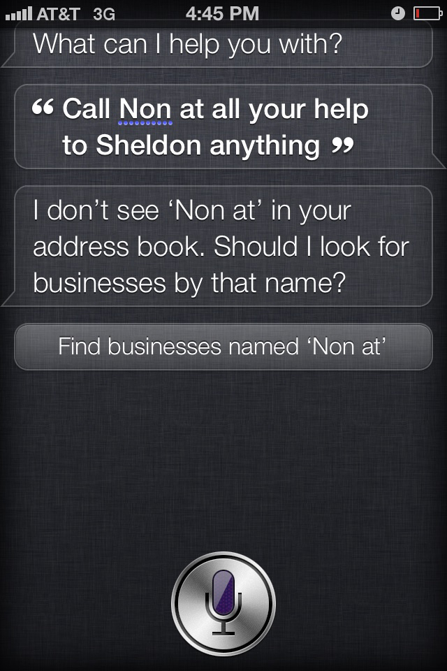
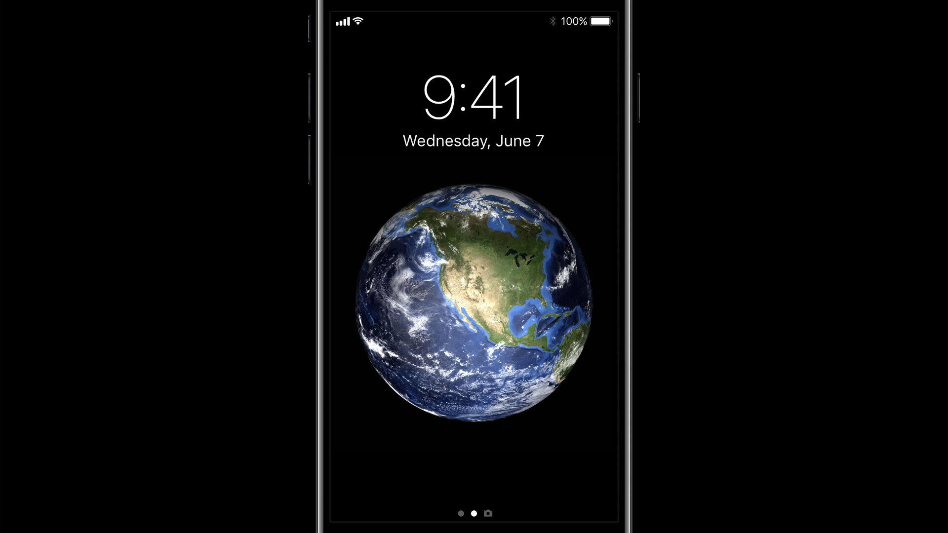
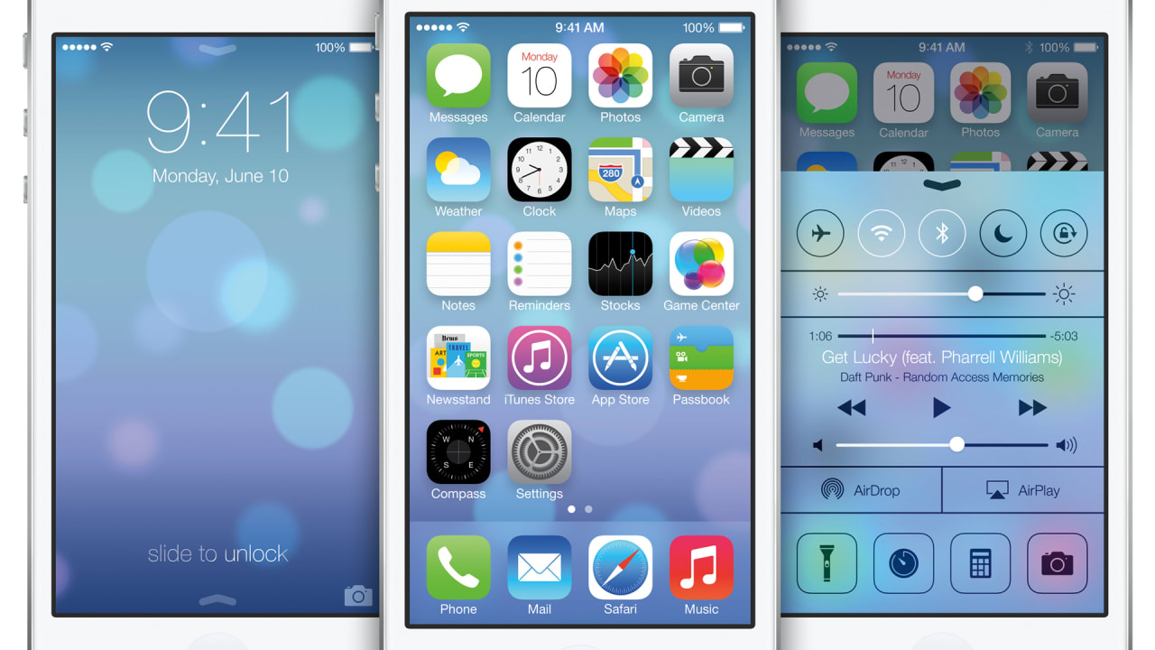
It was only a natural evolution that, over the coming releases of iOS, especially with iOS 7, Apple introduced a more simplified interface design. By then, people have learned how to perform desired actions and access its hidden content by swiping and tapping rather than pointing and clicking on an object as they understood it from decades of using a desktop computer. Also, the introduction of Siri, Apple’s voice-powered technology, and -assistant changed the way people engage with their devices.
iOS Evolution
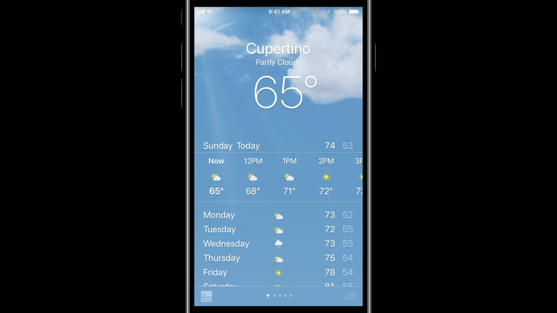
As people became increasingly familiar with their devices, it was only natural that over the coming releases of iOS, especially with iOS 7, Apple was able to introduce a more simplified interface design because by then, people had learned how to perform desired actions and access hidden content, for instance by swiping and tapping, rather than pointing and clicking with a mouse, let alone with the introduction of Siri.




Apple wearables
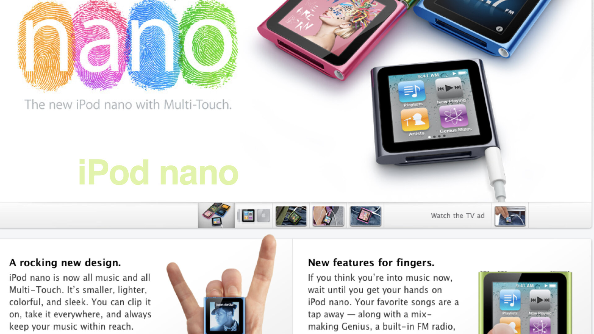
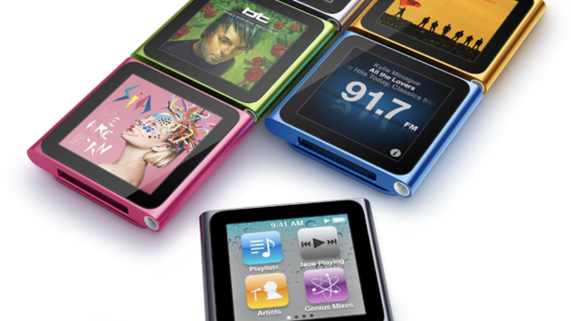
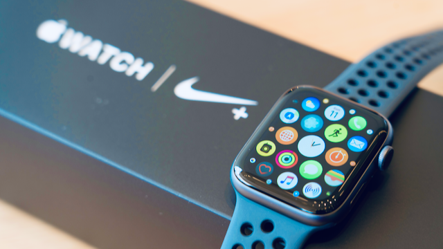
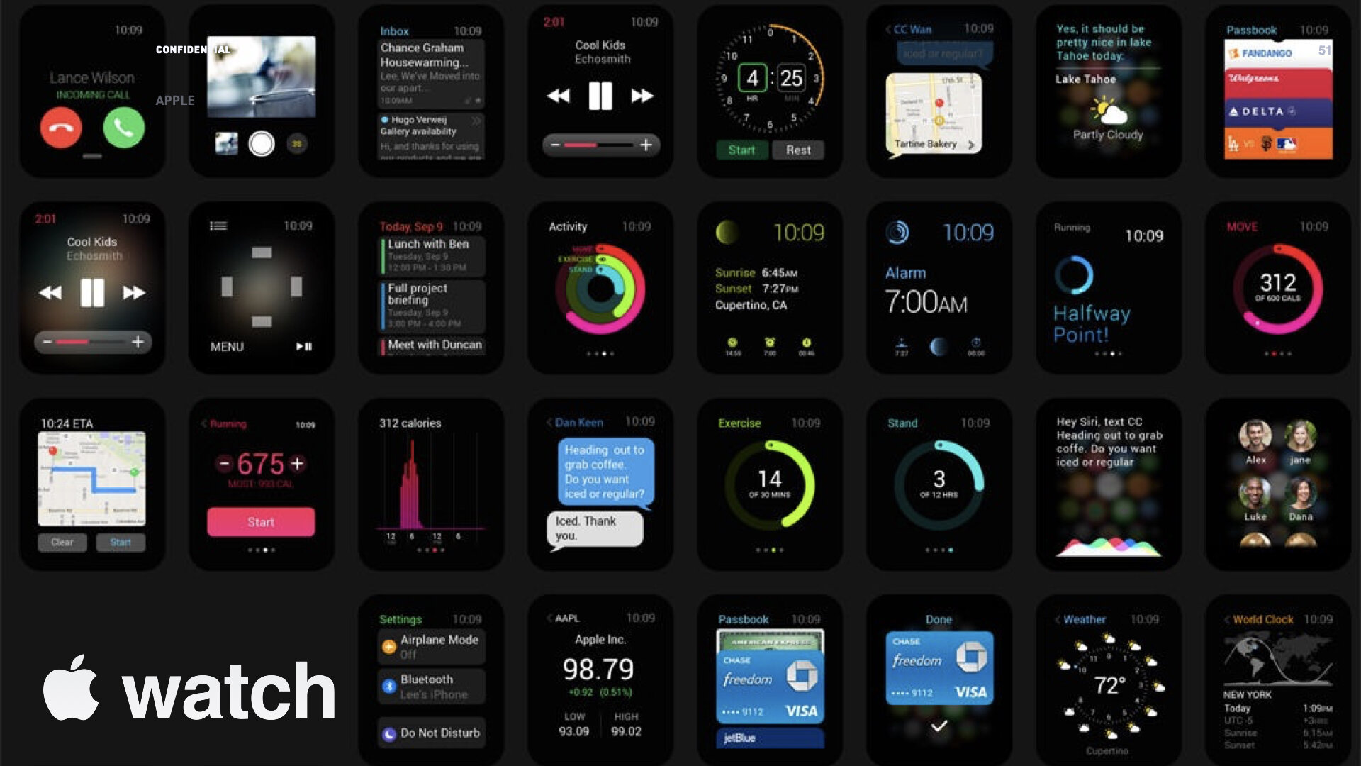
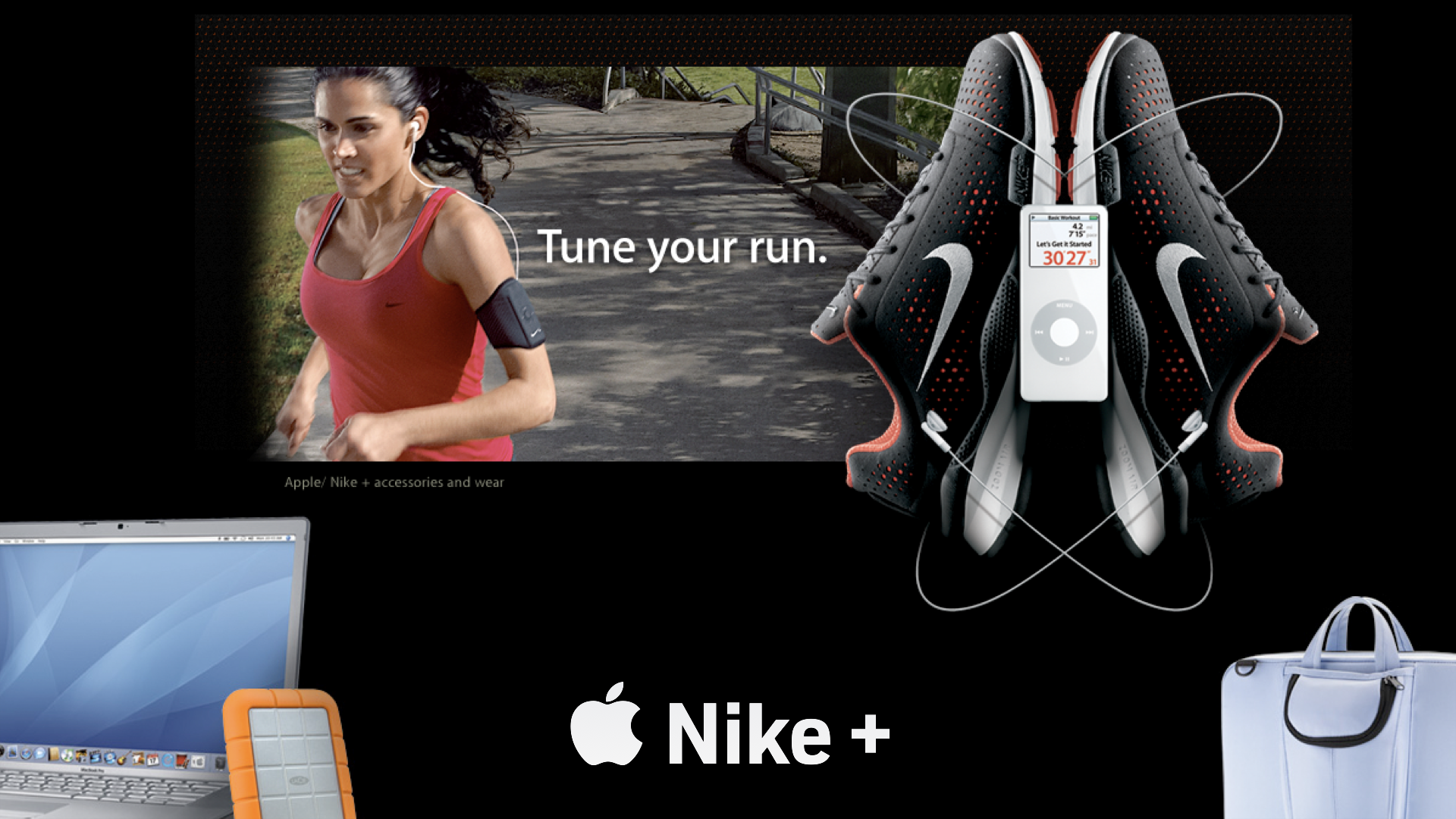
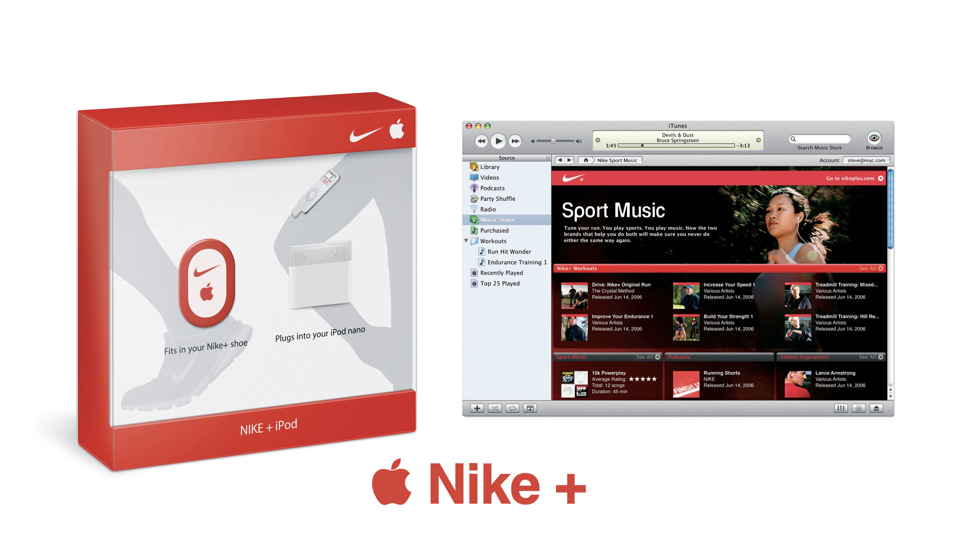
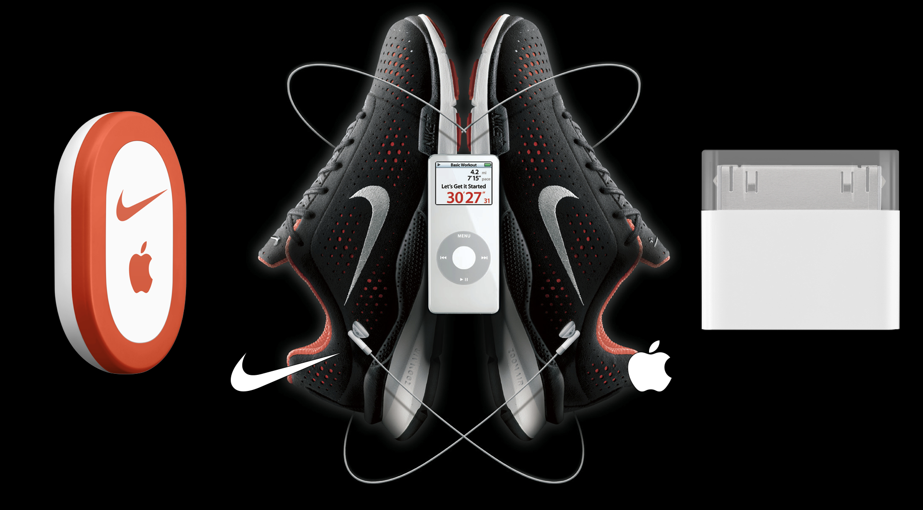
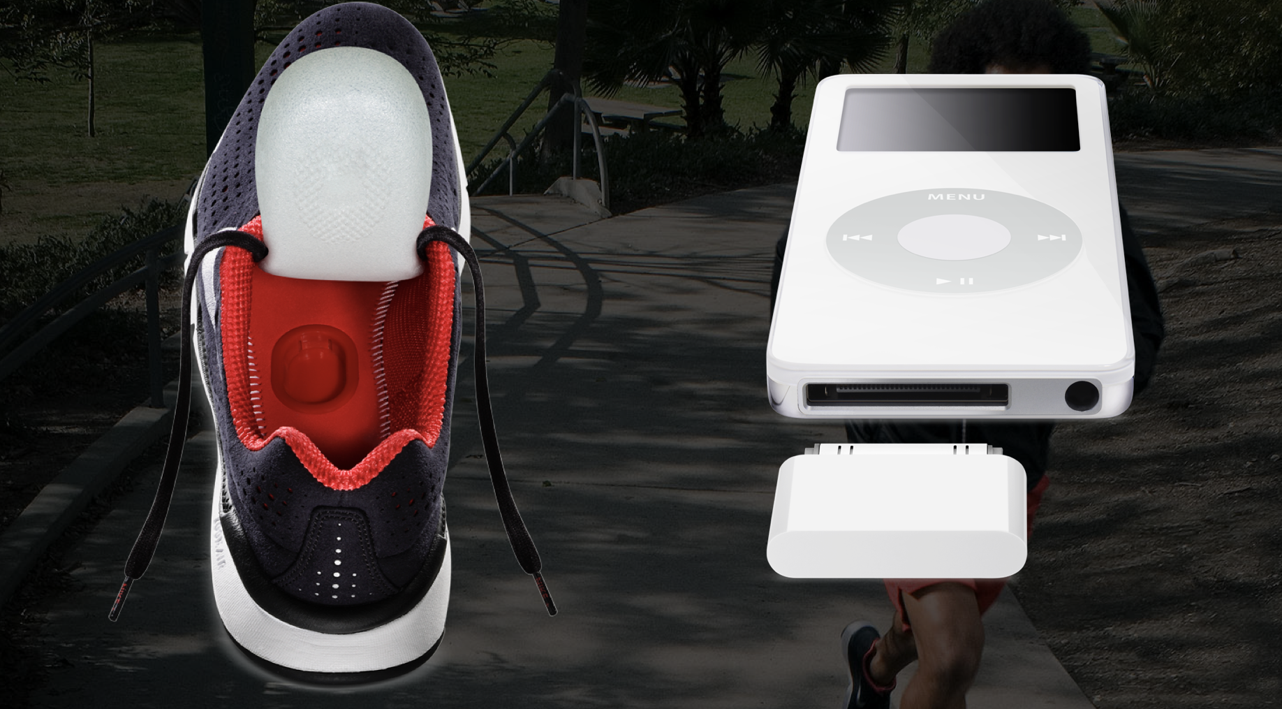
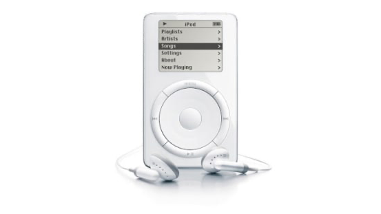
During the same period, when I had the honor to work on a project code-named ‘P2’, also known as project “purple,” which was Apple’s first iPhone, my design research inspired some of Apple’s most notable user-interface design work, which did not only win several patents but also became foundation GUI for the iPhone and the iPod nano and Nike+, which both were part of Apple’s early research and development for their “wearables.” Eventually, this work would inspire “dark mode,” the dark yet vibrant look & feel of the Apple Watch, and other exciting projects of the Apple eco-system.

Nike+
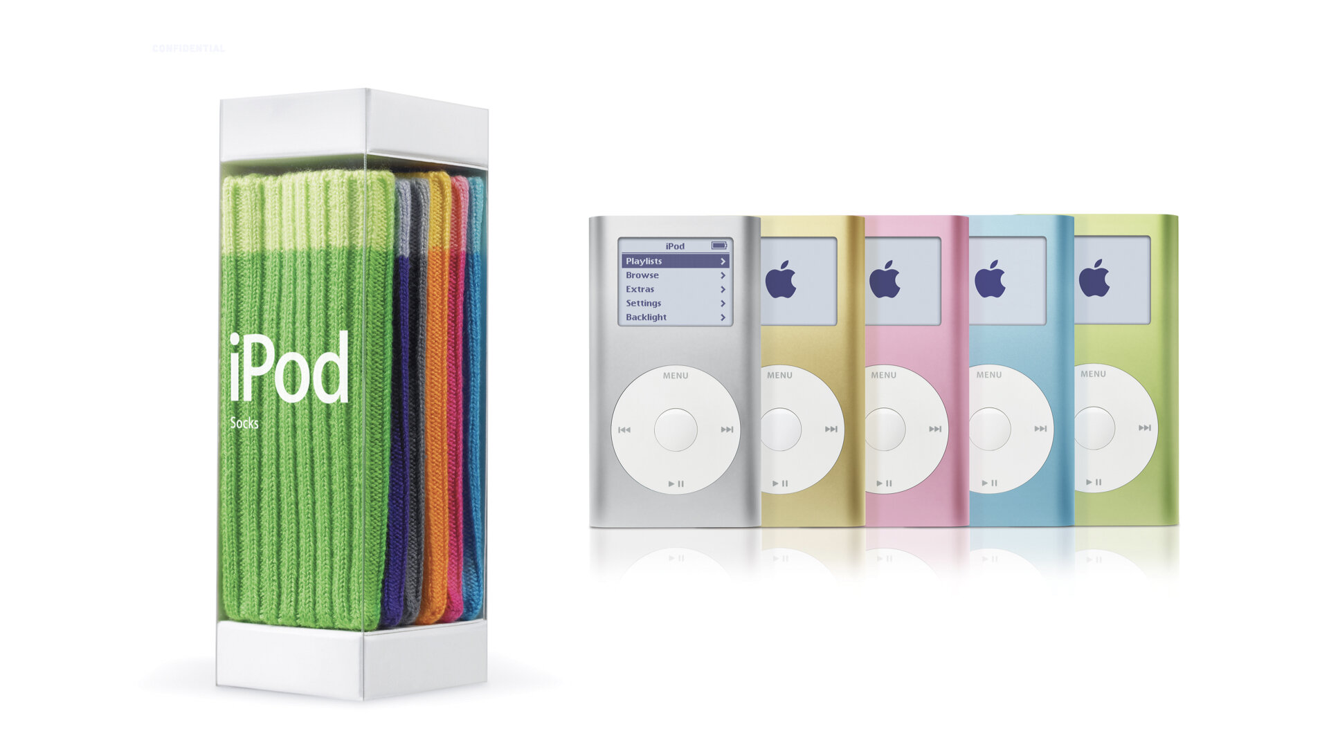
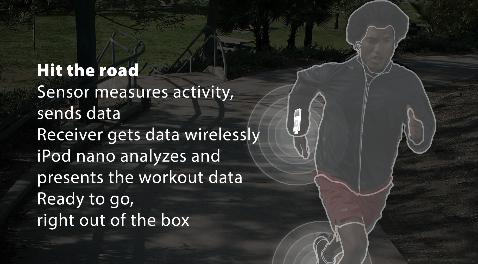
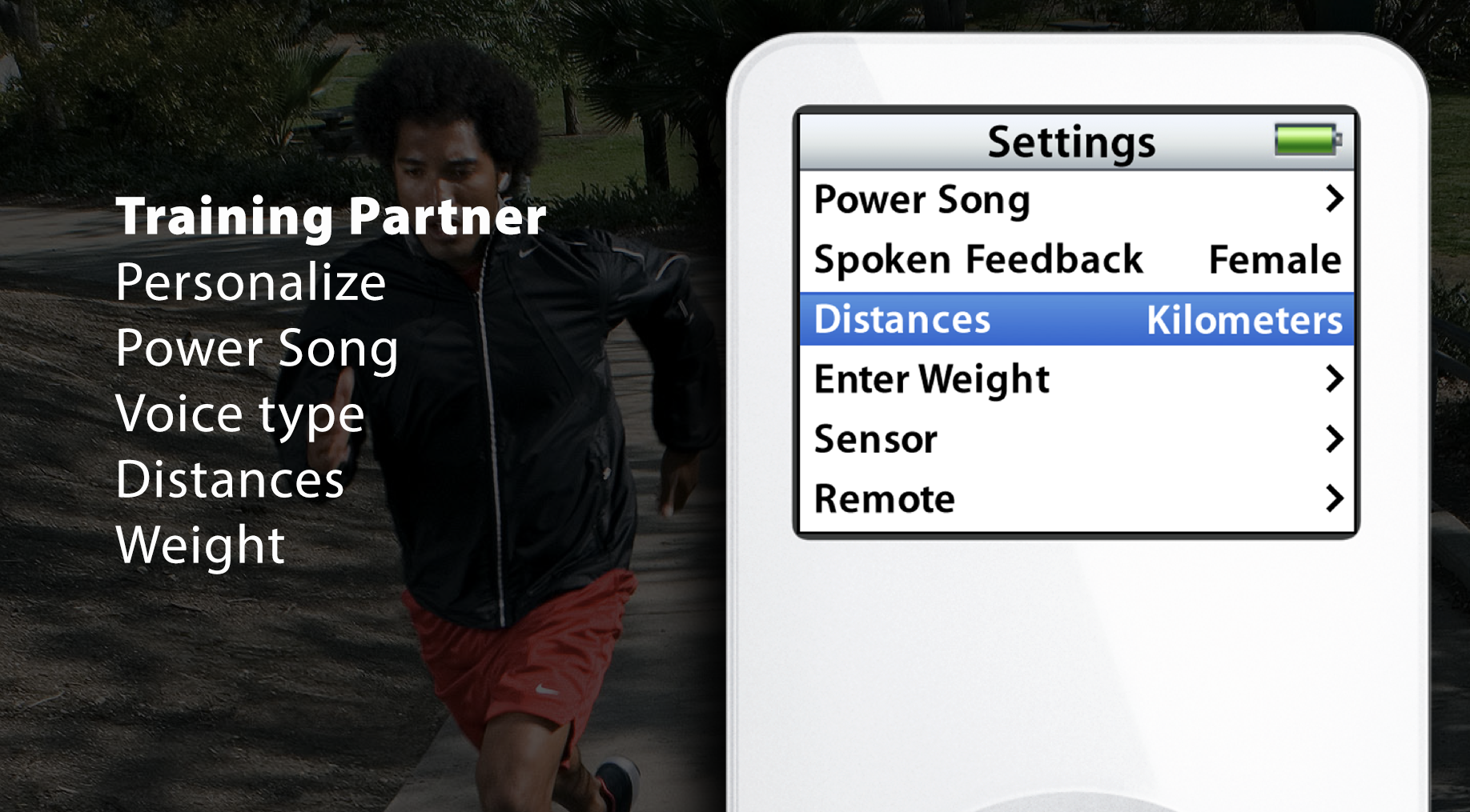
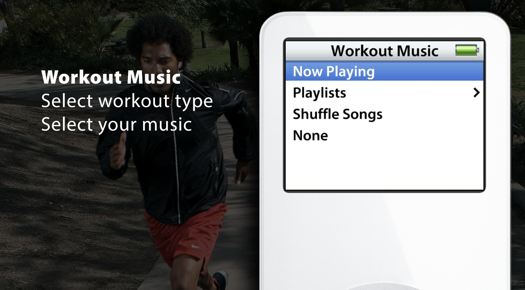
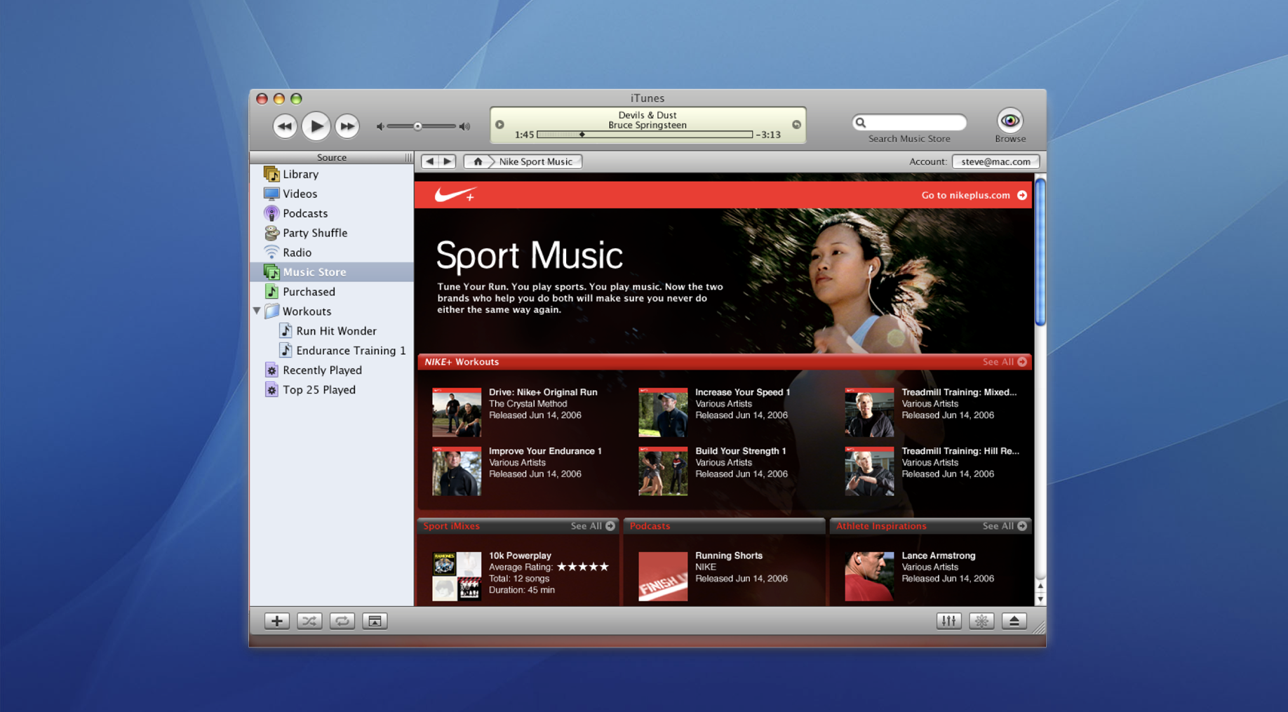
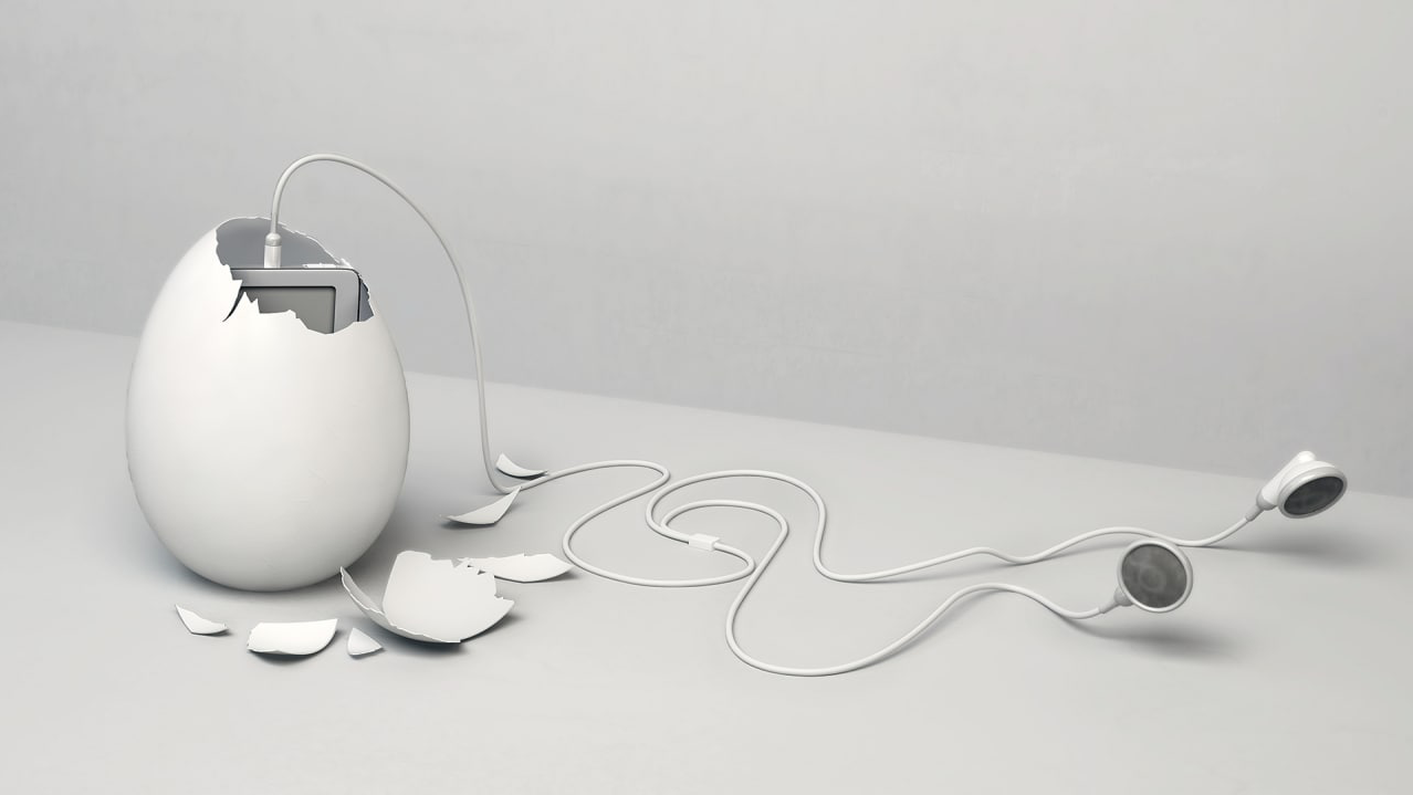
While doing R&D for the first iPhone, I was also part of another innovation R&D task force. We focused on future Apple health applications for a portable device and Nike’s technology. We explored and eventually implemented how Apple music (iTunes), the Apple iPod nano, Apple hardware, and Nike+ shoes would allow for a seamless and personalized fitness workflow.

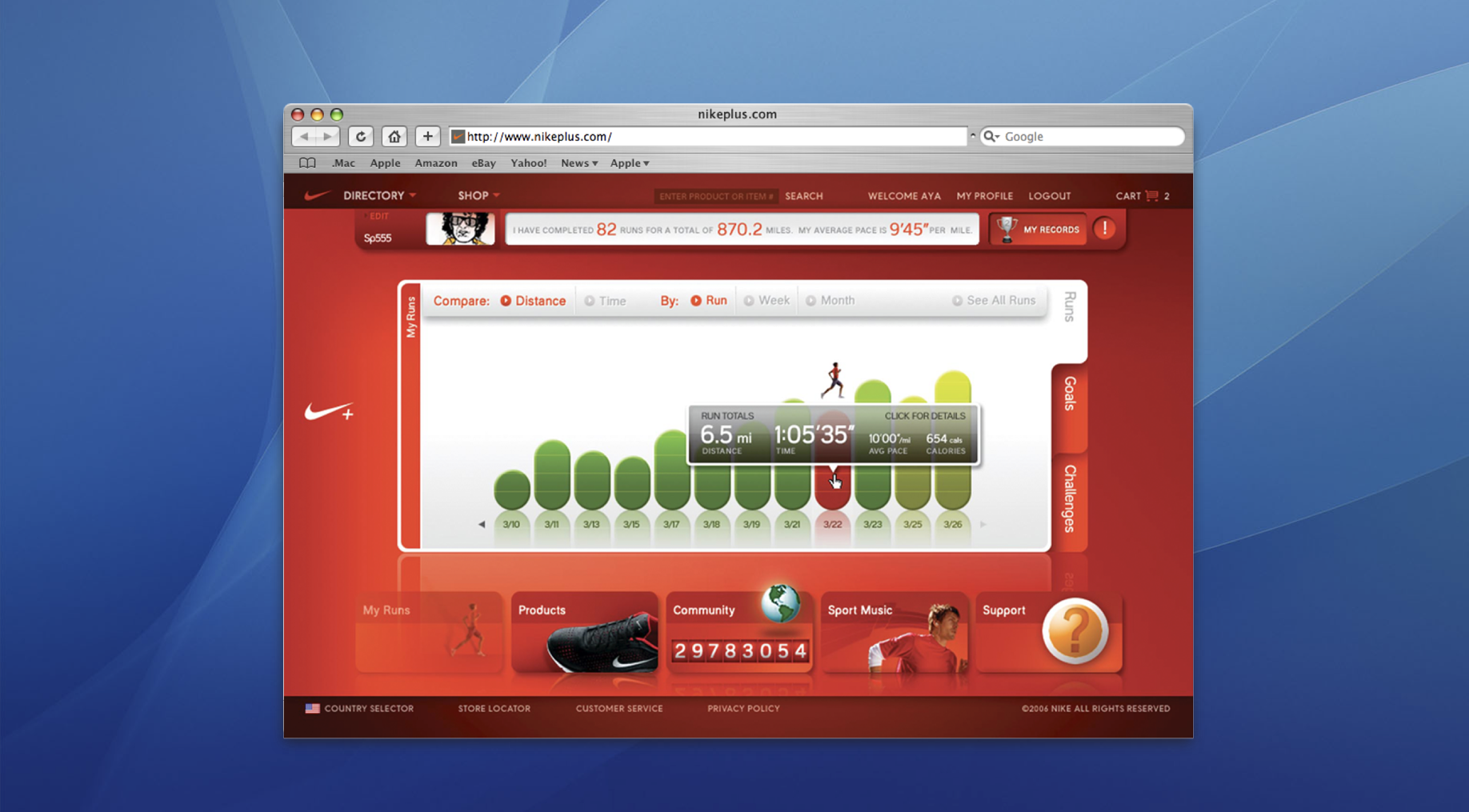
Quote from Vice Magazine Interview: Why I care so much about the future of design and everything else that comes after the iPhone.
“The iPhone — which is everything but a phone — is a fork in the road of humanity. Since its existence, people have been joining into becoming part of one organism and one large, digital neuron. This is beginning to make a dent in (our human) Universe. The iPhone is not just a digital assistant in our pocket, it shapes our environment: It drives about how we share rides, how we build cities, how we use energy, how we employ and pay people. The iPhone has been changing the face of the Earth in a way that has never happened before — since the invention of fire.”
—Abigail Brody (Vice)


The One Device
Odds are that as you read this, an iPhone is within reach. But before Steve Jobs introduced us to “the one device,” as he called it, a cell phone was merely what you used to make calls on the go. How did the iPhone transform our world and make Apple the most valuable company ever? Veteran technology journalist Brian Merchant reveals the inside story you won’t hear from Cupertino based on his exclusive interviews with the engineers, inventors and developers who guided every stage of the iPhone’s creation.
[…] It‘s a firsthand look at how the cutting-edge tech that makes the world work-touch screens, motion trackers, and even AI-made their way into our pockets. The One Device is a roadmap for design and engineering genius, an anthropology of the modern age, and an unprecedented view into one of the most secretive companies in history. This is the untold account, ten years in the making, of the device that changed everything.
Credits
Rarely comes an opportunity like the one I had at Apple, when being there at the right time, when Steve Jobs was still alive, and when I witnessed how the company transformed itself from almost bankrupt into one of the world’s most dominant players.
Because my team has been creating some of Apple’s most advanced designs in Apple’s professional applications design department, it was logical that Apple’s executive team looked for inspiration and creative input from my team.
While the entire iOS engineering and design production team was under the helm of Scott Forstall, Randy Ubillos and I was instrumentally defining some of the iPhone’s most recognizable and iconic elements today, down to minute details, such as the wallpaper (choice), use of large digitals on the lock screen and the home screen’s dock, as well as the dark mode.


