Apple ProKit
How Apple got its dark mode “look’ and professional look & feel
My role: individual contributor, creative director, and hiring manager, Apple Professional Applications
About
Most people take Apple’s much-copied look and feel, including its Finder, applications, and multi-touch interfaces that are either dark or light, colorful and dynamic, for granted. Little do today’s design trend seekers know that this much-coveted look and feel were created at Apple for its professional user base over a decade ago. It was only recently — with iOS 13 and macOS Catalina — and as of June 22, Big Sur, released for use to the broader public.
Here is the background story about why and how we pioneered Apple’s sophisticated and polished design system, especially ‘dark mode’ which began as “ProKit,” a bespoke design language for Apple’s post-production customer base.
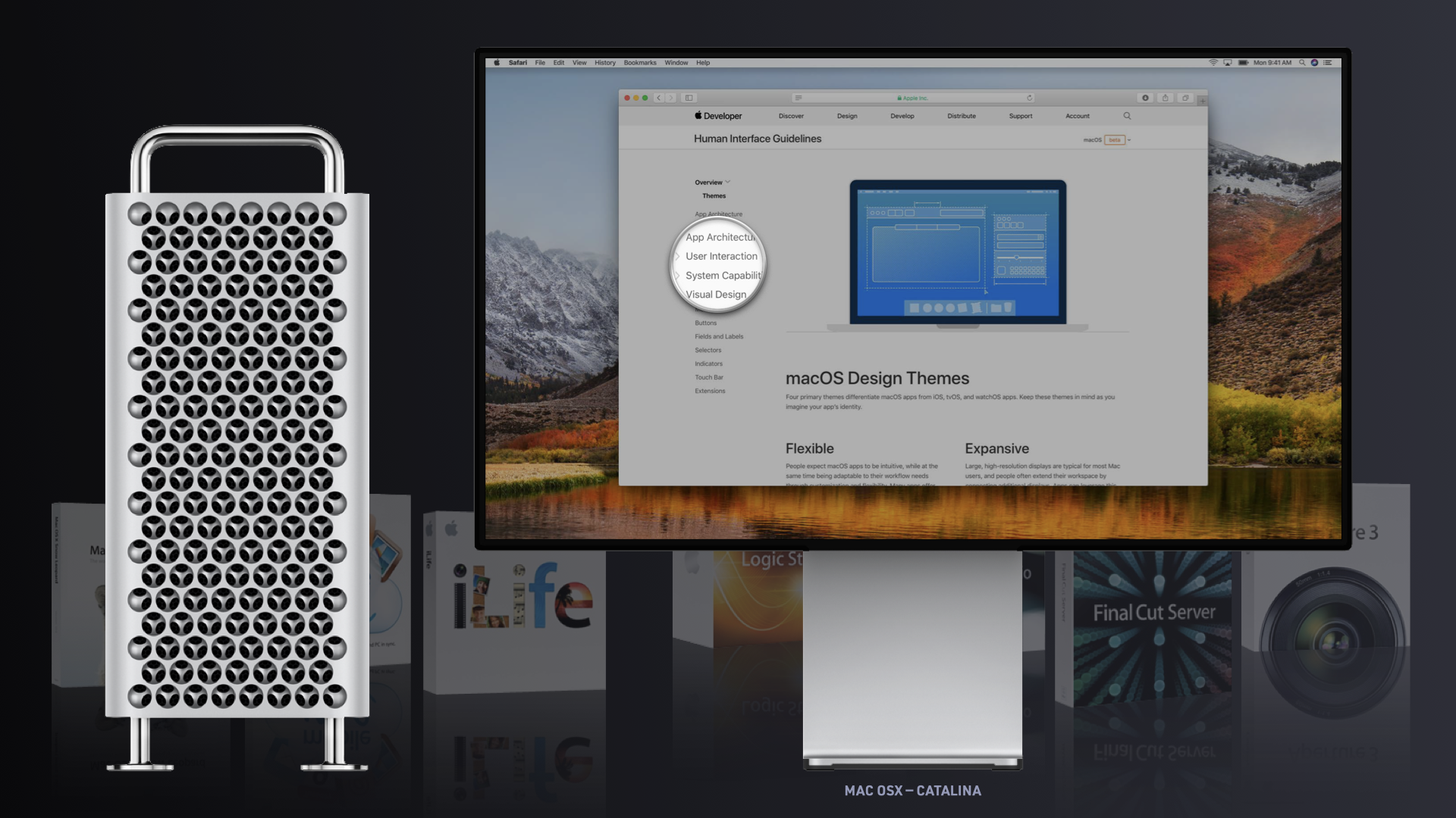
A design system is a collection of reusable components, such as buttons, controls, color palettes, typographic styles, layouts, use of imagery, tone of voice, and so on, guided by clear standards that can be assembled to build many applications. There can be very minute details that should be tracked by design guidelines, such as the direction of the light or the corner radius of buttons. This attention to detail adds polish and beauty, resulting in a cohesive system. Sometimes a design system is informed by brand guidelines and vice versa. While consistency is essential, one must allow for the constant evolution of a design system, which, much like a dictionary, can grow and expand its inventory over time. My team and I and our colleagues at systems engineering laid the foundation for what would later become the HIG (Apple’s Human Interface Guidelines). At Apple, we conceived the HIG for designers and engineers to enable them to create more compelling, intuitive, and beautiful experiences and design better apps.
At a glance
In 2020 the ‘dark look’ is en vogue and well-known. This was not the case over 19 years ago, when Apple was looking to enhance the user experience for film editors and composers using their software, such as FinalCut Pro, which they had acquired from Macromedia in 1998.
A glaring Issue
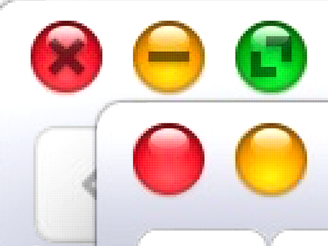
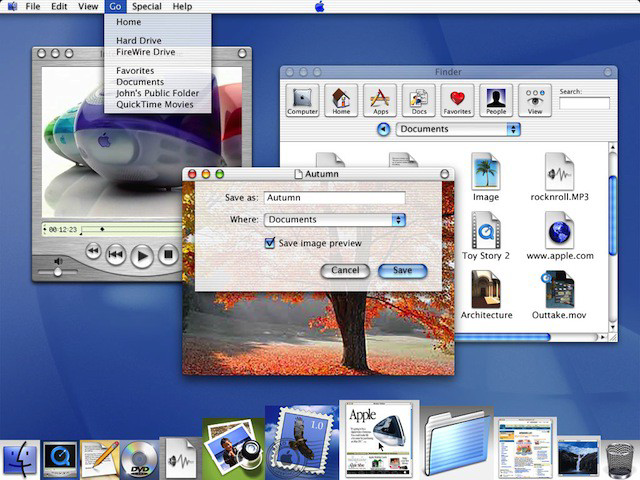
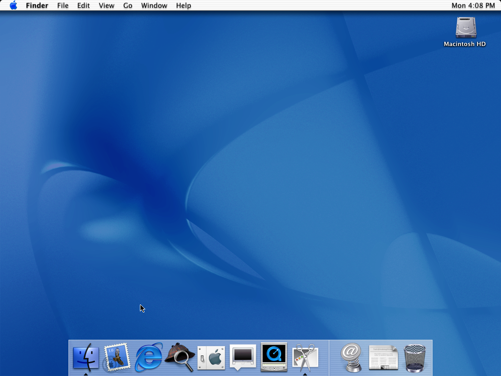
Aqua, Apple’s own user interface design system available via X-Code at the time, was too bright for professionals working in dark editing rooms. In the late 1990s, the world’s operating systems were plain and light gray, with boxy windows, sharp corners, and lots of lines, bevels, and other visual noise. Then, in 1998 Apple came out with the teardrop-shaped iMac. The iMac was a revolutionary internet computer without a floppy drive. It was encased in a semi-transparent plastic shell, a blue-green hue named after Australia’s Bondi Beach shoreline, combined with an ice-white pinstripe pattern; the color scheme created a stunning enclosure — unseen in the PC world. It was a big inspiration to our user interface design team at Apple. Steve soon would approve mockups of colorful, airy interfaces with see-through menus, soft edges, and round, organic buttons. The bright, light, and pin-striped dialog boxes and Bondi blue interface elements were delightful to look at, and you’d sometimes were indeed inclined to ‘lick the screen’ because of the gumdrop-like colors. Simultaneously, those user interface elements and their attributes turned out problematic for Apple’s very own plans in developing state-of-the-art photo, video, and audio applications, starting with integrating FinalCut Pro into its suite of tools.
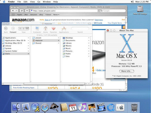
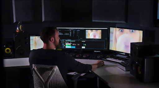
At the time, during the initial release of macOS X in March of 2001, Aqua’s consumer-friendly interface elements turned out to glaring, too big, and colorful on the computer screens in the dimmed editing rooms and studios of creatives like Walter Murch (world-renowned video editor) and Annie Leibovitz (world-renowned photographer ). Their only interest is the content (photo or film clip) and the effects of edits to it. Therefore, we had to develop a visual design strategy to address this concern and other issues. This was when we devised Apple’s proprietary framework and design system, ‘ProKit.’ While maintaining all of Apple’s familiar design patterns, modules, components, and controls and adding a lot of innovation to professional applications and consumer products, we crafted an innovative solution. ProKit did introduce not only Apple’s dark look but also many distinct aspects of macOS X’s more mature design, including elements such as a subdued color palette, shapes, layout, typography, etc., as well as the behavior of dynamic features such as patterns, heads-up displays (‘HUDs’), fullscreen screen view, buttons and menus (the ‘feel’).
Dark Mode
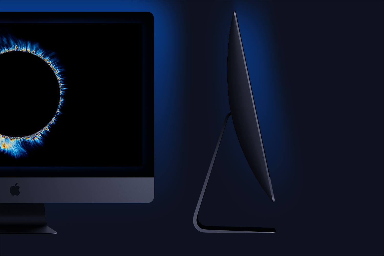
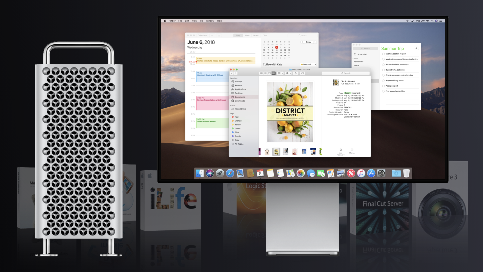
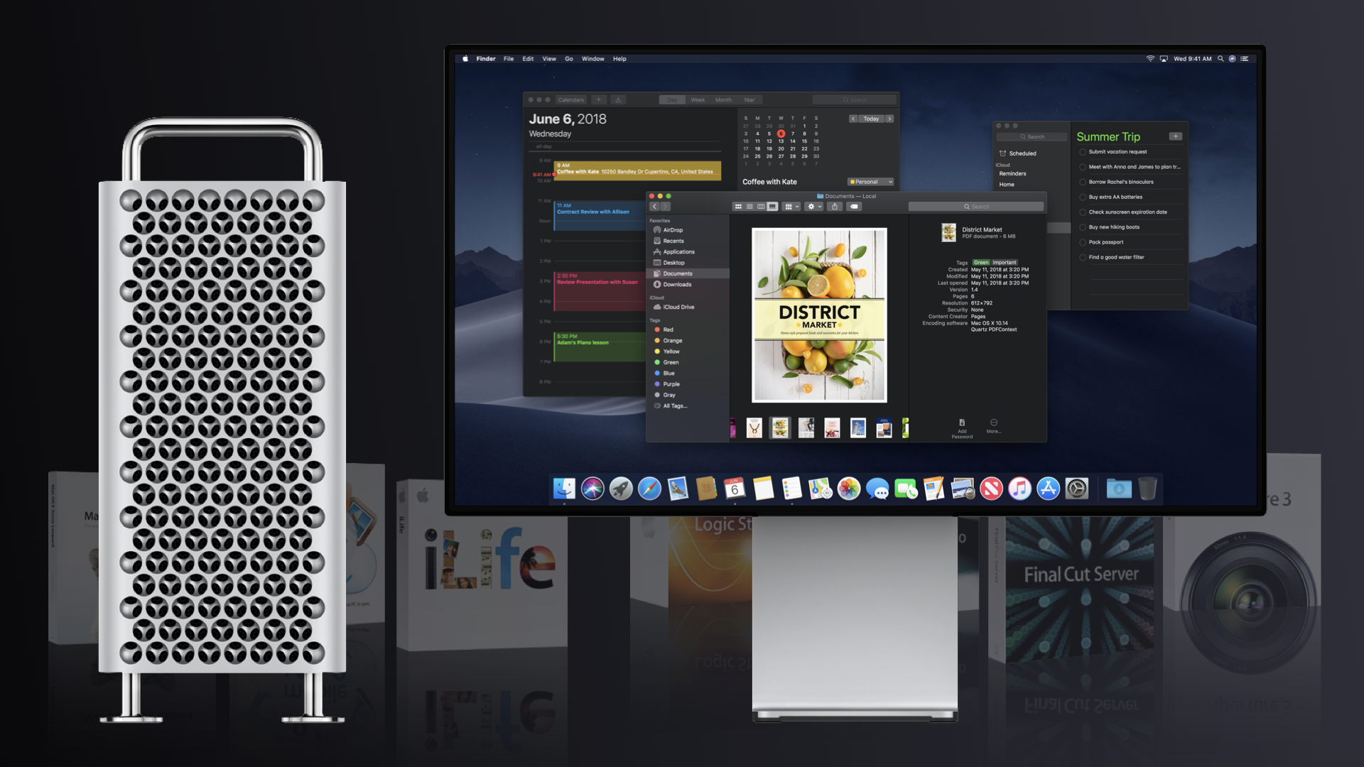
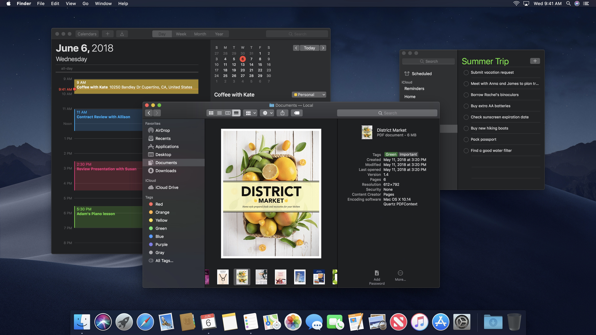
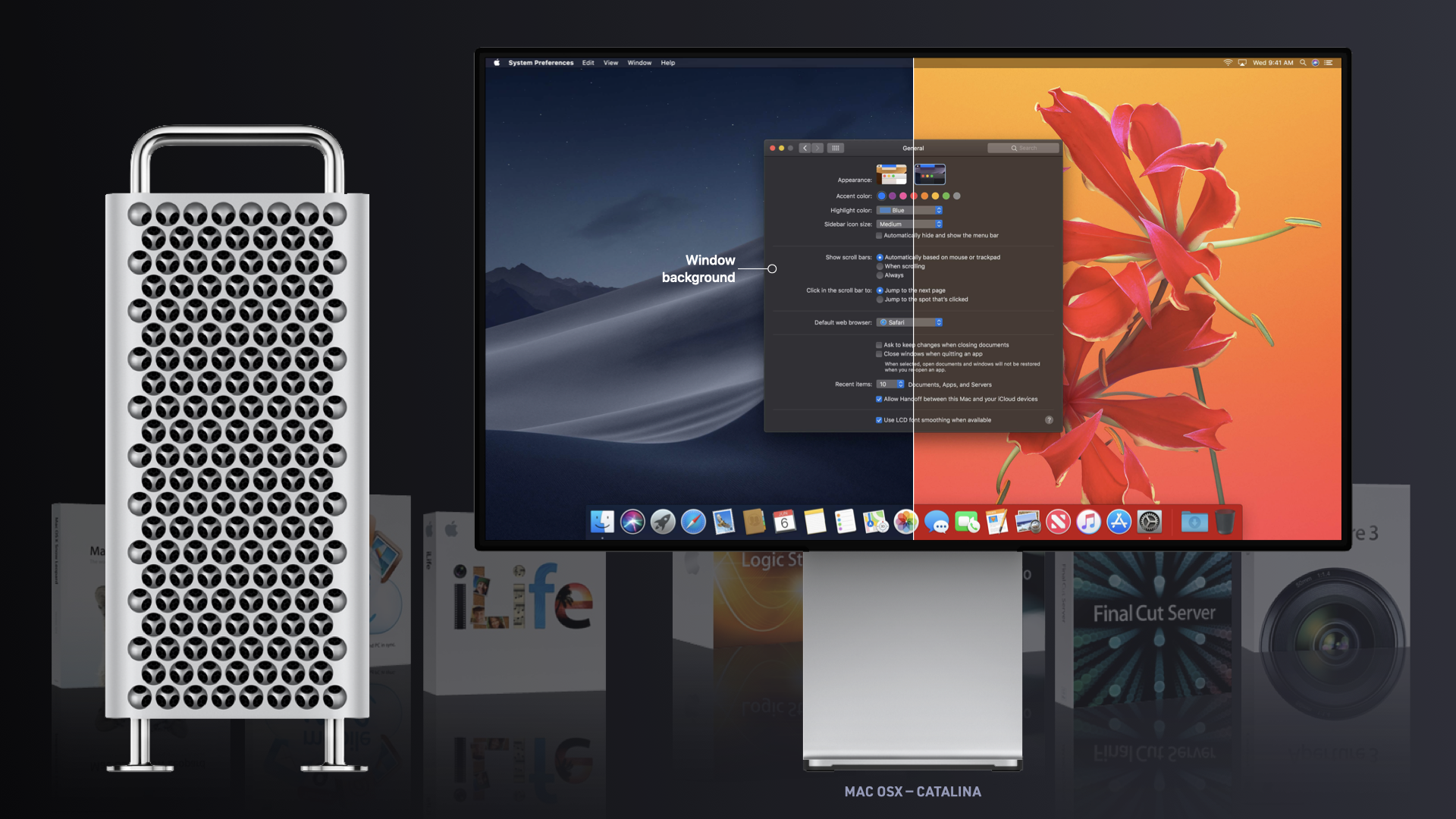
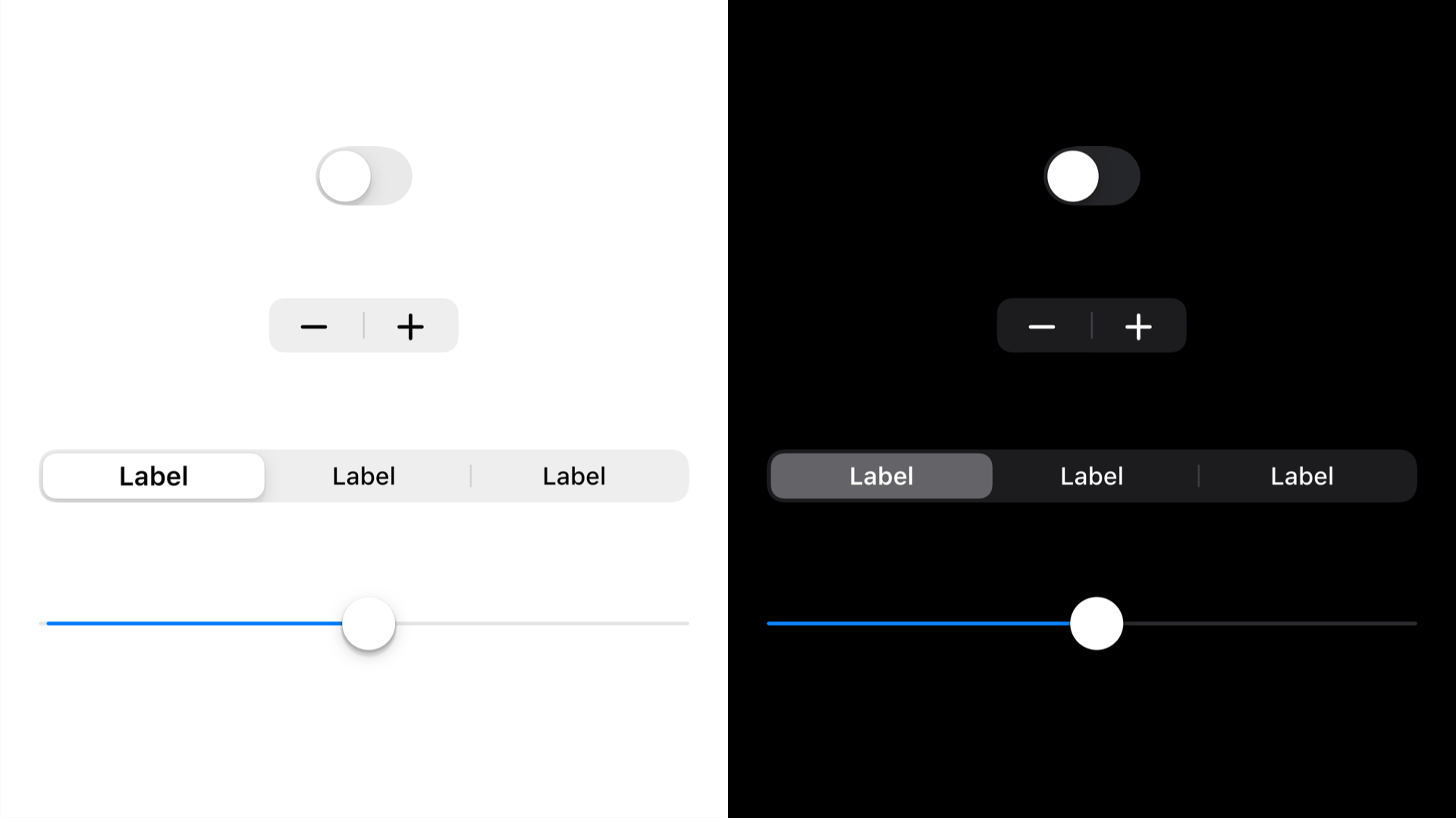
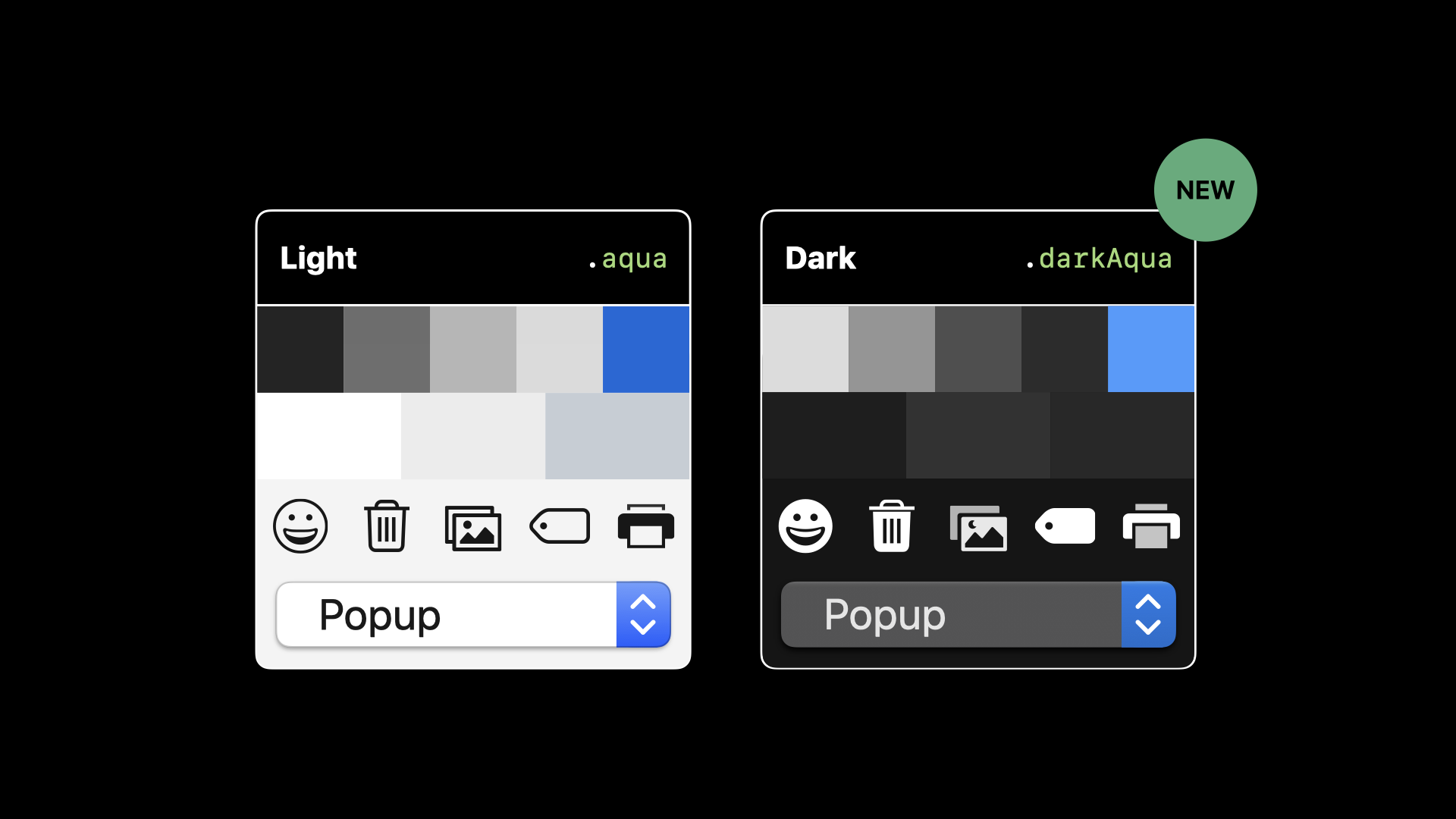
Apple’s current website mentions that its ‘new’ Dark Mode option gives iOS 13 and apps a beautiful dark color scheme. “Perfect for low-light environments, Dark Mode is easier on your eyes and won’t disturb people around you.”
A look & feel that never gets old.
Apple’s current website mentions that its ‘new’ Dark Mode option gives iOS 13 and apps a beautiful dark color scheme. “Perfect for low-light environments, Dark Mode is easier on your eyes and won’t disturb people around you.”
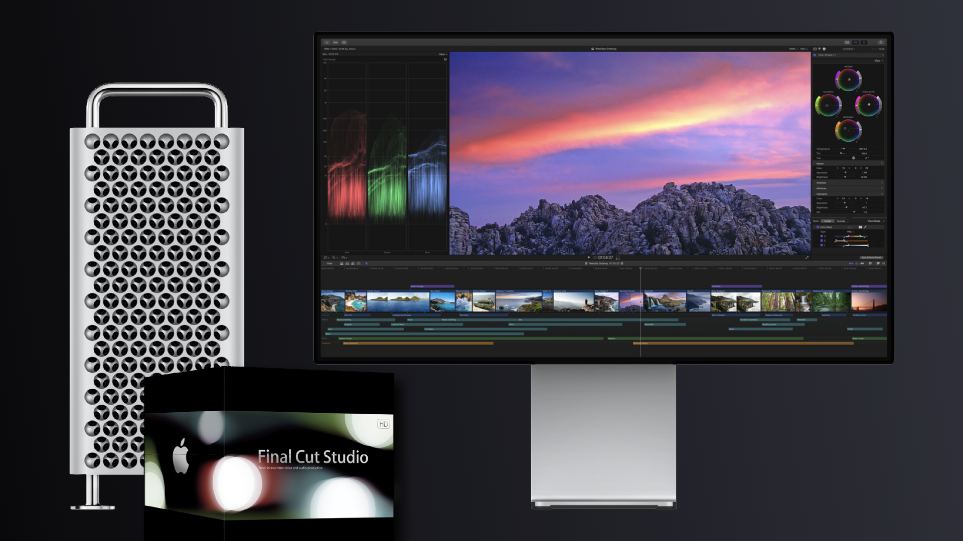
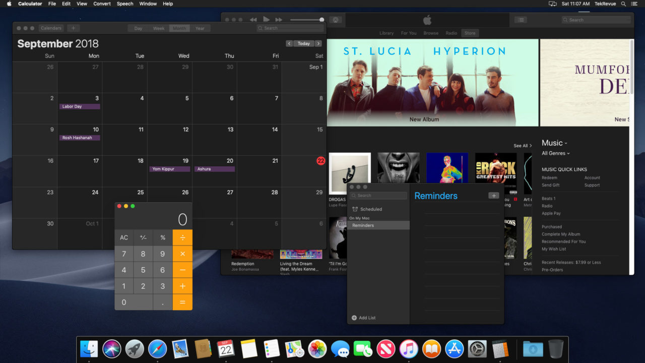
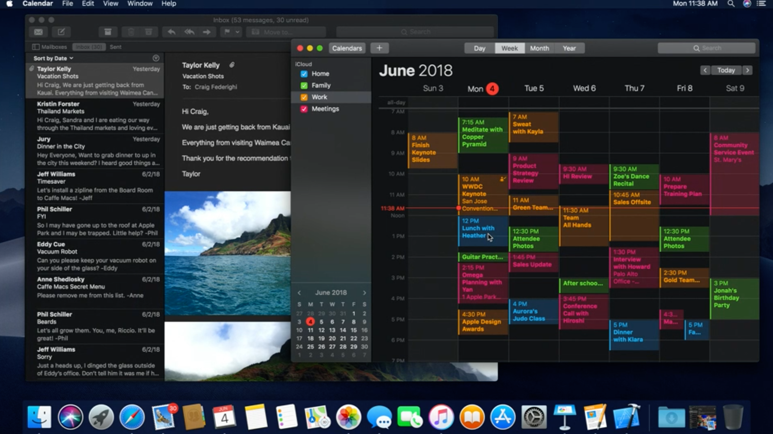
Also Apple’s OS sports its Dark Mode all over as a preference in addition to the appearance of FinalCut X, Logic and other applications that were originally designed and inspired by ProKit.
The Challenge
Problem
When Apple acquired FinalCut Pro in the late 1990s, it was an already well-adopted software among specialists. Still, it did not offer the same experience as Apple’s easy-to-use family of products and its newly launched Unix-based system macOS X. Aside from visually ‘clashing’ with Apple’s Finder and other Desktop apps, which were recently presented to the world as ‘Aqua’ and, with each release, dubbed after a big cat, the biggest problem that FinalCut Pro’s user interface presented to its users was, the relative brightness of its controls, especially in a dark, windowless editing room.
Solution
To address these ‘glaring’ user interface issues, we created an entirely new design system and -language that did not exist before. We had to start from scratch because Apple’s own developer kit did not have the much-needed smaller and darker user interface elements that we eventually created. There was a unique opportunity not only to rewrite the underlying code but redesign the entire user interface. Apple was lucky because we created a design language that was visually more subdued. Everyone at Apple, including Steve Jobs, recognized that it was highly sophisticated and polished. Eventually, this look would take the world by storm.
Go back to previous
Before and After
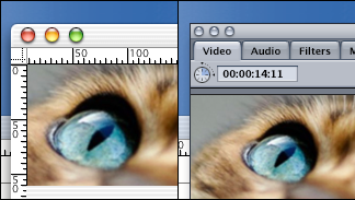
Apple’s “classic” graphic interface design from the late 1990s looks very anachronistic today. However, it took the newly founded applications division’s efforts that create innovative designs and textures for the Quicktime Video player and the professional applications (Final Cut Pro) to introduce the new design language “Aqua,” which would change computer interfaces forever.
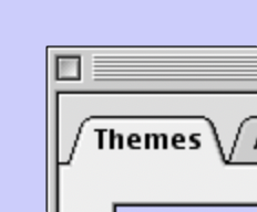
Aqua was a huge leap over the classic MacOS’ Platinum appearance (left) and was far richer than anything on Windows at the time. It felt alive, with subtly pulsating buttons and progress bars that looked like they were some sort of modern-day barber poles turned on their sides.
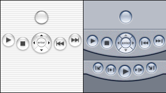
Pictured: Final Cut Pro User Interface Elements — Transportation Controls — at the time of Apple’s acquisition of Final Cut Pro from Macromedia and before the redesign. After Apple acquired Final Cut, we needed to create a new look and feel and more attractive user interface elements.
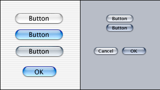
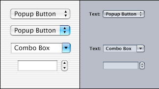
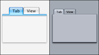
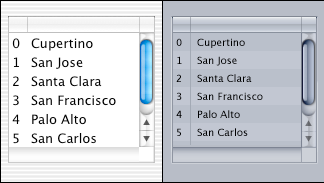
We created the same type of controls; however, by reducing the severe contrast and introducing natural materials resembling brushed metal and plastic, we introduced a new aesthetic to Apple, which influenced many of Apple’s future look and feel.

Design Criteria & Patent
- Define a New Look and Feel for Apple’s Pro Product Suites
- Ensure Visual Consistency with Apple’s existing macOS
- Support Color Adjustment needs with a Color-neutral UI
- Slider or Settings to adjust Luminosity of the interface
- Proportional Sizing of User Interface Elements
- Visual User Feedback through Rollovers and Non-distracting Animations
Pictured above: we developed a darker, more compact set of elements, all based on Apple’s Aqua macOS X Human Interface guidelines, which we eventually informed with our own bespoke look and feel that would not only solve the ‘glaring’ problem but also result in a very sophisticated look and feel.
Patent Nº 8341542: To allow users to compensate for different and dynamically changing lighting conditions, the present invention introduces a graphical user interface shading system. The graphical user interface shading system provides a very simple intuitive interface to the user. In one embodiment, the user is presented with an adjustable user interface widget such as a slider that allows the user to select any shading setting along a shading continuum. The graphical user interface shading system reacts to the users control by adjusting a number of different graphical user interface elements in response to the new shading setting. In one embodiment, the graphical user interface shading system adjusts singled colored areas with a linear interpolation, text with a font color selection, icons with an icon bitmap selection, textured areas with a texture blend, and decals with a decal blend.
How we created ProKit’s Look & Feel
Applying the principles of clarity, deference, and depth, we created a crisp, beautiful interface system that would help people focus mostly on their content (material) while never competing with it. We made sure that content filled the entire screen through the newly conceived ‘full-screen’ view and other innovative ways hiding mostly vertical user interface elements, while translucency and blurring often hinted at more. Any ‘hidden’ feature could be easily accessed through progressive disclosure or keyboard shortcuts, the former common among prosumers and the latter common for professionals. Minimal use of bezels, gradients and drop shadows kept the interface light and airy while ensuring that content was always paramount. Simultaneously, a brushed ‘metal finish’ and distinct ‘transport’ controls introduced a very sophisticated and distinctive look for Apple. When we created such visual hallmarks of Apple’s ProApps’ design language deliberately, these interface’s design would perform like a carmaker’s design known for both performance and its distinct, recognizable design language. For instance, at first glance, a BMW. Thanks to its striking face, a BMW is recognizable at first glance: two kidney-shaped air intakes — the grille — with the blue-white BMW emblem above. Like the ‘ultimate driving machine,’ everyone would always recognize Apple’s product from a distance — depicted on a billboard. Distinct visual layers, vibrant color-coded film clips, and realistic motion conveyed hierarchy, impart vitality, and facilitated understanding. Discoverability via progressive disclosure (or keyboard shortcuts) heightened delight and enabled access to functionality and additional content without losing context. Transitions provided a sense of depth as users navigated through content. We did our homework through extensive R&D, both by having the professional experience firsthand — not only by assuming the role of film editors and photographers ourselves but also by shadowing world-class professionals during their typical workdays on the go and in their studio(s). We set up our own ‘lab,’ where we would get our hands on every conceivable piece of software, device, cameras, printers, and gear — a habit that I have been keeping up with ever since I have been an executive design leader. We performed in-depth audits of all available industry-standard tools and workflows, including taking stock of all of Apple’s very own hardware and software inventory available to date. While studying Apple’s existing user interface guidelines very carefully, we initially created a mock-up for one of Apple’s first yet be-released-professional applications, DVD-Studio Pro, while using Apple’s existing developer tools and elements. It became clear very quickly that the current Aqua GUI was too bright, large, and busy — with all the GUI’s pin-stripes all over its bright-white dialogues and alerts, Aqua was unfortunately useless for any of Apple’s future professional applications.
Yet, there were still many good reasons why it was prudent for us to follow Apple’s existing Human Interface Guidelines. For example, following the ‘direction’ or ‘angle’ of the light source when rendering an interface’s material, such as drop shadows cast beneath a window, has always been a 90° angle in Apple’s case. This way, our ProApps would blend well with the Desktop and other apps, including Mail or Safari. Well-established patterns and principles, such as the use of a grid, alignment, label conventions, legible text of every size, precise and lucid icons, subtle and appropriate adornments, and a sharpened focus on functionality, which all have been all essential to the success of our ProKit design language, and so has negative space, and so on. However, we were very deliberate with both a more compact layout and the introduction of a much darker appearance. We accomplished this by creating ‘HUDs’ (Heads Up Displays) and neutral shades of gray for windows and backgrounds in favor of tinted grays. This ensured proper color-correction for users when editing content and also made content, and jewel-like color-coding of user interface elements, such as film clips or soundwaves, etc., stand out better. We also guided interactivity. With both ProKit and the creation of each professional application, we created an entirely new, proprietary look & feel for Apple that would, on the one hand, address all requirements of the professional user (i.e., progressive disclosure, a transparent user interface, etc.) while on the other hand maintaining all of Apple’s familiar design patterns, modules components, and controls.
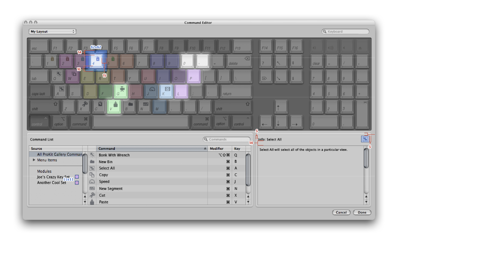
ProKit’s sophisticated look and feel eventually and gradually entirely took over the entire Apple operating system and was ultimately released with Mountain Lion, albeit many features and visual attributes were introduced sooner. This was an iterative process; with each new release of macOS and cross-pollination between the teams, Apple would benefit from this massive innovation directly coming from the professional applications team. Notable updates included not only the overall look and feel (more compact, flatter, and darker), the behavior of dynamic elements and patterns, such as heads-up displays (‘HUDs’), the fullscreen screen view, buttons, and menus (the ‘feel’), but truly the dark mode look, which has been finally introduced with iOS 13 and also with macOS Catalina. ProKit has also been a significant influence in creating Apple’s first version of iOS when the first iPhone was developed.
Focus on what matters
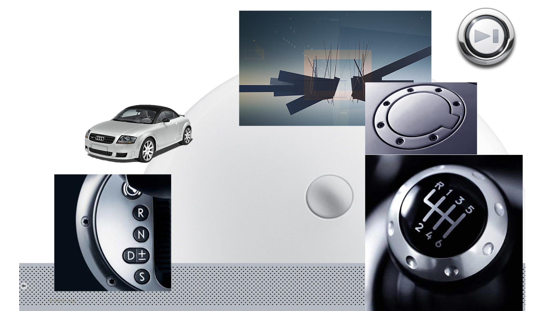
We got our inspiration from transportation design: on a car’s dashboard, you always and only notice what’s important, so you focus on what you see through the windshield, getting you safely from A to B. While the majority of an app’s interface should be ‘invisible,’ users benefit from interface elements that stand out — as needed only.
The dark look and feel of ProKit turned out useful, especially for music editing, because the UI gives useful feedback to users (VU meters). Only what matters is glowing — in the dark — in a literal sense.
From hardware to software
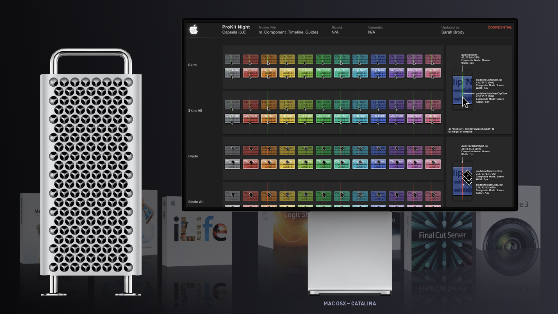
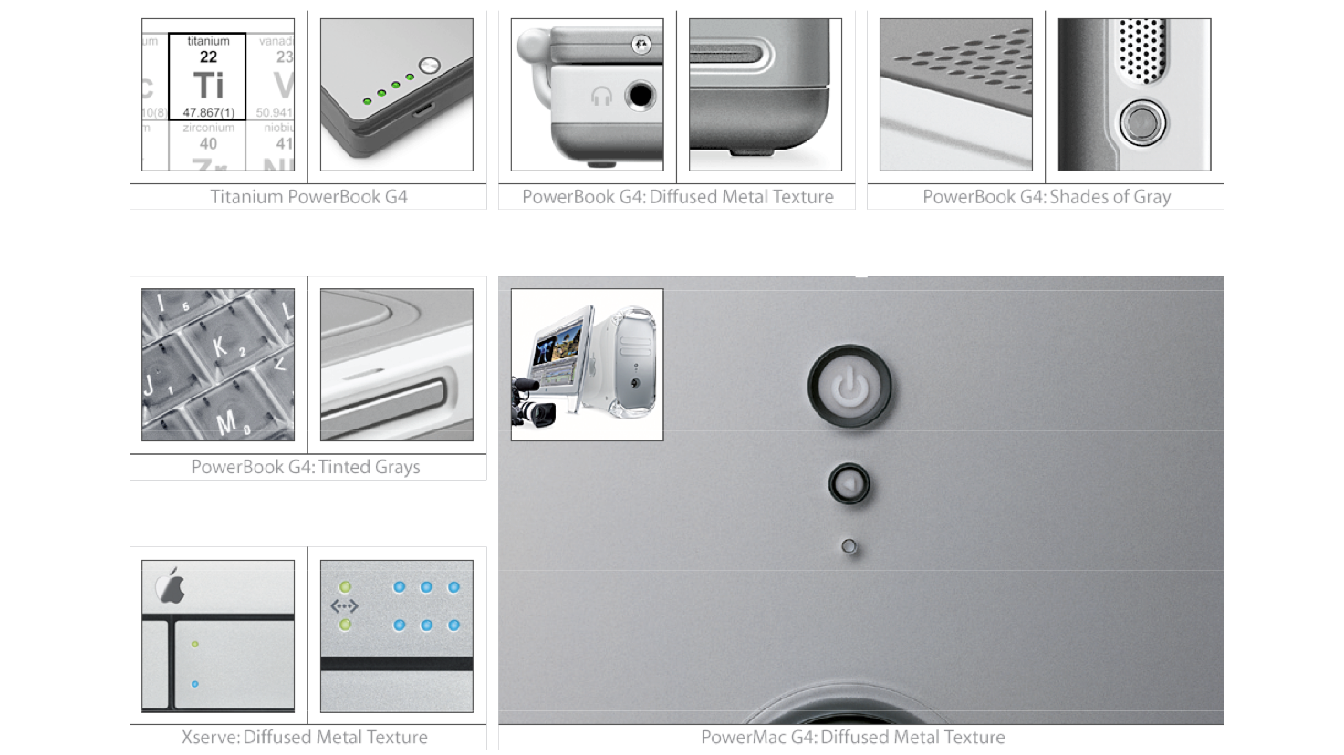
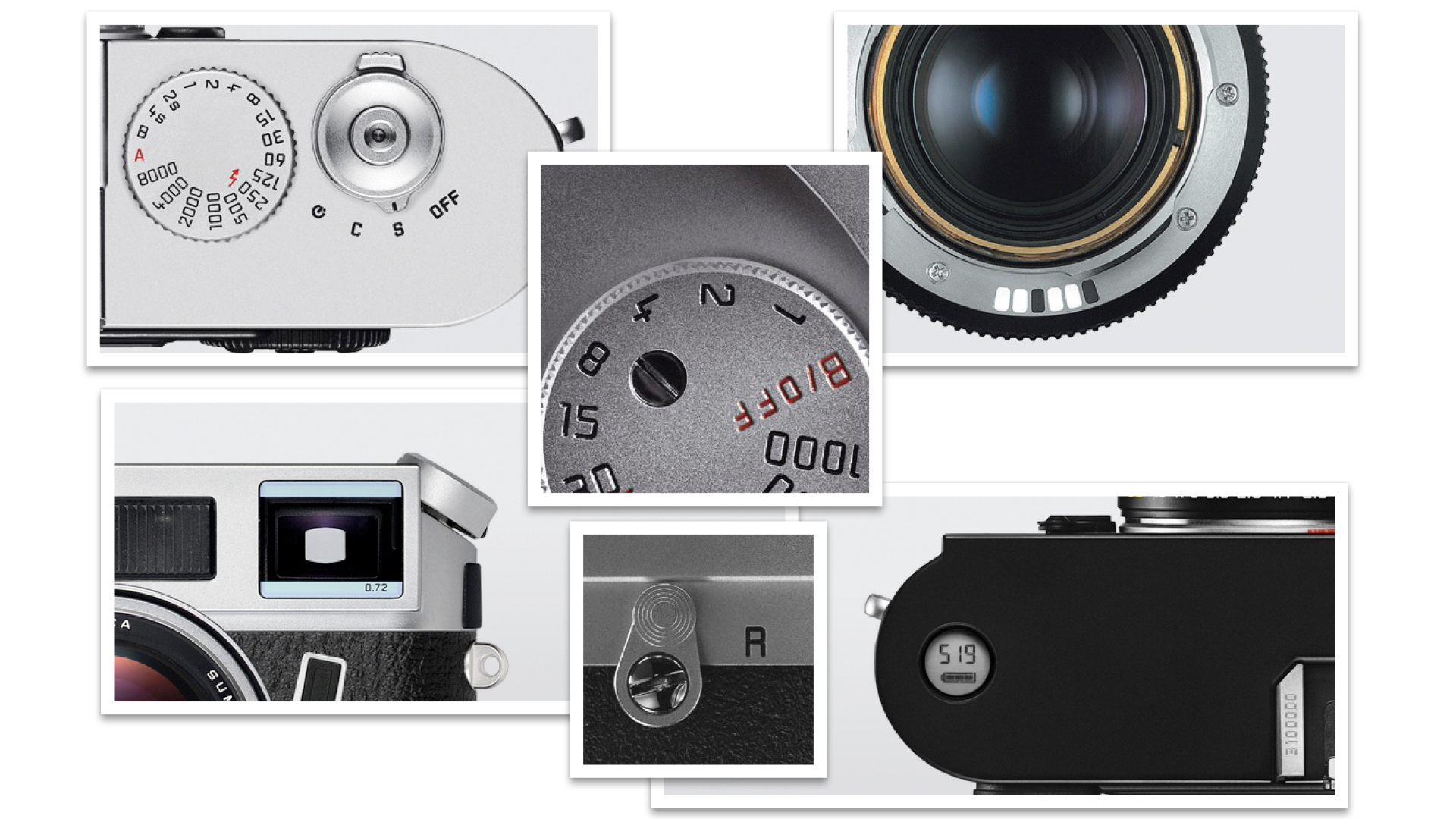
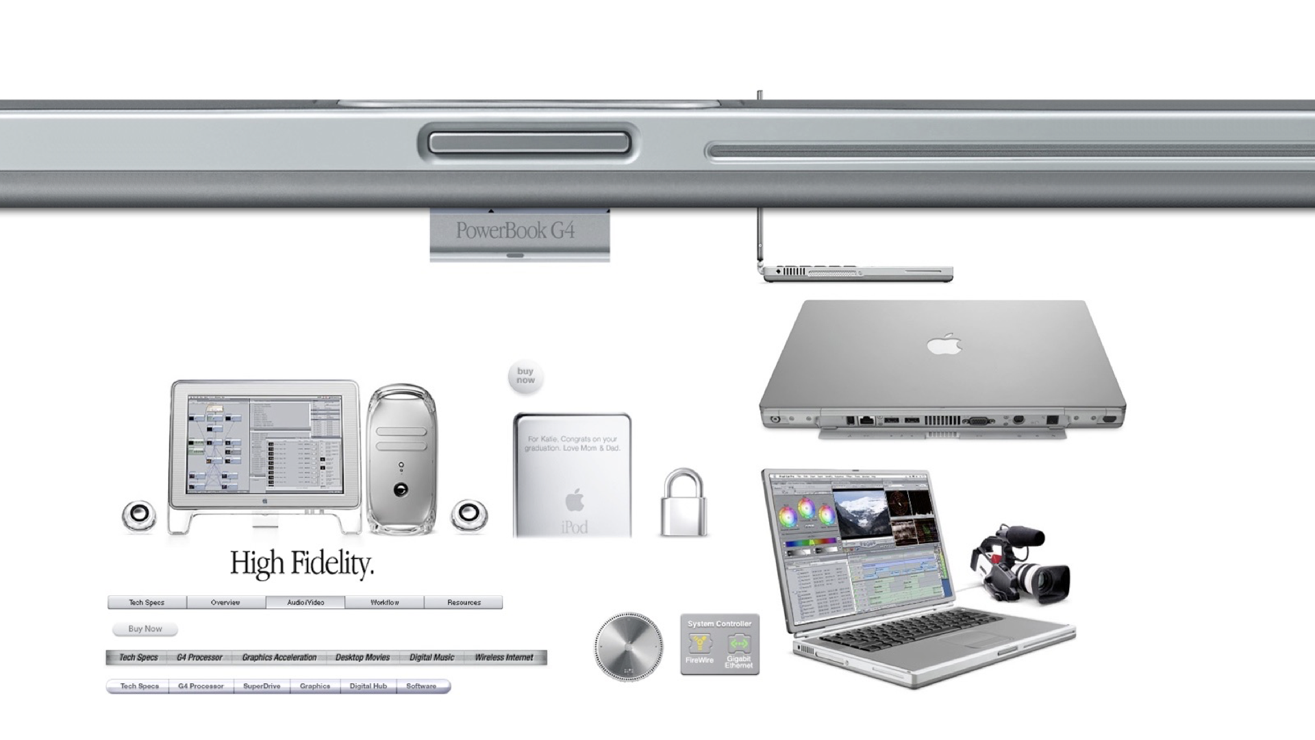
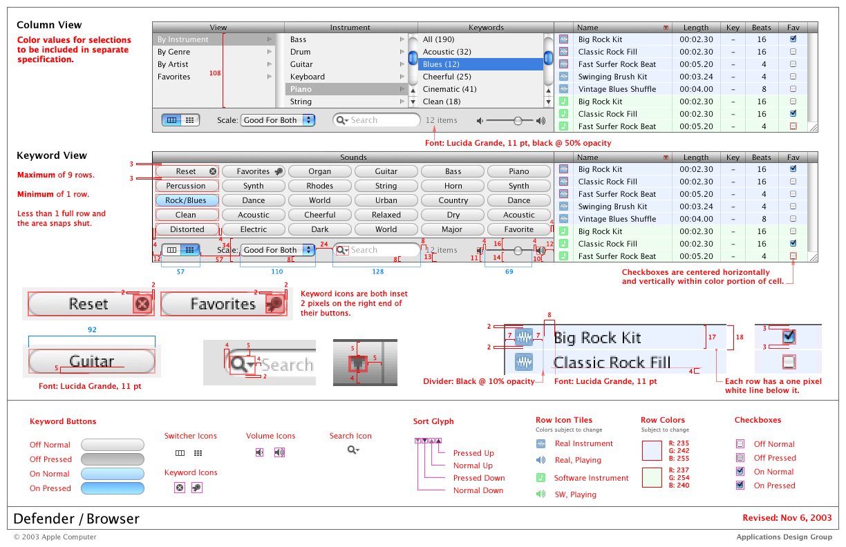
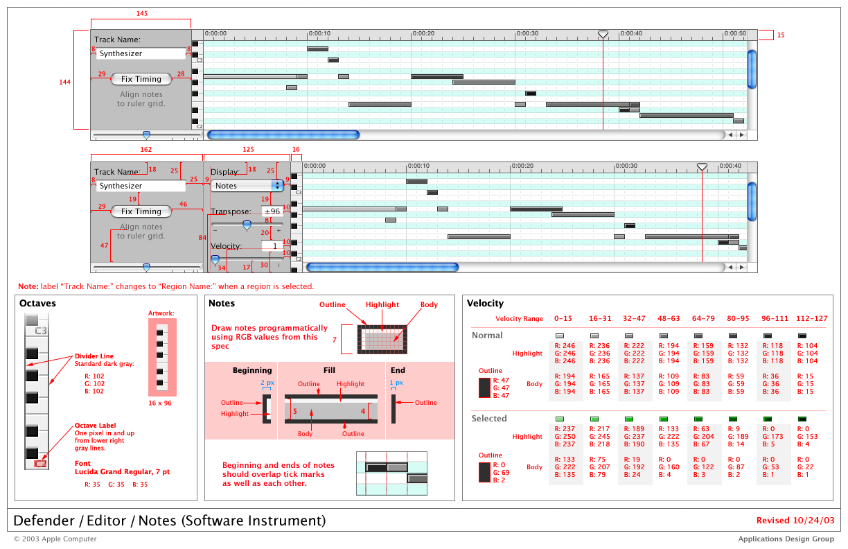
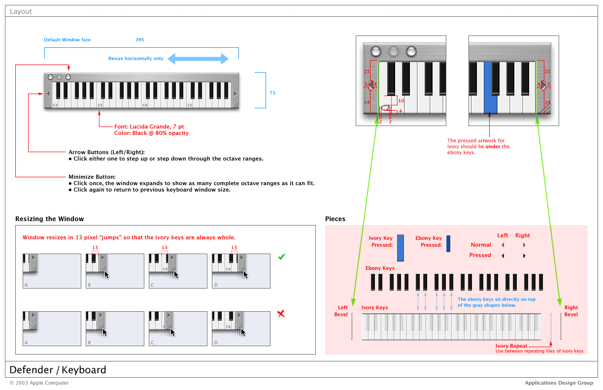
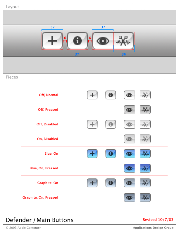
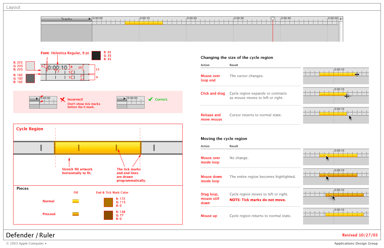
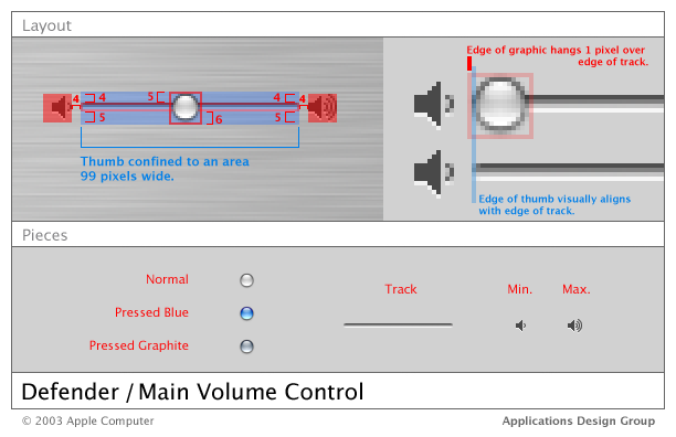
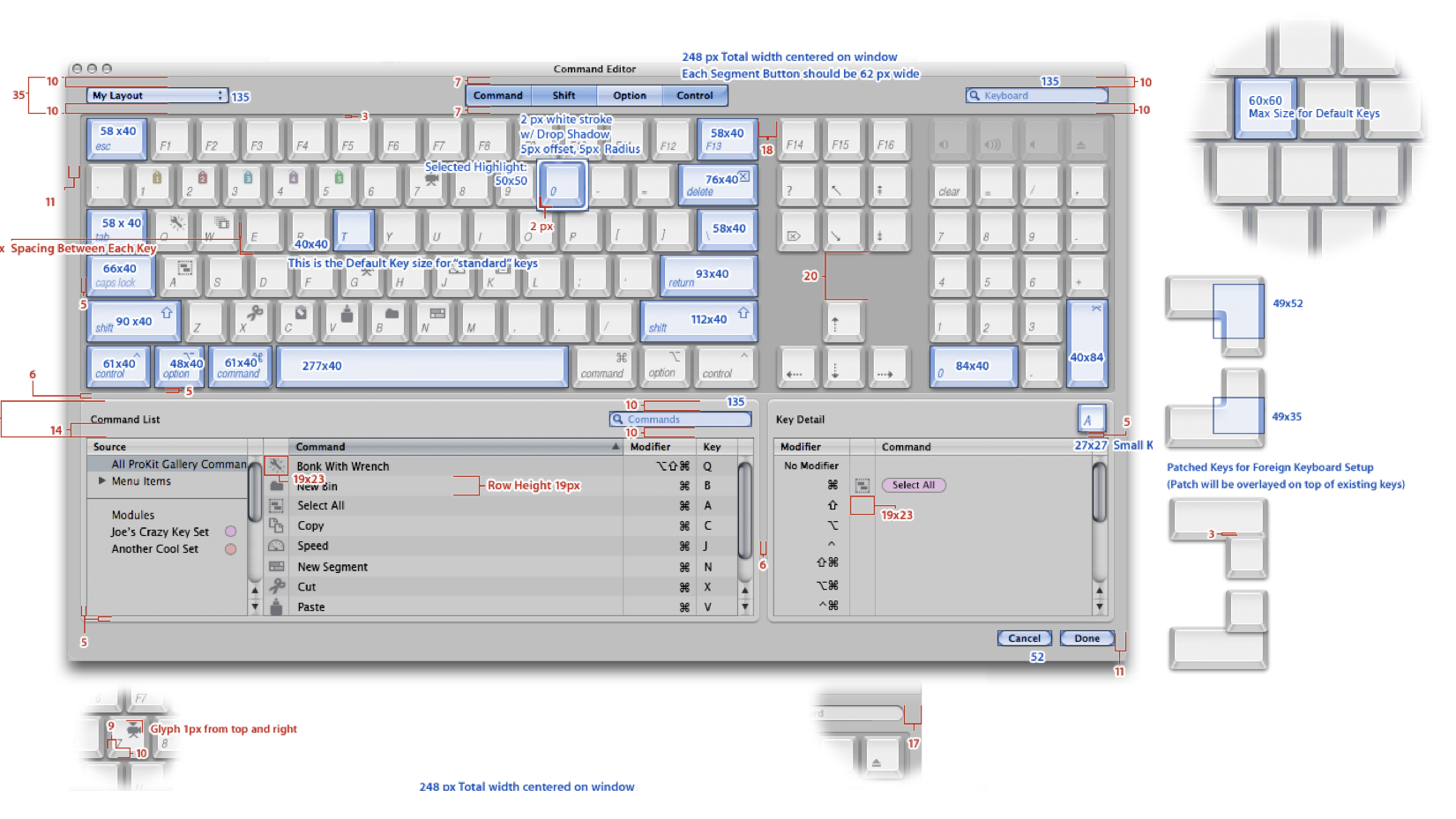
To bridge the gap between the hardware and software, we took visual cues from materials, textures, other attributes of Apple’s hardware, and different popular industrial designs, such as transportation design and cameras from Leica and Nikon. Our team was the first in the entire company and possibly in the world to use “red lines” (see below) to create detailed specifications for the placement and layout of elements.
When using color
Test the hues for suitability in OS Generally, and the spectrum is a great base palette (12 Hues). Tip: test mostly red, green, yellows, and blues to ensure suitability for OS users). Focus on Neutrals (Black/ White/ Gray) for the brand, and the entire spectrum uses spectrum hues derived from light (not pigments) for OS. Focus on essential “elements” of nature, air, water, light/energy (fire), and earth/metal/ green/life, perhaps bioluminescent colors, which are all very vibrant and beautiful. Use Tones (add Gray), Tints (Add White), and Shades (Add Black) and use Gradients for more variation and depth in OS and also for themes and elements other than actionable elements (buttons and links). Focus on blue/ cool hues for OS base color for actionable elements other than alerts, warnings, or “success,” e.g., incoming calls are green.
Light and Dark Themes: Ensure the palette works for both light and dark “Themes.” Use Pantone Color Matching system swatches, especially for Corporate identity (CI), to allow for consistency and beautiful CMYK printing. Consider Gray for the main CI, and neither black nor white for brand CI: Black is very commonplace; for print and packaging, black is difficult to yield a beautiful result; every laser printer can produce business cards with black text, making it feel very generic. Gray is sophisticated and rare. Choose Pantone Cool Grays for CI; also consider Jewel and Gem tones.
ProKit & macOS
macOS X Catalina 10.15.4
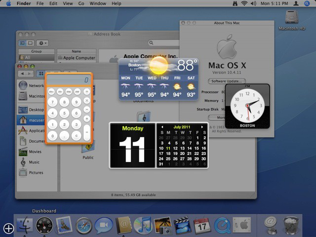
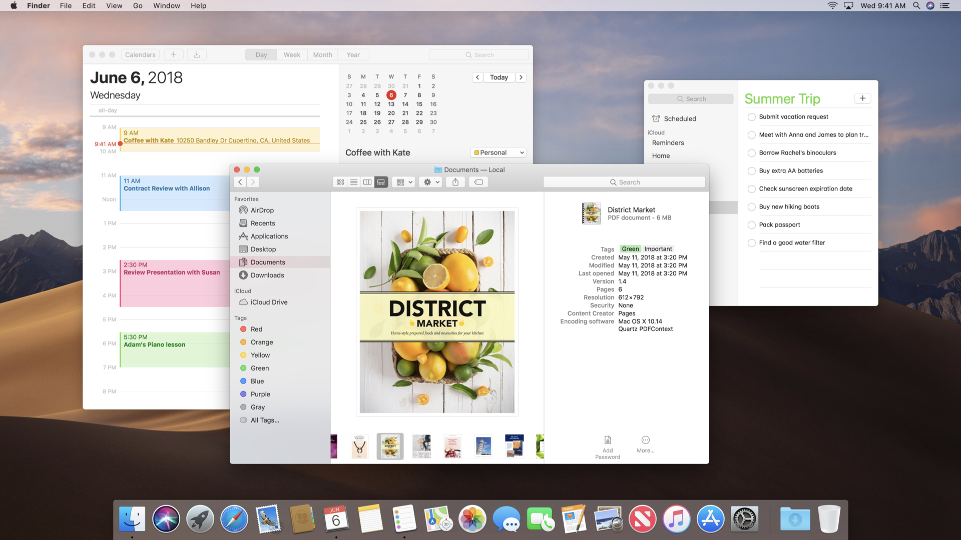
Apple’s latest operating system, Catalina macOS X version 10.15.4 bears more resemblance to ProKit now than it did in 2000 when Aqua and macOS X were initially released. This is worth noting, and by using a visual ‘time machine,’ we can appreciate the importance of iteration and constant learning.
Dark Mode (Catalina)
Steve would not shy away from ‘cannibalizing’ his own company’s work, meaning he would be willing to “kill’ a design (direction) or call off a project or product in favor of a better solution and direction. By doing so, we would keep teams nimble, and the company focused on what’s essential. I have been heeding that advice ever since.
